In “Identity and Transformation”, an essay in our recent monograph, FUSION – The Performance of Architecture, I posed the following question: how do we see the role of academic architecture, sited within campus environments that are continuously changing and evolving? In the essay, I reviewed different strategies used by a handful of recent projects by PAYETTE, relating them to the strength of the institution’s identity, the evolution of the campus character and the desire for transformation.
Since writing the essay almost one year ago, I have been following the development of three projects currently on the boards that apply a particular strategy to this question that was not identified in the essay. These three projects serve very different institutions, house very different programs, are located in very different campuses and will not look similar when built. And yet, they share a basic strategy regarding siting, their position within primary campus spaces, and massing, the elemental geometry of their form). In this regard, these projects challenge conventional siting and massing strategies that were applied in most of the other projects featured in Fusion. These two problems, siting and massing, are related, and in these three projects, the latter follows the former.
Projects such as these usually represent precious opportunities to improve the campus’ character, its spatial structure, hierarchy of buildings, open spaces and circulation paths, and the experience of the place. This is what we usually call “campus-making” architecture. These three projects West Two at Penn State University, the New Academic Building at the University of Hartford and the New Science and Technology Building at Cape Cod Community College represent such opportunity. They are being asked to inject life into existing campus precincts and to strengthen, transform or establish primary open spaces.
Interestingly, all three projects have taken an unusual approach to framing these primary open spaces: buildings are being placed “in” the space, as opposed to along one side of the space, effectively reducing the area devoted to the primary open space. Instead of standing along the edge, they step in, disrupt the existing organization, recalibrating the scale and form of the open space.
PENN STATE WEST TWO
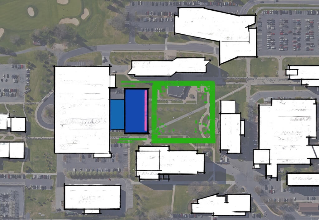
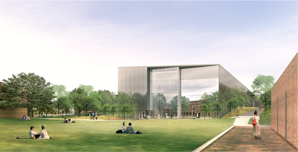
At Penn State’s West Campus, the 105,000 sf West Two building was placed in front of a parking garage, effectively providing the fourth side of an orthogonal open space. Thus, West Two provides a new identity for the newly re-imagined West Quad, while reducing its area by a third. By sitting “in” the space, the new building tightens the proportions of the quad (approximately 300 by 300 feet) re-energizing the dialog between the buildings flanking the quad on all four sides. West Two enhances this effect by offering a “super window” towards the east, visually anchoring the quad –and the whole West precinct – and orienting itself clearly towards that direction.
Having clearly established its front side, the building compresses the space to the north and south by maintaining narrower 50-foot corridors against the neighboring buildings for pedestrian circulation. The building’s mass is simple, boxy and quiet, sitting comfortably within the precinct’s orthogonal grid. Its material palette follows the general character of the precinct’s buildings. West Two achieves its desired prominence by occupying a privileged location at the new head of the quad –enhanced by its east-facing super-window – and by presenting a clear, simple, proud form.
CAPE COD COMMUNITY COLLEGE
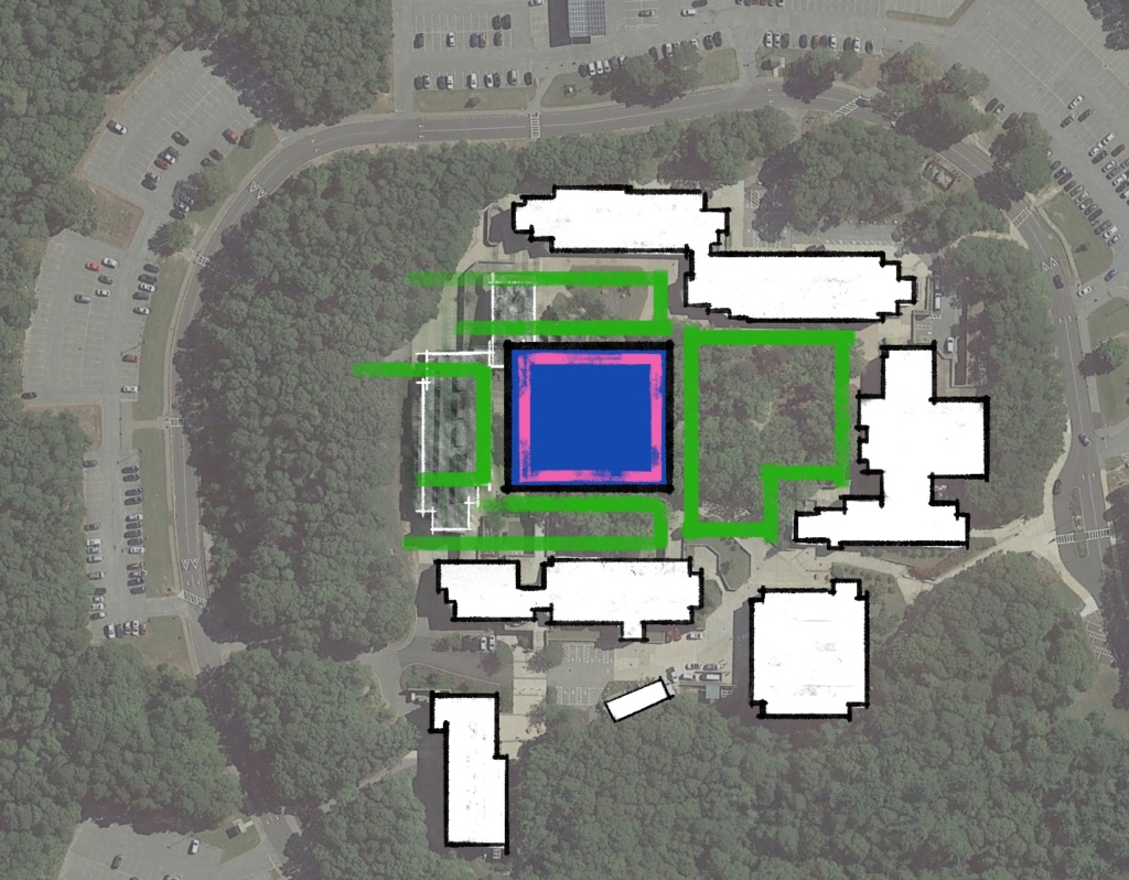
At Cape Cod Community College, the 39,000 sf New Science and Technology Building will replace a building that once framed the north side around the central quad. The campus was planned and designed in the 1970’s as a coherent and consistent row of buildings, forming a ring around a central wooded hill – the symbolic heart of the campus. The siting of the new building, intended to re-energize the campus, provide a heart and transform the identity of the campus, challenges the organization of the original campus by violating the dimensions of the central space, reducing its area by almost 40%. The building sits inside of the realm of the original open space, tightens the dimensions of the central wooded area to the south creating an interesting dialog with Wilkens Library across the quad and starts to create a new lawn towards the north –the open, “outer side” of the campus. The new building follows the orthogonal campus grid, but sits in a non-symmetrical position in the east-west direction, creating a larger green space on the east and a tighter plaza to the west, where it creates a terrace serving the adjacent Grossman Commons building.
The footprint of the new building is square, suggesting a building that has no back, being equally open and accessible on all four sides. The square form reinforces the building as a destination, a hub, a fresh start for a “tired” campus. The building’s architecture reinforces this neutral orientation by running the articulation around all four sides and by exposing the racetrack circulation – also serving as its public and social space –towards the outside. The tension between the non-directional orientation of the building and the square proportions of its plan, placed on a site that is not neutral, with clear north-south axis – (while simultaneously nestling into the landscape and retaining a one-story change in grade along this axis) creates an intriguing energy all around the building.
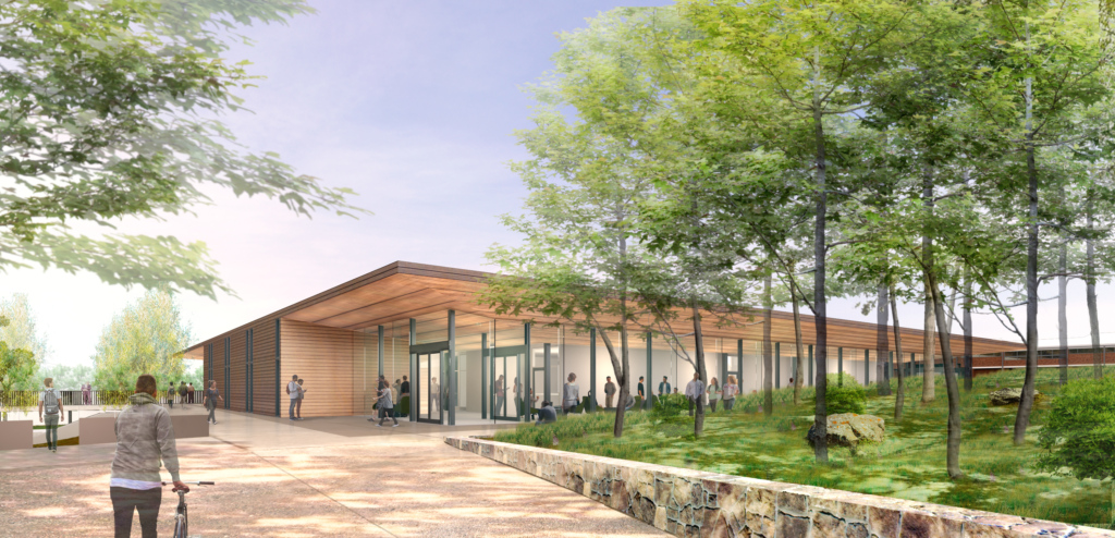
Cape Cod Community College
THE UNIVERSITY OF HARTFORD
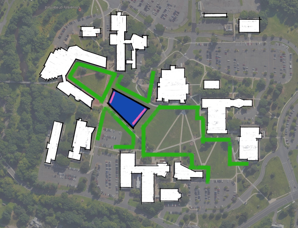
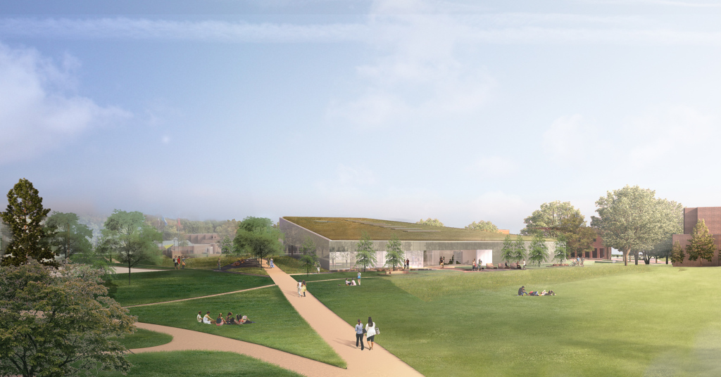
At the University of Hartford, the 60,000 square foot New Academic Building sits in the middle of the iconic Main Academic Green, the signature place on the campus. This curious siting strategy is driven by the client’s desire to create “a destination and activity hub” for the campus; a building in this central location will carry a symbolic meaning consistent with the client’s goal. Notably, the physical impact of this move is no less substantial: the open space that meanders along the north-south axis for approximately 1,200 feet is partially blocked by the new building, effectively replacing it with several smaller open spaces, not a trivial intervention for such a significant open space. Furthermore, the building location breaks down the only unifying element of the precinct, the Academic Green, as it is flanked by buildings of inconsistent character. The continuity of this new array of spaces is guaranteed by the generous space still available around the sides of the new building.
As was the case in the two previous examples, the New Academic Building has a simple massing – a four-sided polygonal footprint. Given the organic organization of the buildings sited along the Green, the new Academic Building chose to avoid any accidental alignment with its adjacent buildings, thus it features a non-orthogonal shape. The result is an unmistakable independent form, and object that is free from the rules that regulate the existing perimeter buildings. However, the building remains relatively quiet, subtle, and low, and it does not try to build a strong contrast with its context. Importantly, in a clear gesture to anchor itself to its place, its large roof is low, slightly sloped and planted, essentially suggesting a continuation of the topography of the Green.
Related Content:
Introducing: FUSION – The Performance of Architecture
New Project: Cape Cod Community College
PAYETTE Awarded Commission at University of Hartford
New Commission at Penn State University

