Bringing Artistic Innovation to Architectural Visualization

I recently attended a presentation on the use of Photoshop as a fine art tool. Character designer and animator Aaron Blaise demonstrated how to harness the power of Photoshop beyond its photo editing capabilities. As a classically trained artist, Aaron has used Photoshop to paint the characters he designs. Aaron described the connection of painting on canvas and painting in Photoshop. He developed techniques through creating his own custom brushes and utilizing layers when painting light and depth. Aaron shared several Photoshop files of creatures he designed and painted fully in Photoshop, including the breakdown of the layers, revealing some of his processes. Analyzing his process provides insight into exactly how he uses Photoshop as an artistic tool. Aaron’s technique’s remind me of some of the strategies our 3D visualization group employ when developing architectural renderings.
For some time now, I have developed similar techniques in terms of layering effects. When painting over architectural renderings, some layers offer only small details or highlights and other layers have much more of an obvious effect. I’ve found there is more power and flexibility in using new layers when adding in specific highlights or specific shadows. Similar to Aaron’s method of using a base diffuse layer under shadow layers, speckle layers, and highlight layers to create depth and life, we also start with a simple flat rendering out of 3ds Max and build life into the image. Initially the layer stack appears intimidating until you start to understand the underlying structure. All of Aaron’s processes, in my opinion, are another way to represent lighting and create a story, which something we do all the time in our own visualizations.
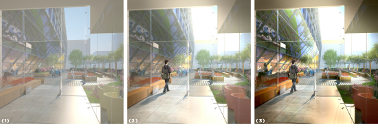
Here are a few images I worked on soon after attending the conference show the amount of depth that can be added using Photoshop to paint with light. In each series of renderings, the numbers 1, 2 and 3 correspond as follows:
(1) Base rendering, as initially imported into Photoshop
(2) Basic color correction
(3) “Light painting” techniques applied

Click to enlarge
Atrium rendering: I use light painting to add depth and detail to the image. Some examples of this are the highlights on the red chairs and on the wood window trim.

Click to enlarge
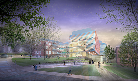
This rendering was assembled in Photoshop. Almost 100% of the image is a Photoshop construction. The second image shows the lighting that was painted on top of the image.

Click to enlarge
This terrace rendering shows the rendering with basic color correction and with added Photoshop lighting and effects.


