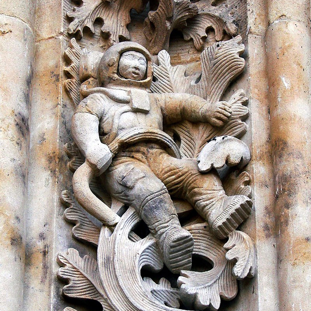
Some years ago I took a tour of the 16th century cathedral in Salamanca, Spain. The tour guide pointed out a carved stone astronaut near the front entrance. During the 1990’s the cathedral underwent renovations, and since knowledge of the original shape had been lost, the mason placed an astronaut. The tour guide did not like it all, as he felt it was not historically accurate or reflective of the exiting cathedral details. But I rather liked it, and it turns out there is a culture among masons of leaving a signature. This mason wanted to leave a mark on the building to signify the renovations of that time. So he chose the astronaut as a symbol of the 20th century.

The stone astronaut, though just a small object in the façade, is a design fingerprint, a clear example of a design decision with great meaning. Each of our projects at PAYETTE have design fingerprints: objects or moments where we chose to either highlight or hide, create a signature or take a sharp right turn in the design process. Here are a few examples of stone astronauts I found in some of our recent projects:
Tufts University Science & Engineering Center: Brick and Terracotta Walls
As you walk into the atrium at Tufts, you will no doubt notice the brick wall with terracotta details. The design team chose to highlight walls that reinforced existing campus architecture, while down-playing other walls in the space. The brick wall featuring terra cotta is washed with light from above, has limited perforations and features the original window openings. On the other hand, a brick veneer wall from the 1960s was painted white and perforated with large openings, so the eye is drawn to the historical bricks or to action of people beyond the wall. The new walls are similarly downplayed. At an opening celebration, a professor noted that he had never noticed the terracotta, even though he passed by building every day. The designers made their mark by choosing to celebrate the historic architecture at Tufts.

Georgetown University Medical Center Facilities Master Plan: Library Rendering
The process of creating a facility plan does not generally end in design or built product; it is a process of analysis of existing structures, their utilization and quality and making recommendations for future development. A central theme in this study was to create sense of place, an identity for the school. The original Med-Dent Building created an entrance for the school, but identity was lost among faceless 1960’s buildings. The library is largely windowless; they need a stone astronaut. To create a sense of place, the study recommended making the library an icon, though PAYETTE didn’t provide a specific design. What the team did provide is the rendering of a hypothetical renovation and addition to make the library an event. This rendering will serve as a tool for campus leadership and administration, highlighting the importance of creating an icon. Even at the study stage we can leave a fingerprint to guide future design.

University of Pittsburgh Medical Center Tribute Wall: Monitors
As a special project, PAYETTE is designing a tribute wall inside the lobby at UPitt Medical Center. The wall highlights influential doctors in UPitt’s history. At first, the project featured kiosks with monitors located in the lobby. But for the designers, this didn’t seem like a bold enough fingerprint. The team realized it was the treatment of the monitors that was key. The design shifted to feature monitors wrapping the columns, creating a single immersive space. Visitors can see the monitors as they exit the elevators and climb the stairs. They can choose to dive deeper at the touch screens at the counter top which have a greater depth of information. The monitor placement, our astronaut, reframed the project from an object within the lobby to an entire experiential moment. This moment will be a lasting tribute to the school’s history.

Dana Farber MRI Replacement: Hatch
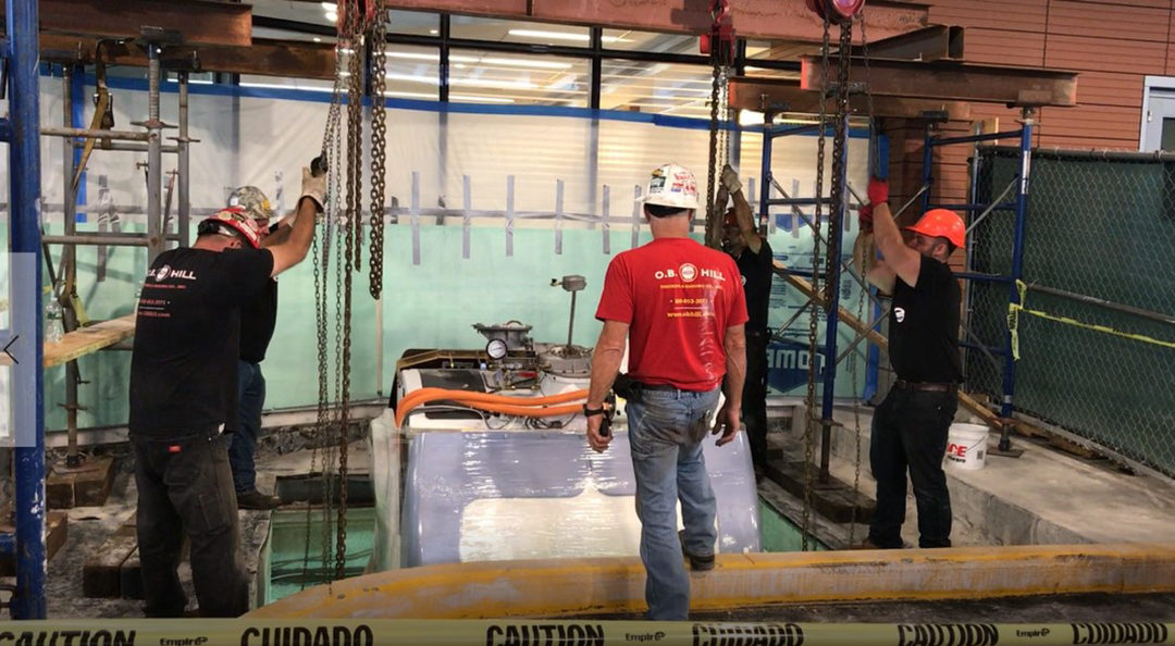
Sometimes our design fingerprints, our key decisions, are not visible at all. Dana Farber is getting a newly renovated MRI suite. But walking along the sidewalk outside, you will probably never notice survey marks in the ground. This is the only sign of the hatch – the logistical path that made this project possible. Back in 2014, the PAYETTE team was working on a lobby renovation located a floor above the existing MRI suite. Knowing the MRI replacement was coming a few years down the road, a hatch was created with sacrificial panels to facilitate craning out the old machinery. When the time came this year, the workers removed the panels and pulled the old MRI up by hand. After the new MRI arrives, the hatch will be closed once again, awaiting the next cycle of machine replacement. Though hidden from view, and unrelated to the day-to-day function of the suite, this detail is an essential fingerprint left by the designers.

Northeastern University ISEC Cybersecurity: Espresso Machine
Can stone astronauts also be found in equipment? How about an espresso machine? At Northeastern, a team fit out the 6th floor for Cybersecurity, a computational group. The concept was for an open office filled with collaboration zones and soft seating. Initially, the client was concerned that the open office would be noisy and disruptive to work. The design team wanted to meet the client’s workspace needs, but also strove to maintain Northeastern’s design intent of openness, light and views. The designers went through a great effort balancing client desires and architectural intent. At one point, the users asked for an espresso machine, and the team made sure that they had a coffee bar that could accommodate one. The users sent over the specs for the machine that listed power needs and a dedicated water line, and these were incorporated into the plans. In the end, Cybersecurity loves their new space, thanks to the team’s effort to listen to the wants and needs of the users. An espresso machine may be small, but it represents our dialogue with the client.

All of these stone astronauts have a story to tell, a design story that is much bigger than themselves. Whether iconic, humble, esoteric, they represent key decisions that shaped the course of the project. They are the fingerprints of good design.


