Puzzles are fun. Puzzles are also challenging – and rewarding. Puzzles utilize all the skills we need to design buildings, plan cities and create engaging, desirable spaces. While we may not typically equate our design process to literal puzzle games, both endeavors require strategic thought, pattern recognition and memory. Architecture is relatable to all sorts of puzzles, including jigsaw puzzles, anagrams, Sudoku and more. Through the lens of these games, we can see the playfulness and thoughtfulness of architecture on display. Let me walk you through a few #PAYETTEpuzzles in our portfolio.
![]()
The Jigsaw Puzzle – MEDITECH Canton Office Renovation
Jigsaw puzzles are typically composed of two-dimensional tessellating, interlocking pieces. Each piece has a small portion of an image printed on it, so that when the puzzle is solved, a completed picture is formed.
This fit-out is a phased renovation of an open-office environment that has been pieced together over several years, much like a jigsaw puzzle. The phases divide the floor plates in unusual ways to manage constraints related to noise and egress, leading the team to carefully consider how the parts fit together.
Additionally, the fit-out design is an experiential puzzle. The design team worked to create connections through transparency, which was achieved by opening several walls, replacing opaque walls with glass corners in conference rooms and inserting flexible partitions that can open spaces to each other. As a result, occupants can see across, through and beyond their own spaces, allowing them to work in a more united environment. This jigsaw puzzle forms a picture through both visual and physical connections of space.
 The Expert-Level Tangram – University of Chicago, Crerar Library Renovation
Tangrams are tiling puzzles, similar to jigsaw puzzles, where players are given a silhouette and several differently shaped pieces called “tans.” The goal is to entirely fill in the silhouette with the tans, leaving no gaps or overlaps.
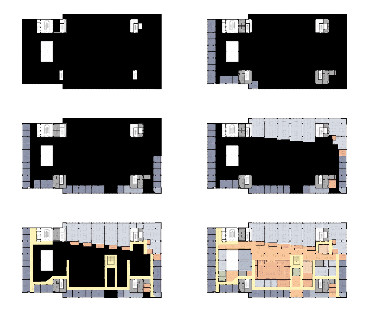
If we analyze the Crerar Library renovation as a tangram, our “tans” are the programmatic elements we insert into the project. Our puzzle is the empty third floor footprint of the Crerar Library. This floor was once home to physical stacks and archives, but the university decided to transform this space to be used by a more digitally-focused program. The floorplate is nearly the size of a football field and offers few constraints – so how do you design in space like this?
The design process uses similar strategies as the puzzle – identify obvious outliers, populate the edges and figure out how the remaining elements fall into place.
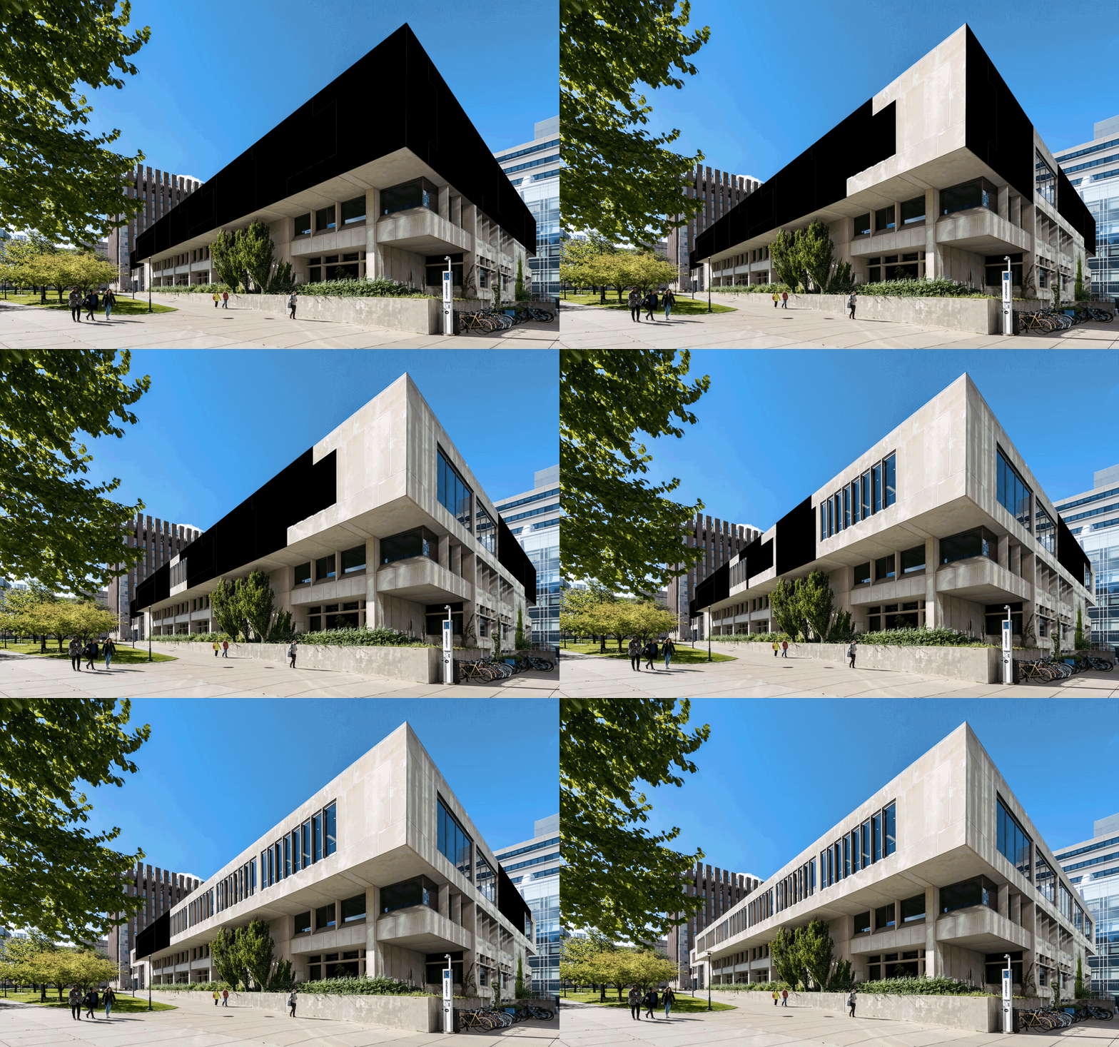
 Another interesting condition about this puzzle is that there used to be no windows or natural light coming into the third floor, as it would have been damaging to the archives. Looking at the exterior of the building, you can see how this renovation changes the face of the library and makes it lighter and more inviting to the campus.

The Rubik’s Cube, a parametric puzzle – Hengqin Hospital
The Rubik’s Cube is a spatial, mechanical puzzle. The puzzle is played by first mixing up the colors on the cube, and then restoring it to its original position with a single color on each face. While infamous for its difficulty, there are methods to solve the madness. Seasoned players solve the cube by learning a several sequences of moves called algorithms. Each algorithm has a specific effect on the puzzle without impacting other parts of the cube. Some techniques solve layer-by-layer, and others solve the corners first.
In the architectural sense, the colors of a Rubik’s cube represent a variety of design disciplines. It is important to remember the solving strategies for Rubik’s cubes – they are never solved by fixating on a single color, face or discipline at a time.
The six-sided puzzle of the Hengqin Hospital includes:
- Landscape: Landscape is central to the design, and positively influences the site’s thermal comfort.
- Building Science: Studies explored ways to use the local tropical climate and water features to cool the air.
- Circulation and Access: The water feature acts as a wayfinding element for the divided circulation paths between inpatient and outpatient access to the hospital.
- Medical Planning: The divided circulation influences how to place departments in the facility. The hospital was conceived as a single entity, allowing the landscape to be central to the design. The building utilizes a podium / tower language.
- Architectural expression: The podium / tower language translates into architectural expression of the façade. The podium is ribbon-like and stretchy, while the tower is vertically louvered and light. The louver studies were a part of building science to influence occupant comfort related to heat gain and glare.
- Context: context is part of steps one through five as well, allowing the design to tie into the climate, landscape, urban fabric and culture of Hengqin.
Not a single side of this cube could be solved on its own. Working layer-by-layer, each of these aspects speak to each other and inform each other as the design details are resolved.
 Next time you’re in the weeds of architecture, “puzzling” over a problem …remember, it’s just a game.


