This is the first of a three part series of diving into the design of all-gender restrooms and current obstacles to building them.
Part of an architect’s moral imperative is to design space that is inclusive and accessible to everyone, regardless of physical ability or identity. The concept of “universal design,” as coined by Ron Mace at NC State University, refers to the idea that environments should be designed “to be usable by all people, to the greatest extent possible, without the need for adaptation or specialized design.” For example, a building entrance that requires climbing three steps is unusable for someone using a wheelchair. A restaurant with hard surfaces and harsh acoustics can be hard to endure for someone with sensory sensitivity. Architects, then, should make every effort to integrate solutions to those hostile conditions: adding a ramp to that entrance, using soft sound-absorbing materials in that restaurant. The same framework applies for gender in public space, particularly restrooms.

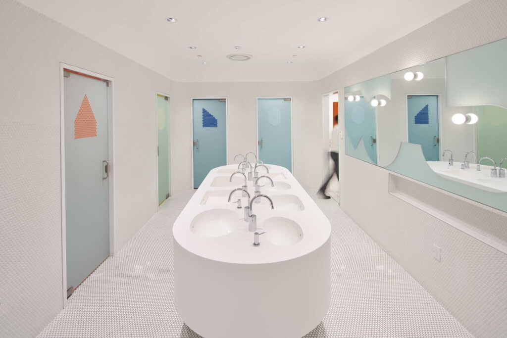
The multi-user all-gender restroom at the new Student Center at RISD, designed by WORKac.
The past decade has led to more mainstream understanding of gender and sex as different things: sex being a label assigned at birth based on chromosomes and genitalia, gender being a social construct of characteristics, expectations, behaviors and presentations. Modern restroom designations, originally created in the late 1800s, do not reflect a nuanced understanding of sex assigned at birth as something distinct from gender identity. Gendered restrooms make transgender people easy targets for transphobic legislation which links restroom use and sex assigned at birth. Additionally, designating restrooms as either for men or women reinforces the outdated notion that gender is binary and is othering for people who are nonbinary. Restrooms that can be used by anyone across the gender spectrum are a simple but powerful step that help to make a public space inclusive to everyone, regardless of their gender identity. While the demand for “all-gender” restrooms has never been greater, barriers to design and implementation remain in place. One of these barriers, which users first encounter when attempting to use a restroom, is signage.
Signage refers to the label outside the restroom telling the user how it is designated. Often, signage will indicate male or female, sometimes unisex, sometimes “family”. While those designations historically began as ways to ensure equal facilities for men and women, they are outdated and, in our contemporary knowledge of gender, exclusionary by omission. These signs ultimately communicate the same underlying message–certain spaces are for specific groups people while others are not welcome. Restrictions are communicated through language and symbols.
This series will use the term “all-gender” to describe a restroom that can be used by any user regardless of gender identity. Other terms attempt to get across the same fundamental point about gender and restrooms, but passive terms like “gender-neutral” or “unisex” can be read as being dismissive of gender. “All-gender” is explicitly affirmational and inclusive of all gender identities. It is also, increasingly, the terminology adopted at institutions (like universities) that have made a point of adding these facilities.

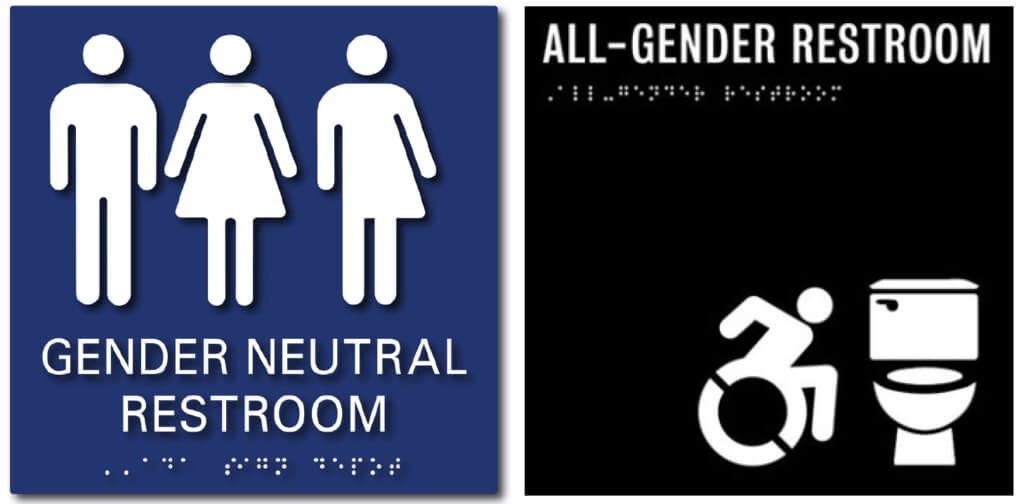
Left, signage using gendered stick figures, from adasigndepot.com
Right, signage with icon of a toilet, used at Fashion Institute of Technology in New York City
The symbols on restroom signage are, at first glance, a more difficult problem to solve. The default symbol on gendered restroom signage is the stick figure: human-shaped for male and human-with-a-dress-shaped for female. Some all-gender restroom signage uses an additional third figure, a split male/female icon. This icon, while perhaps well-intentioned, should be avoided. Many advocates and LGBTQ+ users have raised valid concerns that it plays into problematic stereotypes about trans people and, again, reinforces the gender binary.
But what to use instead? Designer and activist Sam Killermann proposed a radically simple solution: a picture of a toilet. Users understand what a sign with a toilet communicates: it’s what you encounter in a restroom. Men’s restrooms can include an icon of a urinal to accurately reflect what specific fixtures users can expect to encounter. The toilet sign is such a bluntly elegant design solution that seems obvious in retrospect, but it requires a subtle and important shift in thinking—that signage should place emphasis not on who can use a restroom, but what is in a restroom. Replacing needlessly gendered cartoons removes an initial barrier of hostility; any restroom is the “right” restroom. If the ultimate goal is to no longer have restrooms as gendered space, the signage outside it—both the iconography and the terminology—must be rethought.
The next blog post in this series will dive into a much more complicated issue, one that is arguably the largest impediment to building all-gender restrooms: building code.
Related Posts in this Series:
Part 2: Navigating Building Code
Part 3: Putting Ideas into Practice
Bibliography
Ball, Aimee Lee. “In All-Gender Restrooms, the Signs Reflect the Times.” The New York Times, 5 Nov. 2015, www.nytimes.com/2015/11/08/style/transgender-restroom-all-gender.html.
Davis, Lisa Selin. “The Simple Design Solutions That Can Make Bathrooms Better—For All Genders.” Quartz, 16 Mar. 2017, www.qz.com/933704/how-to-design-transgender-friendly-bathrooms-that-make-people-of-all-genders-feel-safe/.
Hogan, Terry. “Code: History.” Stalled!, www.stalled.online/standards.
Joseph, Catherine, and Whitney Odell. Bathrooms for Humans. FXCollaborative Podium, 2018, www.issuu.com/fxfowle/docs/fxcollaborativepodium_bathroomsforh.
Killermann, Sam. “All Gender Restroom Sign.” Sam Killermann, Apr. 2014, www.samuelkillermann.com/work/all-gender-restroom-sign/.


