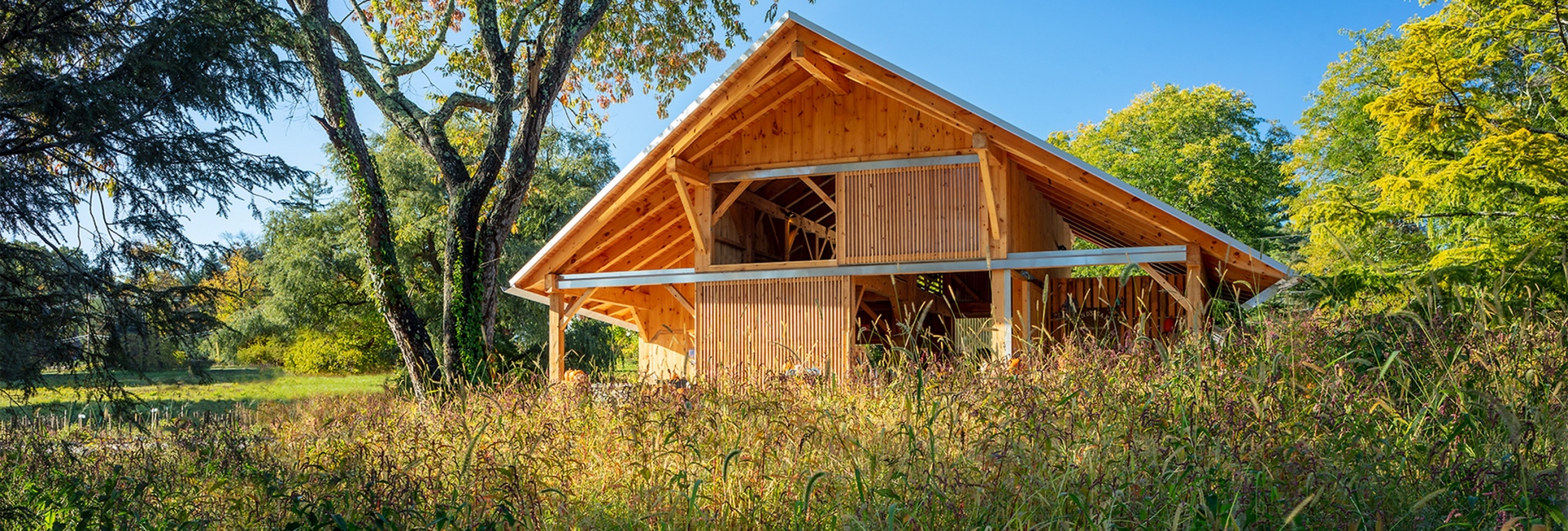
The story of this year’s sketchbook begins with a tree – a tree that once humbly lived in a Weston grove, a tree that now stands tall as the support post and centerpiece within the Land’s Sake Animal Barn.
PAYETTE’s projects span over three categories: science, healthcare, and pro bono work. Though we more often discuss our high-performance labs and robust hospitals, in this year’s sketchbook, I had hoped to celebrate the great strides in our pro-bono work. When I sat down with Wes Schwartz, the Project Architect for the selected project, and reviewed our pro bono work, one stood out in my mind.
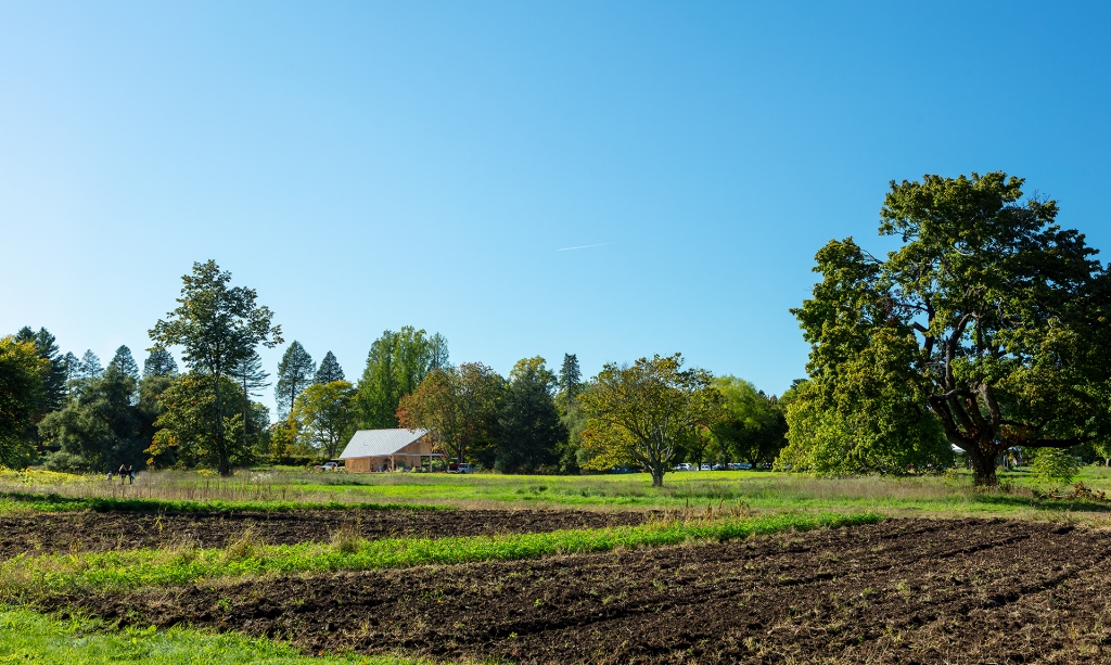
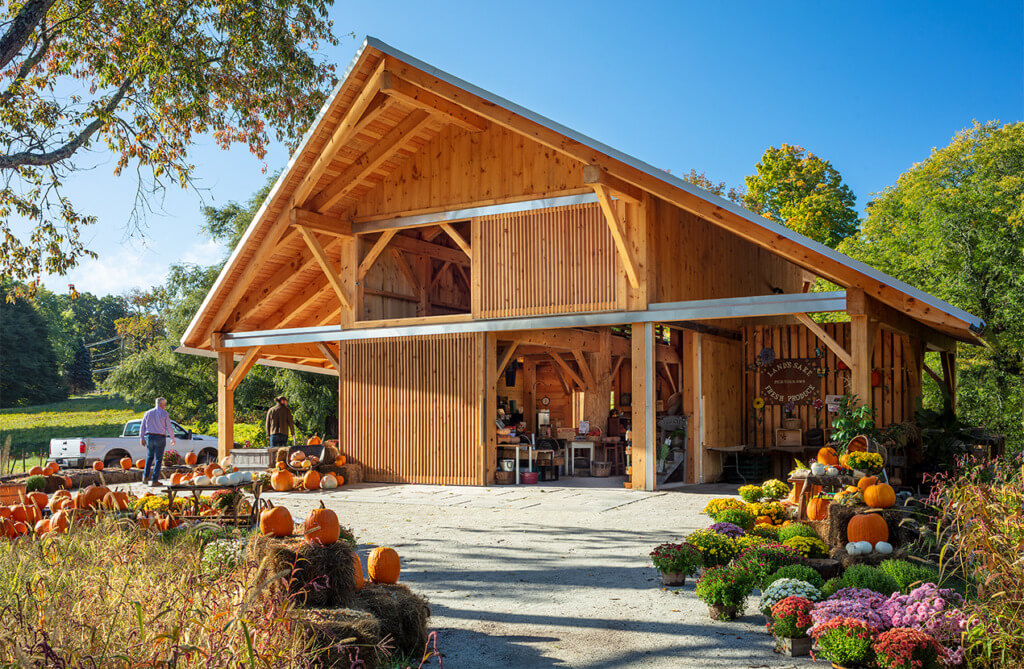
Land’s Sake is a non-profit community farm in Weston, MA that serves their townspeople and hunger relief organizations through fresh produce and environmental education programs. For the past five years, PAYETTE has assisted Land’s Sake in developing and executing a long-term infrastructure project for their 40-acre farm. Last March, the timber frame for the animal barn was raised in 5 days, and when we returned in the fall to take photos, the barn was already in full operation. Mostly constructed of wood donated by a Weston landowner, the barn’s hallmark is the center tree post. The organic silhouette of the tree contrasts with the usual shapes and textures seen in our buildings. It brings an earthiness, grittiness, gentleness that contrasts with straight edges and smooth faces. I knew instantly – I wanted this year’s sketchbook cover to feature the tree.
So, how do we turn a physical object into a design?
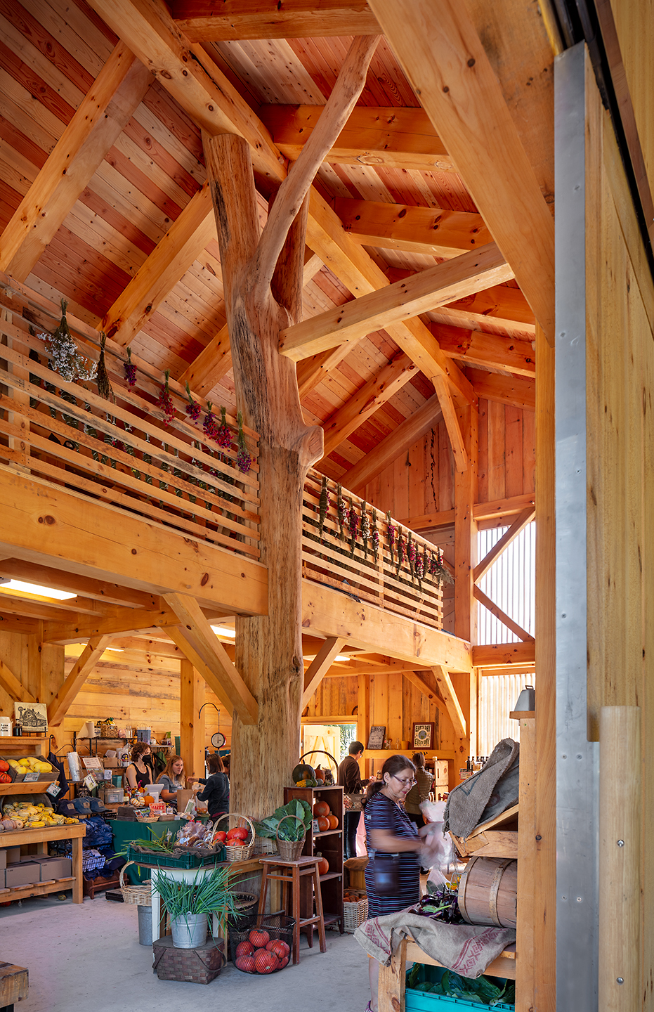
My vision was a cover that could evoke both the visual and tactile sensation of the trunk. Though the raw finish of the paper was an intentional selection, I was still looking for more roughness and depth. Thus, we turned to creating a vector that would not just be printed, but engraved, onto the material. I collaborated with Clare Liu, our Communications & Graphics Coordinator on this fun process:
1. We begin with a tree. Not just any tree. The tree.
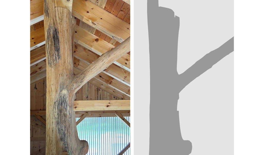
2. Fill in the silhouette. The notches and ridges are crucial in maintaining the specific characteristics of the tree.
3. Define the values and experiment. The initial examples applied linework to depict the non-uniformity in the bark, but it contributed too much visual noise, establishing a form that was difficult to parse. The change to using solid blocks of color instead streamlined the visual.
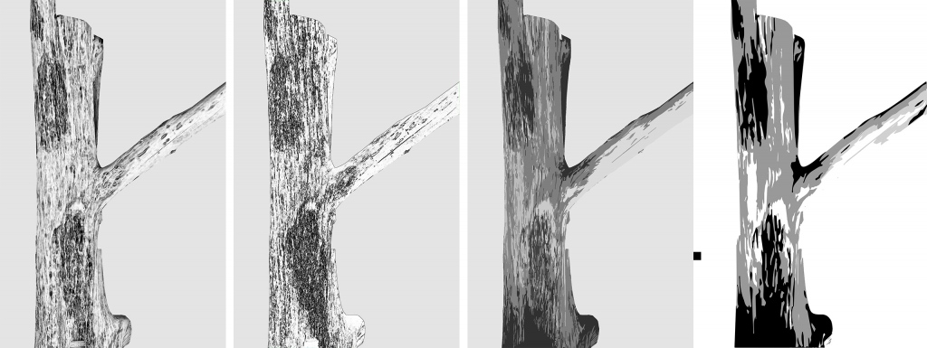
4. Reduce and refine. Many smaller shapes were merged to clearly distinguish individual planes. This simplifies simplified visual noise and offers offered enough tolerance for the manufacturer to work around.
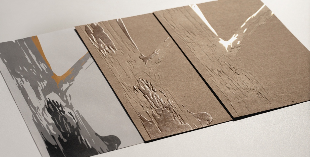
The final version consisted of 3 values total to be embossed, debossed, or foil stamped, generating a multitude of permutations. While discussing the variations with Wes in the office, someone accidentally turned the lights off, then back on. In the moment it took the fluorescents to beam down again, the figure of the tree vanished, then resurfaced. “This is it!” Wes and I quickly reached an agreement, and the decision appeared to be obvious.
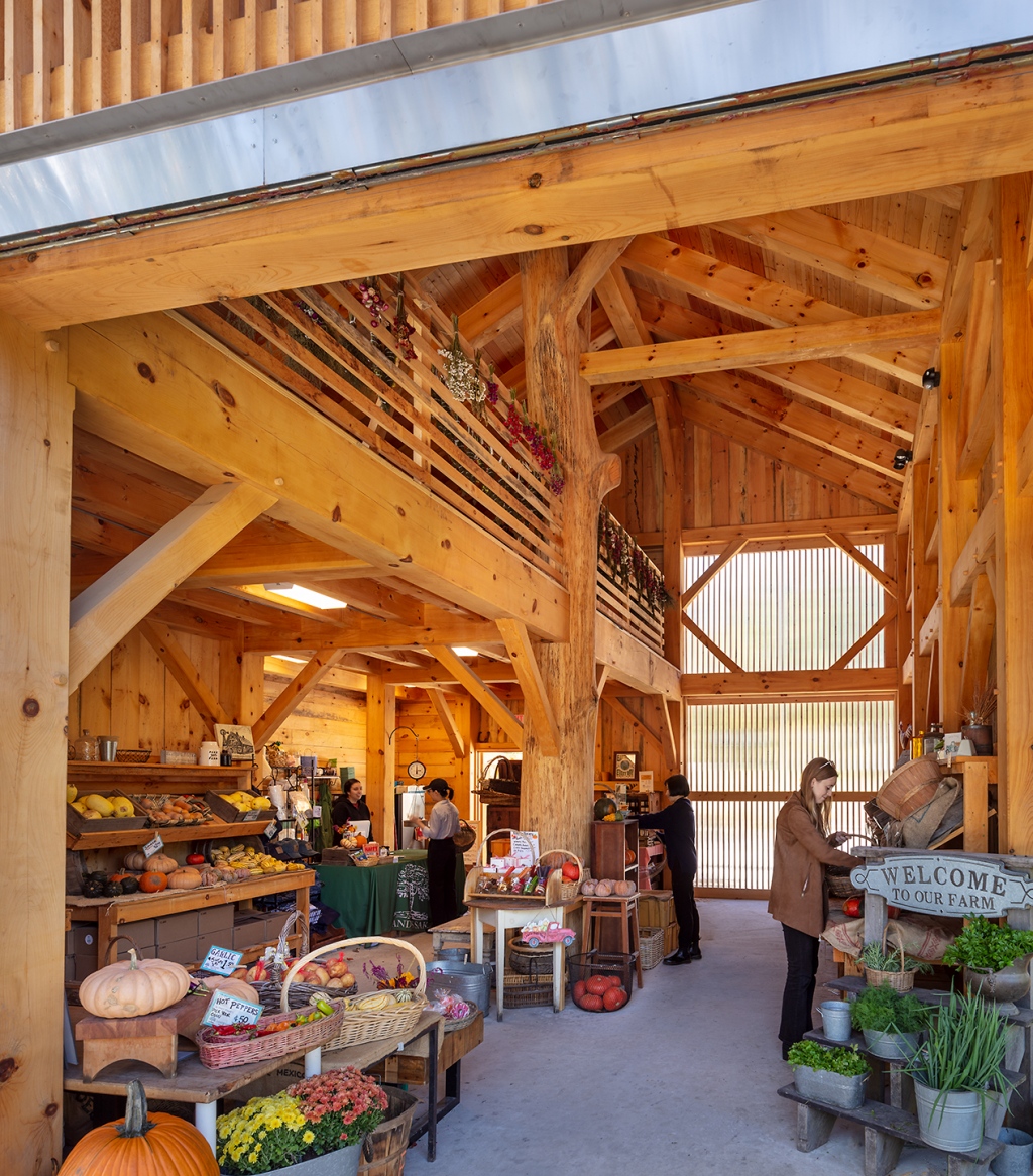
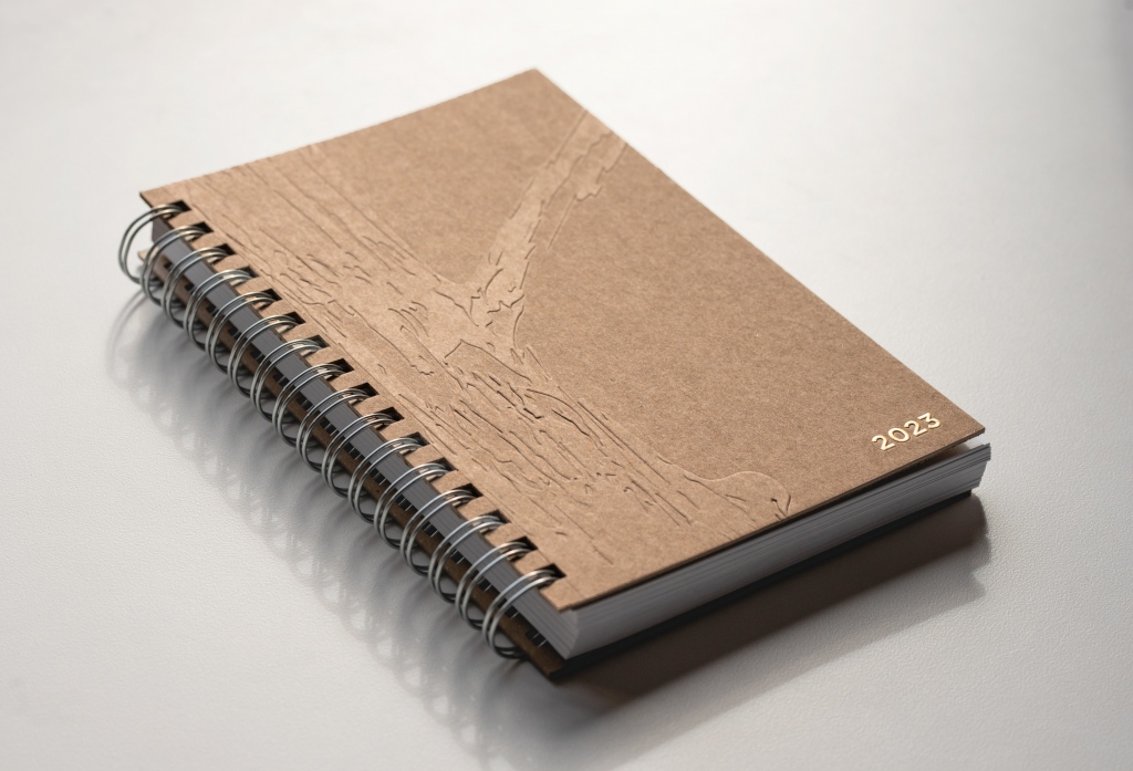
A memory from the photoshoot struck me – although the tree was the centerpiece of the barn, it sometimes settled into the rest of the wood environment and blended with its brothers and sisters. We decided on the simplest sample: an unadorned tree, just as it was in the barn, with only the year highlighted in gold, a small suggestion of sunshine.
The inside cover features a simple plan and section of the barn highlighting the central figure of the tree under the expansive roof of the pavilion like barn with sliding doors that open the space to the farm.
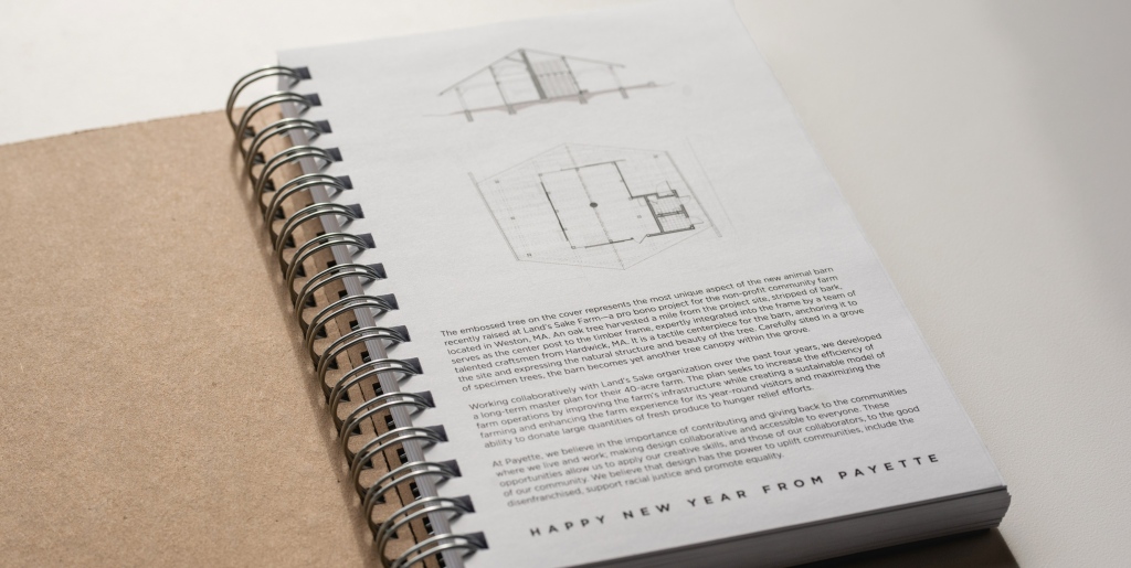
As with our all our initiatives, we strive for sustainable solutions. The Land’s Sake Animal Barn utilizes traditional timber framing and locally harvested wood left raw to weather. The sketchbook cover features Neenah’s premium post-consumer fiber paper in Grocer Kraft. The silver spiral coils are a nod to the stainless-steel gutters and components made in-house in our FabLAB.
This year’s design is a subtle reminder — it’s not always seen, but it is always felt. The texture of the pattern is tangible and comforting under the fingertips. Our pro bono projects will always be some of the most rewarding work we do. And this year for PAYETTE, we hope to continue to engage in more collaborative and accessible design with the communities around us.
RELATED CONTENT
2022 Sketchbook: A Celebration of Our Firm
2021 Sketchbook: When Design Empowers Community-Led Initiatives
