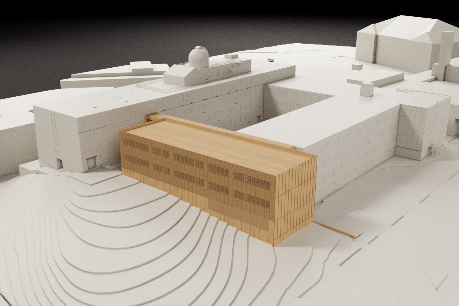
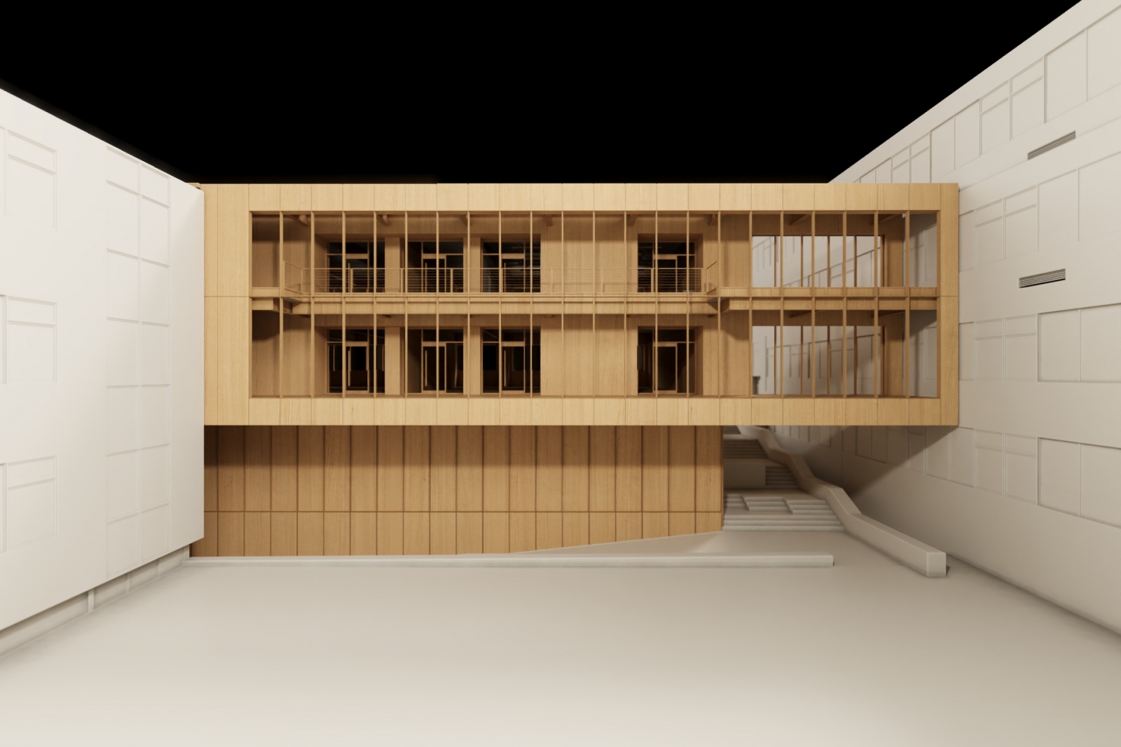
In the early stages of our projects, there comes a time when we need to show our client what the exterior of a new building design looks like, but it is often too premature to get into discussions about materiality, color and other challenges that come with photorealistic renderings.
While it is not a new idea to use a nicely crafted basswood model to convince a client that we are on the right track, but models often take more time to build than is available. Models are also not an easy media to iterate multiple options with.
The Salem State University team was in this very dilemma last week when the Design Visualization Group pulled off the Eureka solution: simply render the digital model that the team already had in the works as if it was a physical model!
The Design Visualization Group reviewed examples of model photography and applied a color and material palette often used in our models, down to the same shade of white used for the site context. Contours were made to look like they were milled on the CNC machine, the existing buildings had approximately the same amount of abstraction used when shaping them with a bandsaw and, most importantly, they studied the lighting from typical model photos taken in photo room.
The revolution here is not representing a building in basswood, but the speed at which it can be updated as teams iterate through design ideas on an hourly basis. Before this, we spent several days trying to tune a material palette for photorealistic renderings and they still were not quite ready to share with the client. We decided to try this idea on a Wednesday morning and by 4 o’clock that same afternoon we had the images posted below.


