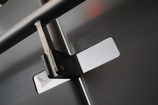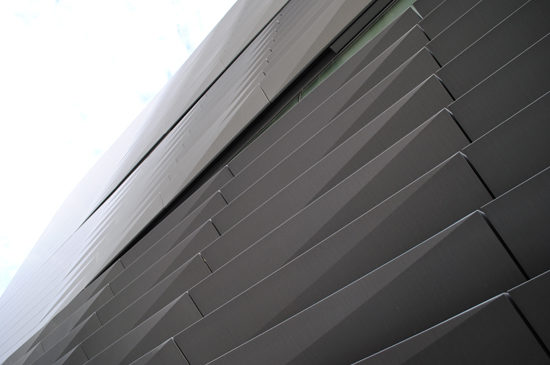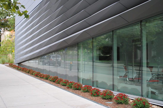
The first thing I noticed about the Perry and Marty Granoff Center for the Creative Arts Building at Brown University was the skin. Unique to the neighborhood typology, ribbons of metal cladding flip, bend, peel and fold along the building façade. The skin seems to wrap the building like a carefully placed scarf, allowing the glazing to peek through and peel open, offering light and views to the occupants when appropriate. Zinc panels fold to create ribbons of three dimensional sculptures that eloquently play with light – casting shadows and reflection depending on the time of day or the observer’s angle. Electrical and mechanical functions are seamlessly integrated into the architecture making it immediately evident that someone, more likely a team of people, cared an awful lot about this building, executing details with a notable amount of vigor.
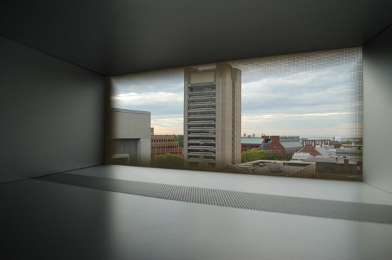
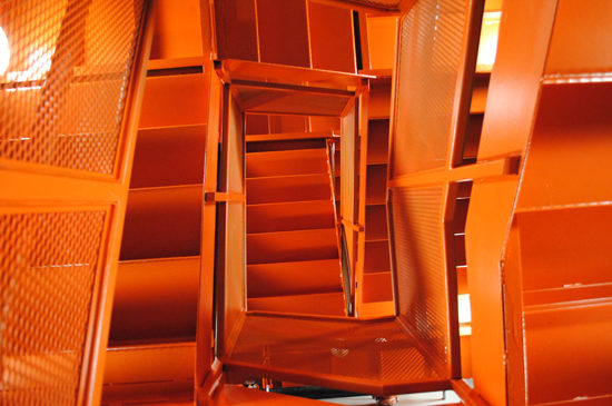
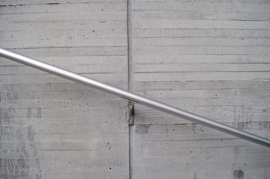
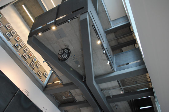
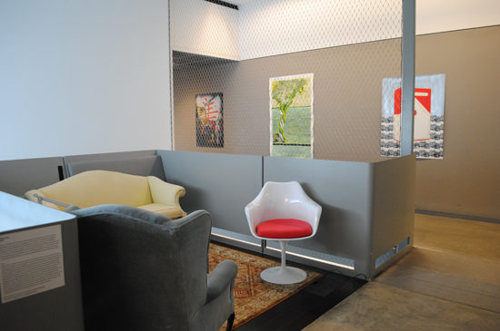
Upon entry, the well-executed detailing continues. Even the egress stairs, where the finishes budget was likely kept to a minimum; I noticed a detail of exposing a concrete column flush to the face of the gypsum wall board. Such attention to detail is a credit to the design team. With concrete floors, welded steel guardrails, metal grating and metal mesh netting, the building takes on an industrial feel. Organized by a central stair that splits the building into north and south wings, the three story structure fits the height profile of its neighboring context. The south wing is depressed half a story to create 6 midlevel stories in the atrium to accommodate programming for performance and studio spaces with high ceilings. To the architect’s advantage this vertical approach allowed the team to create additional spaces for social interaction at the heart of the building. Here, the stair landings open up to “living room” balconies that invite the users to sit and observe art displays, creating a space for casual encounters and encouraging multi-discipline collaboration.
I sat in one of the spaces to look at my photographs for a while. Despite the hard surfaces and industrial feel, the building is quiet; literally and figuratively. It was morning and there were few interior lights on inside the building, but it was well lit. I felt comfortable in the open atrium, with just the right amount of privacy, like sitting in a friend’s townhouse living room.
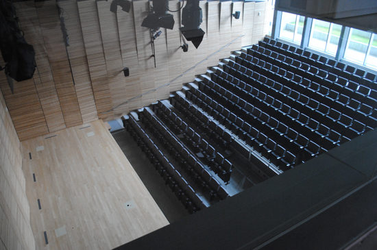
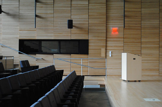
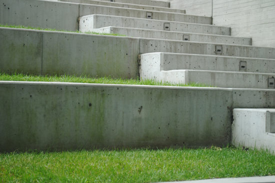
Finally, I concluded my visit with the auditorium. Folded wood panels line the inside of the space for acoustics, with doors and railings gently crafted into the surface. The program occupies volume in the low level and first level of the building. Diller Scofidio + Renfro always have a clever way of integrating performance spaces with the landscape and this building is no exception. The rear wall of the auditorium has full height glazing which looks onto an exterior amphitheater. The exterior space is wired for sound and projection which allows users to enjoy a lecture or film screening outdoors. Again, there are no lights on in the space during my visit but the curtain wall and clerestory flooded the interior with enough light for a daytime lecture.
I exited the building through the west entrance and onto the yard at 10:30 a.m. – still early morning in the life of a college student. As I walked away, I left anxious to return in the evening for a performance or an exhibit and to witness life and creativity whirl about the building in the way the design intended.
Diller, Scofidio + Renfro designed the Perry and Marty Granoff Center for the Creative Arts.


