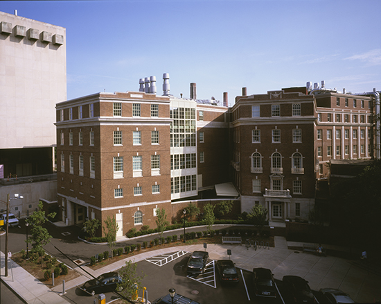
When architects talk about scale, we are referring to the proportions of the building. However, are we also referring to the relative proportion of the various building elements either to the building as a whole or to the human scale? Given that the imperial measurement standard was based literally on ‘feet’ and inches (the size of one’s thumb), I always assumed it was the human scale. I was reminded of this several years ago while working on a Neo-Georgian building on an Ivy League campus. One of the workmen on the site remarked that this building was one of the best looking buildings he had worked on in a long time. Should this observation have surprised me? If you had told me when I was in college in the early 70s that I would someday design a Neo-Georgian building, I would not have believed you, and frankly I was of two minds while working on this project.
What was it about this particular architectural style that was appealing to him? Could it be connected to the fact that the most popular style of house in the Northeast is still a Colonial, more than two centuries after that period ended? Curiously, the town in which I live had a brief affair with Modern architecture and there are several ‘neighborhoods’ designed by TAC and other Modern architects that flourished in the post-war period. But this was a short-lived romance and within a few years, the popularity of that style faded and the builders, for the most part, returned to the Colonial style. More recently, we’ve observed the rise of the “McMansion,” which are more of an ersatz style — part Colonial part Classic Revival.
What was it about those Modern houses that ultimately turned most people away? Could it be the Big Mac effect, where if you go to any McDonald’s,the food is exactly the same. With architecture this translates to: go to any revival building and know what you’ll get; you don’t have to think about what the architect is trying to do. Familiarity begets comfort.
This issue came up again recently, while I was stopped at a red light. My wife, who is also an architect, and I looked at a Neo-Georgian building as we waited for the light to change. As the sun was settling on the façade it struck us both as a beautifully scaled building — pleasant to look at and, in a funny way, pleasing. While neither of us is particularly interested in revival architecture, we both tried to understand why, at that moment, we liked the building so much. We agreed it was an issue of scale: human scale. There were elements on the building that one could easily relate to at the human scale. However, I’m sure proportion and design had something to do with it as well.
When I was in college there was a popular comic book series written by Robert Crumb of Keep on Truckin’ fame. I never forgot one of his many nuggets of wisdom, “never eat anything bigger than your head,” a life lesson I still adhere to today. In the context of building scale, could this nugget also be somehow applied to architecture? As in: always have something on your building that IS the size of your head? Well, maybe not literally, but a human scale that one can directly relate to as a human proportion? After all didn’t Corbu literally put a human scale on some of his buildings least you forget?
We live in a very different era than Georgian England and today’s Modern architect has to deal with all sorts of issues that didn’t exist in the late 1800s. But, what of the criticism that Modern architecture is scale-less and inhuman? This thought brings me to the cover of the October issue of Architectural Record. The FRAC Centre is a design that once again raised this issue of scale. It is a windowless, scale-less form dropped into a nicely scaled grouping of older buildings, described as “insouciantly biomorphic.” The magazine suggests that it is “pushing the envelope” – or is it just destroying the neighborhood?
Does one need to design buildings that somehow reflect the size of the occupants or is that not important anymore? Or am I just looking for familiarity; something the size of my head?


