Last year Boston’s Museum of Science completed a several years in the making project; they opened a new permanent exhibit, the Hall of Human Life. The new exhibit replaces and enhances the former Human Biology exhibit, which may be familiar to locals who haven’t visited the museum in quite some time. The Boston chapter of the AIGA paired with the exhibit design team to host a panel discussion on the design process – including 70 interactive experiences that explore how the body works – and why typography played an essential role in the overall design process.
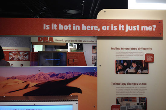
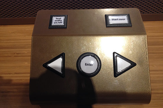
Because I’m fascinated by museums, typography and design, I couldn’t wait to hear from the designers and check out the exhibit. The designers spoke about the specific challenges of designing for this exhibit – from scale to level of interactivity to finding visual cohesion. In particular, they drew the audience’s attention to the typeface they selected due to its friendly and open feel, as well as its expansive family of weights, which work at large and small scales. The typeface appears throughout the exhibit – in the large typography headings to the interactive buttons.
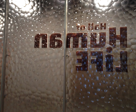
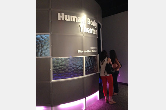
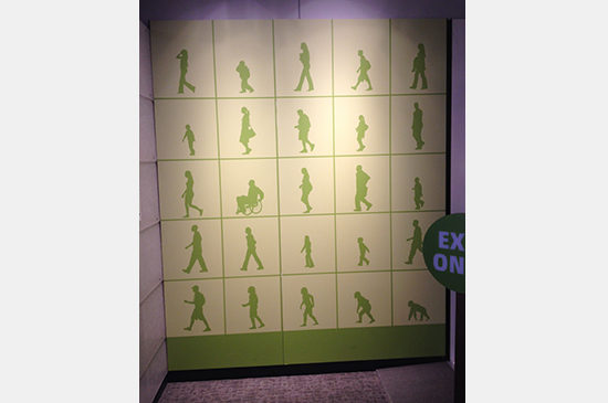
“Membrane” wall as seen from inside the exhibit.
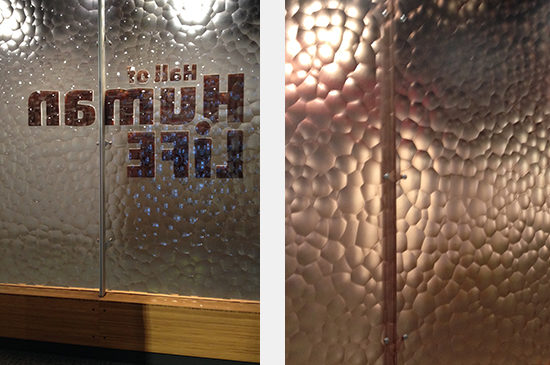
One of my favorite features, based on texture and color, was the “membrane wall” welcoming visitors to the exhibit. It’s a coppery color and smooth on one face and textured on the other. I love the abstract, but tangible quality it has. The designers spoke about the collaborative nature of their process – from sourcing materials (like the “membrane wall”) to creating mock-ups and testing the user experience. I hadn’t realized how much museum exhibit design (particularly interactive exhibits) is like designing the user experience online.
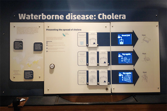
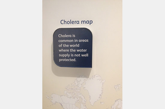
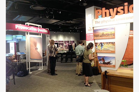
After the Q&A session wrapped, the team invited all attendees to explore the exhibit – a real treat since the exhibit is usually packed during museum hours and 30 of us had free reign of the 10,000 SF. The exhibit features so many elements that comprise the design – from integrated video and touch screens to the personal wrist bands that collect data. The personal wrist bands connect the museum experience to our daily lives. Guests scan their wrist bands before each activity and track their data, like the food we eat and how high our arches are. At home guests can login online and see how they measure up compared other event visitors. With all these components in play, there’s a lot for the designers to consider. What will catch a guest’s eye when the first enter? How will they know to get a wrist band? Will they read all the details about cholera or only the headings? How much information can be packed in to one call-out box?
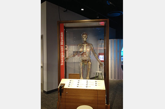
With the process in mind and consideration for all the elements in play, I had a great time exploring the Hall of Human Life. I’d love to get back to the exhibit and see it teeming with life and discovery. And for fans who visited the previous iteration of the exhibit, Human Biology, this exhibit still features the transparent woman!


