When I set out to design the annual sketchbook, I sift through potential materials and scan the pin-up alcoves for inspiration. This time I drew inspiration from PAYETTE’s entry in the Design Museum Boston Urban Innovation Festival Hackathon.
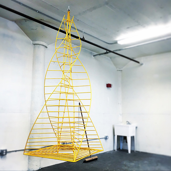
Our entry focused on developing a system of sculptural structures that could facilitate a number of placemaking opportunities. What started as a form we fondly call “the swing,” we envisioned to be the first in a series of forms that could help bring power sources to the I-93 underpass located at the outskirts of the South End, South Boston, Fort Point and Chinatown. By bringing structure and power to the underpass we hoped to offer a platform for programming that would support and connect the neighborhoods. Over that July weekend we had a great time iterating our idea and prototyping the first sculptural form. We brought “the swing” to the final day of the hackathon and invited guests, competitors and judges to give a try – it seats four, why not try it out with your friends?

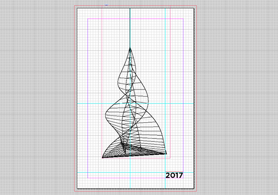
As we assembled the various sketches, drawings and renderings created during the hackathon, I was struck by the complex, yet simple linework that represented the swing in 2D form. It was delicate, artful and intriguing. I wanted to incorporate it in to the annual sketchbook design.
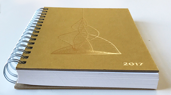
Each year I source different materials for the sketchbook. I search for materials that are recycled, recyclable or have some sustainable use story. I get samples that range from linen to wood veneer to coffee bean bags. Sometimes I’m drawn to a material simple because of the way it feels when I rub it between my fingers. In 2016 paper made of out recycled sugar cane crossed my desk. At first it didn’t catch my eye, but I kept going back to it and I started to develop an idea. I realized I liked the brown sugar cane paper better than the white sugar cane paper – the color has a richness to it that I started to envision with a gold metallic ink. I decided the figure of the swing would be debossed in gold metallic on this brown sugar cane paper.


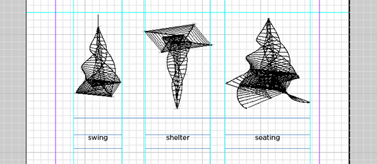
I also wanted to include some of the other sculptural frameworks we envisioned, but didn’t have the time to build during the hackathon. Designing these frameworks as an extension of the swing is representative of how we use parametric modeling to iterate design on multiple scales. Though we’ve historically shown a hand sketch on the inside sheet of the sketchbook, showing the range of forms we designed as line drawings extended the visual story of the hackathon to the inside of the sketchbook.

Part of why this particular sketchbook design is special to me is that it draws on work from a cross-section of the firm. Our hackathon team included designers who’d joined the firm only months prior following their graduation. Other team members included Associates who’ve been with the firm for several years. Our team represented diverse perspectives and skills and we dug in deep on ways to improve and enliven an often-forgotten pocket of our city. I love it when the sketchbook highlights the collaborative, interdisciplinary work of our firm.


