This is the second post in a retrospective series examining how the early work of the firm in healthcare design established deep roots for our practice.
Part 1 – An Innovative Prototype

In May 1949, Markus & Nocka (which eventually became PAYETTE starting in the 1960s) published a short article in the journal Hospital Management with the curious title, “Want to Cut Hospitalization Costs and Encourage Patient Self Help?” They promptly answer their own question in the tagline: “Here’s a new hospital room which does the job.” The article starts with a brief description of the motivation for developing this prototype patient room, reasons which should sound familiar nearly 70 years later:
Widespread adoption of prepaid forms of hospitalization make present hospital facilities antiquated. Present facilities fall into two categories:
1. Private rooms too expensive for Blue Cross (or other) coverage.
2. Wards which were designed primarily for charity cases.
Unless socialized medicine is accepted as inevitable, more efficient means of private or semi-private care for this large middle group must be evolved.
This last sentence is a sober reminder that universal healthcare has been discussed and debated in the US for the better part of the past 100 years, making the passage of the Affordable Care Act, flawed as it may be, that much more remarkable.
Most of the rest of Markus & Nocka’s article focuses on a detailed description of the room, ranging from the design of the window sill to the wallpaper on the wall facing the patient bed. But what about this rather odd term, “patient self help,” made odder still by its juxtaposition with an implicit advocacy for socialized medicine? The authors’ intended meaning becomes apparent through reading the article – essentially, their thesis is: hospitals can save on both construction and operational costs by building small, highly efficient private patient rooms designed in such a way that patients can do certain basic things for themselves, such as opening or closing the window shade, without assistance from nursing staff. We might be accustomed to thinking that part of the point of being in a hospital is to do as little as possible, to rest and heal, so why not have nurses tend to these more mundane tasks? But remember, this was five years after the end of World War II, which had caused a shortage of nurses in the nation’s hospitals. So, maximizing scarce and valuable nursing time for tasks that are directly focused on patient care and recovery was the operational side of Markus & Nocka’s argument. It also points to the role of time-and-motion studies in their work, something almost but not quite touched on in the article, but which will become a recurring theme in this retrospective series.
The term “self-help” might easily be dismissed as a bit of American self-reliance (à la Ralph Waldo Emerson) or a post-war “can-do” attitude. But it may also be drawn from ideas that were floating around the US at the time about housing, which as a building typology is something of an antipode to the hospital. Dr. Peter Ward, Professor of Public Affairs and Sociology at the University of Texas at Austin, writes about this in his article, Self-Help Housing Ideas and Practice in the Americas, published in Planning Ideas That Matter: Livability, Territoriality, Governance, and Reflective Practice (The MIT Press, 2012).
The self-help concept in housing is largely self-evident and has evolved into today’s DIY culture. Building one’s home has well-established roots in US history, from frontier houses to informal settlements cropping up within fast-growing cities. According to Ward, “Before World War II, these self-help areas were outside the economic mainstream, and settlers scrounged materials and used little credit. After 1945, however, owner-built buildings boomed. By 1949, one-third of new homes were owner-initiated, where owners did much of the manual work themselves.”
In a later section on the origins of self-help housing in industrializing nations, Ward writes:
Although the United States was ambivalent at best about supporting self-help housing at home, it played a key role in promoting self-build policies abroad, especially in newly industrializing nations. Though John Turner and his contemporaries are commonly identified as the principal architects of the self-build policy and its eventual adoption by the World Bank and the United Nations, the process had begun in the late 1930s, twenty years earlier. In a fascinating historical account, Richard Harris documents how Jacob Crane’s work at the Housing and Home Finance Agency (HHFA) in Washington, D.C., was, in effect, the beginning of “aided self-help.” Indeed, it was Crane who coined the term in 1945. … Later, between 1947 and 1953, working at the HHFA, he became the linchpin in the promotion of self-help worldwide.
Whether the term “self-help” was commonly used across multiple fields (viz. housing policy, architecture, and hospital operations), or indeed the extent to which the term was part of the general public’s lexicon during the post-war years, would be the subject of additional research and a topic for another time. At the very least, it reflects a certain “pull-yourself-up-by-the-bootstraps” frontier mentality that is lodged deeply enough in the American psyche that it found its way into mid-century discussions in Boston about the hospital of the future.
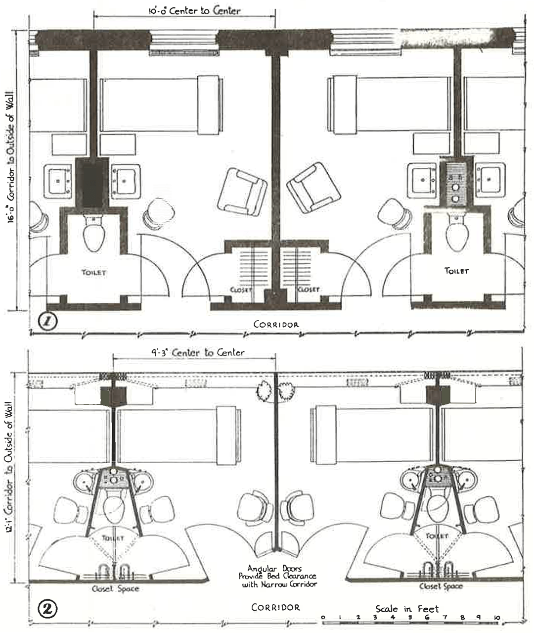
As they did with the Parallel Services Plan, Markus & Nocka start the article by comparing their prototype with the standard patient room of the time – about 160 square feet and based on a 10-foot centerline module from room to room. (Both of these planning metrics have since been significantly increased with today’s FGI standards.)

Above: floor plan comparison between: (1) a standard private room from the 1940s, and
(2) Markus & Nocka’s proposed minimal private room, 30% smaller at 112 square feet
There are many things to notice here, but perhaps the most striking difference between the two plans is the radical reduction of architectural poché, the inaccessible space within walls, columns, partitions, and chases, rendered as solid black in these drawings. Much of this reduction is due to a very different idea about the exterior envelope. In lieu of punched windows in a masonry wall, which would have been very common in the 1940s, Markus & Nocka bring the structural columns further into the building and push the plane of glass all the way to the exterior – essentially a curtainwall in today’s parlance. This can be further seen in the way Markus & Nocka extend the window to fill the width of the room, such that the thin solid plaster partitions separating patient rooms become coincident with the vertical mullions of the windows. Pulling the columns into the room also creates a pocket for stacking the window drapery.
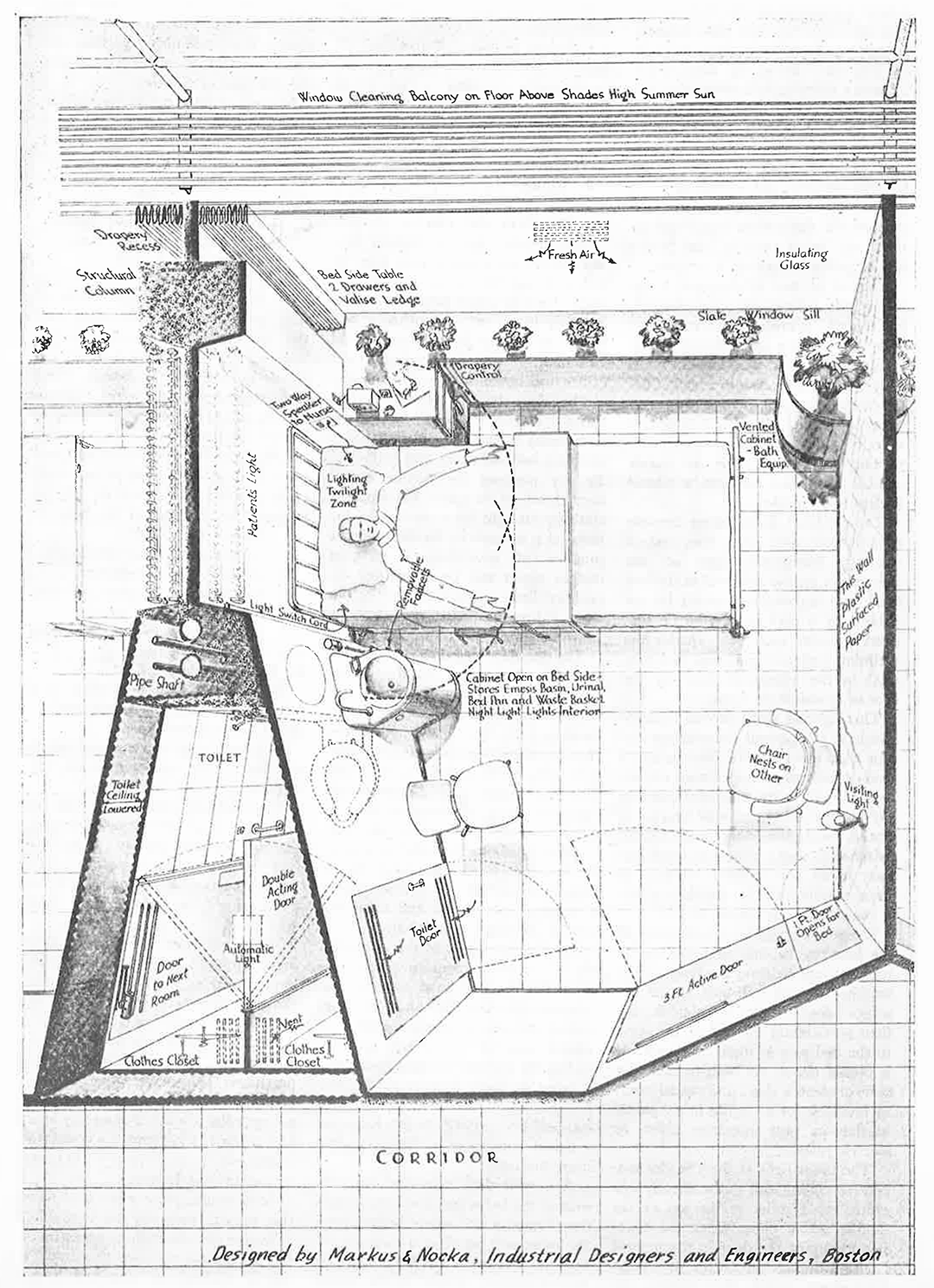
Some of these nuances are not immediately apparent from the floor plan, but Markus & Nocka’s full intent becomes clear with their birds-eye perspective of the room:

This edge-to-edge use of glass within the patient room was an innovative, if not radical, concept for an exterior wall at the time, certainly for US audiences and within the context of hospital design. Perhaps the closest example in Boston would be the Harvard Graduate Center dormitory complex by Walter Gropius and The Architects Collaborative, but this project had just been commissioned in 1948. While Gropius and TAC achieved a similar tautness of façade, with the glass nearly flush with the exterior brick, the Harvard Graduate Center, emblematic of the nascent International Style, is not a true curtainwall building. The structural columns are tightly integrated with the exterior brick façade, interrupting the “ribbon” windows (as can be seen here) rather than a continuous glazed window wall system as implied by Markus & Nocka’s prototype.
The next thing to notice about the birds-eye view is what happens outside. At each floor level, they provide a metal bar catwalk with a guardrail, serving simultaneously as a sunshade and a platform for window washing. With the window sill set at the height of the bed and the sunshade at the head of the window, the guardrail would be minimally visible when looking out the window from the patient bed. Such exterior sunshades would rarely be seen on the curtainwall buildings that proliferated during subsequent decades.
Looking again at the birds-eye perspective, the room takes on a Pullman car quality, with ultra-thin partitions and tightly detailed toilet and lavatory services. Note that the bottom of the drawing reads, “Designed by Markus & Nocka, Industrial Designers and Engineers, Boston” [emphasis added]. The washbasin unit next to the patient bed – reminiscent of Anna Castelli Ferrieri’s Componibili storage units, also designed in the 1940s – has integrated storage below for waste basket and bed pan. With a sensibility that echoes Alvar Aalto, Markus & Nocka carefully articulate the base of the wall-to-wall windows, set at bed height and with a slate sill that modulates its depth to allow for various kinds of storage on top (flowers, personal items) and below. And notice the dashed arc lines at the patient’s hands, indicating reach ranges – further evidence of Markus & Nocka’s interest in ergonomics.
While the shared toilet room, by today’s standards, seems an unfortunate compromise in terms of patient privacy and infection control, such a configuration was common at the time, and Markus & Nocka push this further by integrating the patient’s clothing closet within the toilet compartment to reduce the number of door swings within the room. A double-acting door provides sound privacy from the adjacent patient room when the toilet is being used while also shielding views of the neighbor’s clothes. I wonder, though, about the ventilation scheme, where conditioned air supplied above the window gets exhausted through the toilet room door, placing the clothes closet within the exhaust air stream. But it is worth remembering that air-conditioning systems and ASHRAE standards (originally published by the American Society of Heating and Ventilating Engineers – ASH&VE – in its Heating and Ventilating Guide of 1922) were only about 25 years old in 1949.
So what happened to this prototype? Was it simply a pie-in-the sky thought experiment by some ambitious designers and engineers keen on making a splash in the Boston hospital market? Take a look at the sidebar box on the first page of the article. These rooms were part of a project Markus & Nocka were doing for the Peter Bent Brigham Hospital (now Brigham and Women’s Hospital), and the prototype was developed through a full-scale mockup built in their office and “subjected to scrutiny by competent people in every phase of hospital work [at Peter Bent Brigham].” Seventy years later, PAYETTE is still building full-size mockups as part of our design process.
We will take a closer look at how this prototype was implemented and the public’s reception in Part 2.
Read the article.

