Many people find inspiration in art, and it is a ubiquitous source among architects and designers. Usually, I find artwork with a certain level of abstraction inspirational. Abstract paintings or drawings have a very coherent style and visual language compared to purely figurative paintings. Recognizing the pattern, rhythm, structure or sometimes even a stringent ruleset is much easier in an abstraction. When you see a painting for the first time from a Renaissance artist that you already know, you might not be able to tell that it is another painting of that specific artist. In contrast, if you see a Picasso painting, you can probably tell that it is a Picasso.
Architectural drawings or sketches also have these properties, making them very similar to abstract art in their nature. When we are in the very early phases of a design or are trying to explain a design concept thoroughly, we use minimalist diagrams or illustrations that eliminate all the unnecessary details that can interrupt the clear delivery of the main idea. Most of these drawings can also be considered abstract representations, and without the additional information from their creators, they are simply artwork.
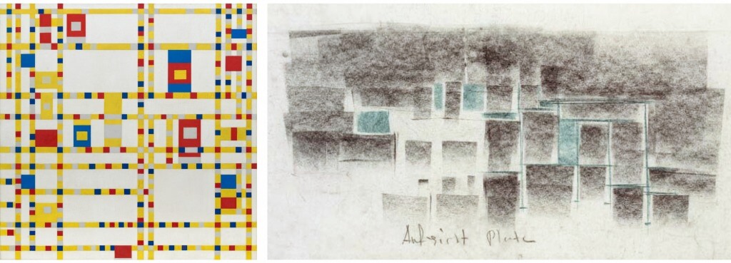
The tendency of reducing information into its most simple form among painters and architects blurs the boundary between the definition of an artwork and an architectural drawing, to the point where it can be difficult to distinguish one from the other. For instance, a painting named “Broadway Boogie Woogie” by the famous artist Piet Mondrian looks so much like a diagrammatic architectural plan that shows a particular building program with a color code. In fact, Mondrian was literally inspired by New York City’s grid system in this painting. So, maybe it makes more sense to say that it looks like an urban plan. On the other hand, Peter Zumthor’s sketch representing the plan of his project named Therma Vals has a composition that seems so similar to a Mondrian painting if you disregard the difference between color palettes.
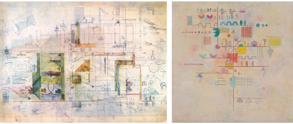
When I think of beautiful hand drawings, Italian architect Carlo Scarpa is usually the first person that comes to my mind. Compared to the minimalist sketches of Zumthor, Scarpa’s drawings are generally much more detailed and colorful. Even with the amount of detail in them, Scarpa’s drawings also have a particular aesthetic that makes them look like abstract paintings. His drawing for Tomba Brion reminds me of some Kandinsky paintings, especially the Graceful Ascent. Both use an orthogonal composition and scatter pastel-colored rectangles, circles, and irregular forms on a blank canvas/paper, making these shapes appear to be floating in space. There are indeed more popular Kandinsky paintings like Yellow-Red-Blue that have different characteristics, however my point is that abstract paintings and architectural drawings are visually very similar in coherency because they both have a certain kind of geometric logic or a formal vocabulary.
As a designer and an art enthusiast, I am deeply interested in understanding the logic and structure behind the masterpieces of art and design. Although making art is generally considered an intuitive process, I think there is always a logical or procedural structure behind our intuitive, artistic expressions, especially if we have a distinct artistic style. The urge to understand the logic behind this mysterious, intuitive process that defines an artistic style caused me to become more interested in a vast subtopic of art which is “computational art.” With the emergence of technologies like machine learning or, more specifically, convolutional neural networks, mimicking the style of a specific artist and transferring this style to another image has become very easy and popular. I think machine learning will become very influential for the future of many things, including art. However, I am more interested in understanding the components of an artistic language, its logic, and rule sets, rather than transferring a style without knowing the machine’s learning process.
Now, I will try to elaborate on what I mean when I say rule sets. Let’s take a closer look at the artists’ and artworks that I have already mentioned so far. If we think about Mondrian’s art from a computational perspective, we can interpret his painting procedure. Most simply, it can be described as follows:
1. Make a white background.
2. Subdivide the background into smaller rectangles by using vertical and horizontal lines at certain distances.
3. Color lines with black that make the subdivision. Fill some of the rectangles with red, yellow, or blue.
Of course, these steps can be slightly different for his various paintings, but this is a simple example of my thinking.

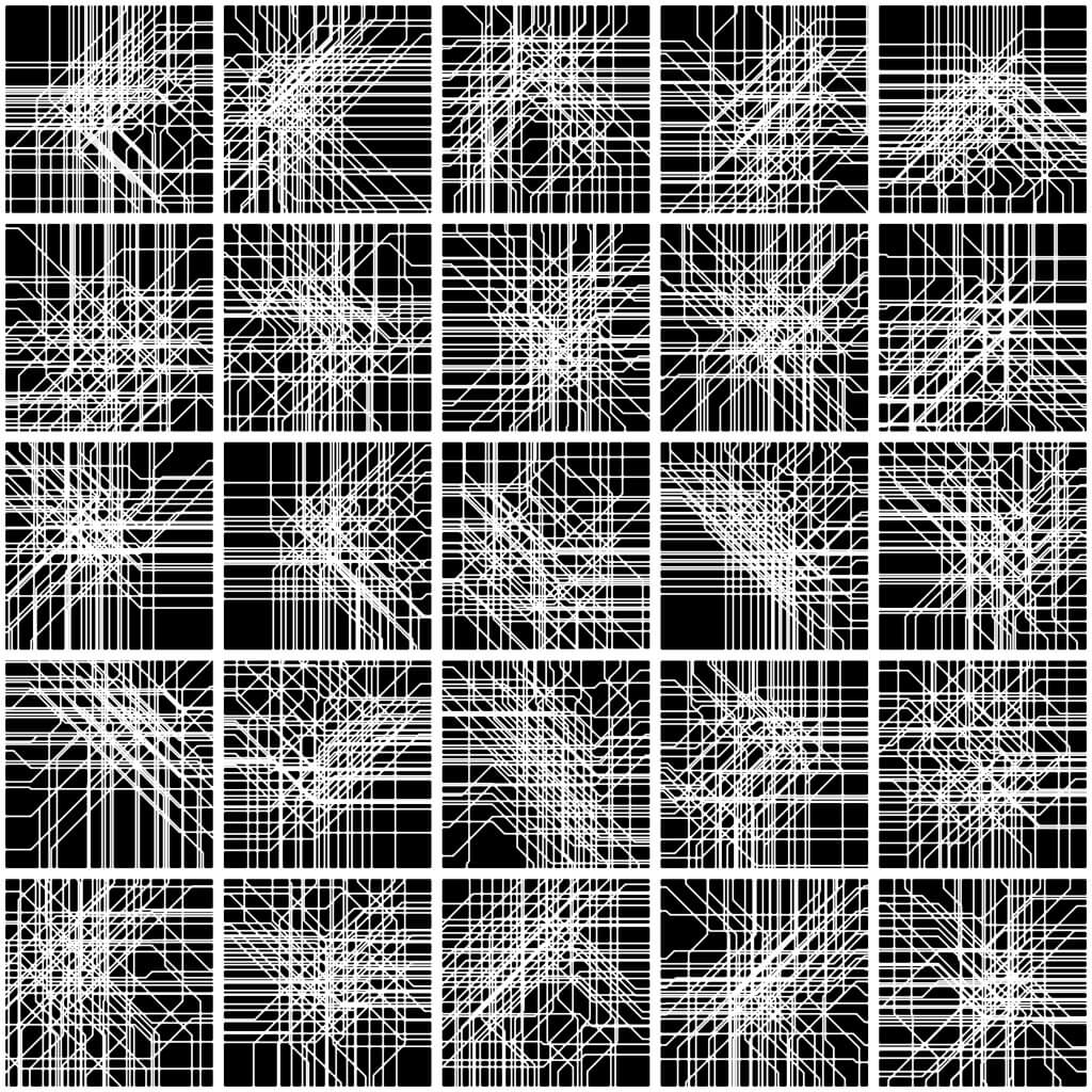
With the help of computational tools, it is much easier to create similar compositions and see other possibilities without spending weeks, months, or years like Mondrian and other abstract artists in history. I took Mondrian’s painting named “New York City I,” which is also inspired by the Manhattan grid, and created an algorithm that generates similar compositions. I did not want to mimic his work entirely; instead, I also added diagonal lines, which also exist in the actual urban texture of Manhattan, and removed colors to emphasize the aesthetic of the patterns created by lines. You can see some of the iterations generated by this algorithm below. I also made an animation that shows a transformation from a Mondrian-like 90-degree grid into a hybrid grid of 90- and 45-degree angles.
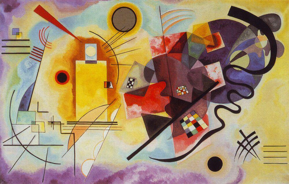
As a second study, I examined other abstract paintings with more free forms and variety, like Kandinsky’s paintings. Let’s also take a closer look at the painting named Yellow-Red-Blue. In this painting, we see lines, curves, rectangles and circles scattered on the canvas. Some of these shapes create closed surfaces, and they are painted with various colors. When these shapes intersect each other, the areas of intersections are sometimes colored with different tones. Of course, these kinds of paintings have much more complexity in them, but this is just a breakdown of a painting procedure to exemplify my analytical approach.
Using similar logic, I wanted to see if it is possible to generate abstractions with a decent level of complexity. So, I made an algorithm that produced the images below.

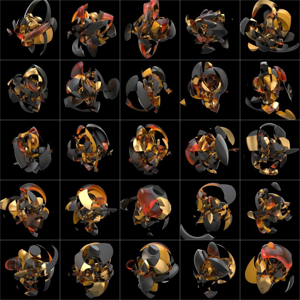
After doing this 2-dimensional exercise, I thought about artists who have much more complexity, depth and a sense of perspective in their paintings. I think my all-time favorite artist, Tullio Crali, has very aesthetic examples for this type of painting. His paintings also have similar features, such as intersecting curves that create areas for color variations. Some of his paintings are half figurative and half abstract, while others are purely abstract. Still, the important thing is they are more three-dimensional and dynamic in contrast to Kandinsky’s. So based on these precedent paintings, this time, I created a 3D version of my previous algorithm and generated images and the animation below.

I know there are many other computational artists who dedicate all their time to create much more advanced artworks. Nevertheless, as a designer, I enjoy doing these quick exercises because it improves my ability to think and design systematically. I believe that there are an extreme similarity and correlation between the intuitive thinking that helps us create a variety of mesmerizing artwork and computational thinking that allows us to design iterations of better-performing buildings. That is why I find inspiration in abstract and computational art or anything that makes me curious enough to investigate the underlying principles of its creation.


