Mapmaking is an inherently subjective endeavor. A photograph is an extension of a photographer’s perspective, an algorithm reflects a programmer’s biases, and a map represents a point of view of the world around us. Deciding what information to emphasize, what graphic style to use, what scope to depict—these are all deliberate choices to point an audience towards understanding something specific. Though they may seem like objective documentation of the world we live in, maps are never without a point of view and they always have a story to tell.

As part of PAYETTE’s recent website redesign, project pages now feature a map: a site plan showing the context in which the project is situated. The most important thing these site plans do is strip out any non-essential information. All that’s shown are buildings and streets (and rail lines, if necessary), each drawn in shades of black. The site plans are subtle and deceptively simple, but they easily and clearly convey a key set of information about each project: the footprint, the relative size, its context and how it relates to those surroundings. And because each project’s site plan is drawn the same way, they are easily comparable.

Photo Credit: Ben Fry
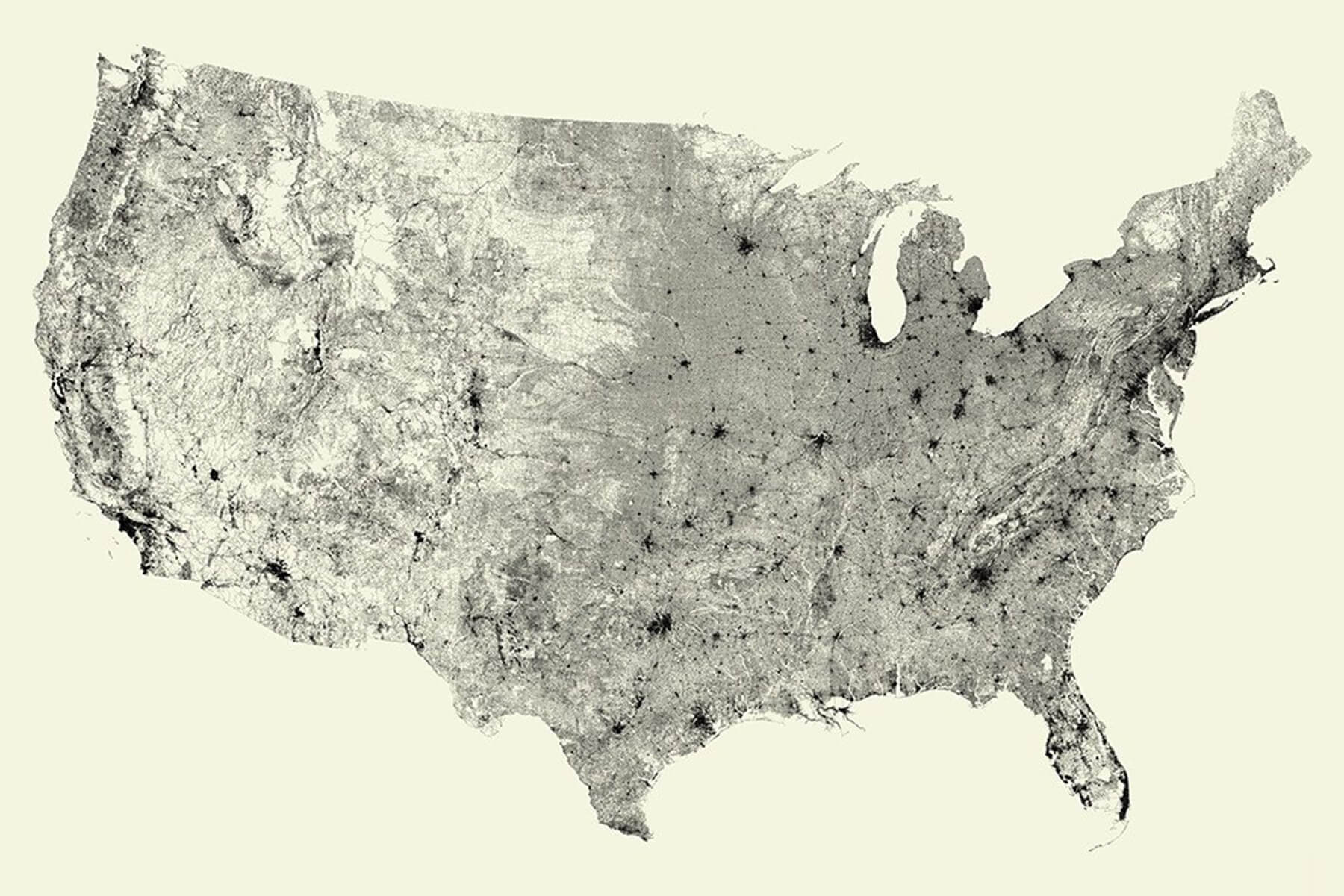
PAYETTE’s site plans are an exercise in removing information, but extreme minimalism in mapmaking can also be a useful creative tool. What happens when you get rid of almost everything on a map, save for one set of information? All Streets by artist/computer scientist Ben Fry is a map of the 48 contiguous United States showing, appropriately, every single street across the country—and nothing else. What’s compelling about All Streets is how much meaning it conveys while only showing one category of information. It’s still clearly recognizable as a map of the United States, even without any borders or land masses. It shows population density, with major transportation routes coalescing at nodes of activity in places like Chicago, Dallas, Detroit and Los Angeles. It shows an underlay of geography, from the flowing outlines around the Appalachian Mountains to the relatively sparse southwest. It even shows the history of American expansion, as knotted colonial streets on the East Coast give way to larger orthogonal grid systems in the Midwest.

Photo Credit: Radicalcartography.net
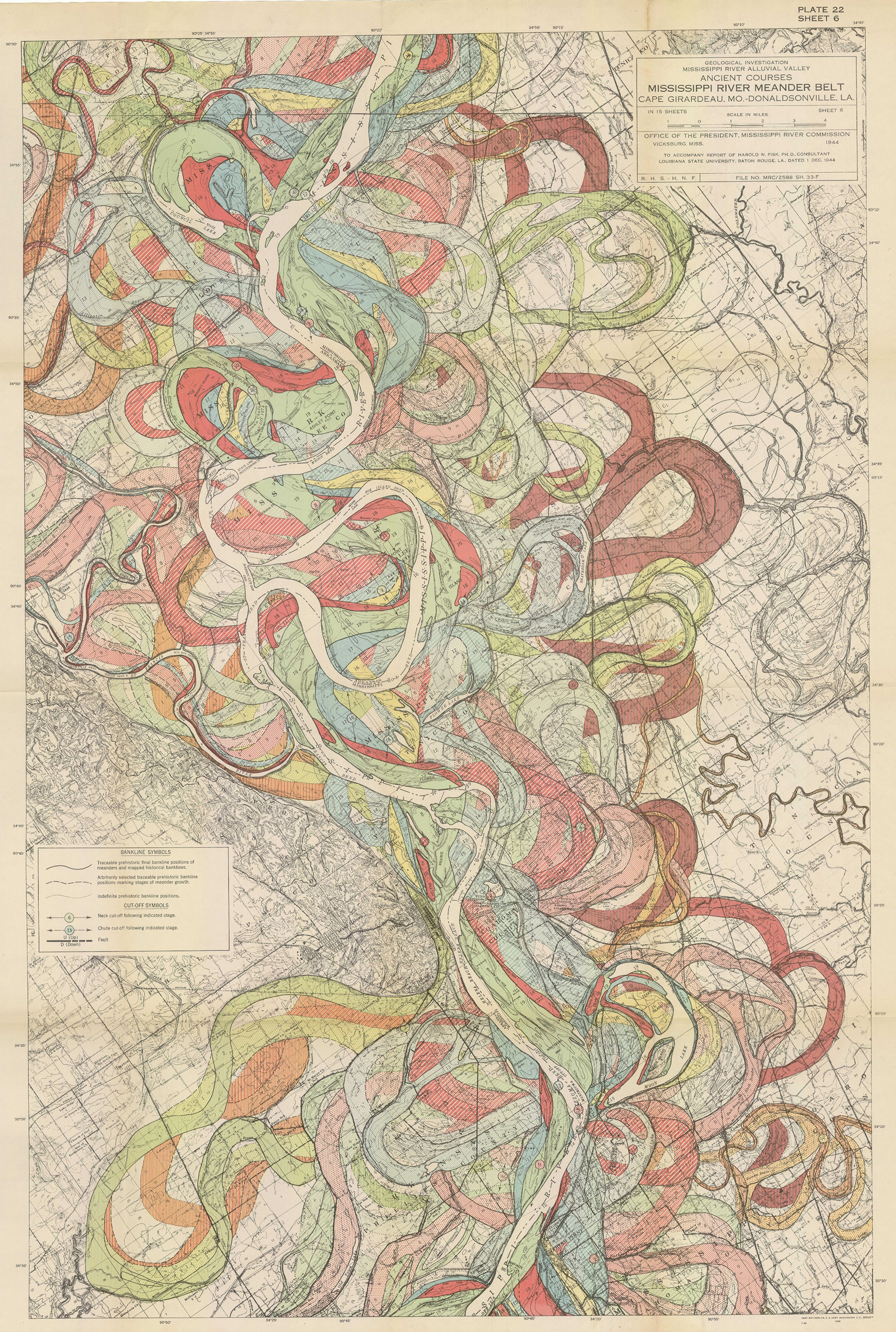
It’s also worth examining a map on the opposite end of the information-density spectrum. The US Army Corps of Engineers undertook a geological survey of the lower Mississippi River in 1944. This map, one of 15, shows how the course of the Mississippi River has changed over time, using information sourced both from historical maps of the region and aerial photographs. Rather than stripping away information to reveal layers of meaning, these maps pile on layer after layer of information and color to build a holistic image of a landscape across thousands of years. It shows the seismic natural changes that occur over a river’s lifetime, occurring so slowly as to be almost imperceptible—except, that is, when taken all at once. And the choice to include other geographic information underneath the water—towns, counties, roadways, topography, borders, labels—puts the map in stark perspective. Such a density of information invites the viewer to get up close and scrutinize each individual street and town, and how all of it is dwarfed by the river’s course. It puts humans, and our egotism, in our rightful place: at the whims of the vast momentum of nature.
Maps are never one thing. A catalog of the Mississippi River is really a story about America’s relationship with nature. An image of every street in the United States is also a reflection of westward expansion and patterns of population growth. And PAYETTE’s site plans are about both the relationship of each project to its surroundings as well as a constant datum upon which to view each unique project. Maps can be pure data visualizations, geographic exercises or pieces of art; at their best, maps can be all three.


