Each year, we design a sketchbook instead of a holiday card. Producing the sketchbook is a fun tradition that has been a part of the firm since 2004. Going into the design process, I knew that I wanted the sketchbook to reflect the exciting year we had. I drew inspiration from multiple places – the icons used throughout the Hengqin Hospital Design Competition book, the firm’s involvement in pro-bono initiatives and the energy of the new PAYETTE website.
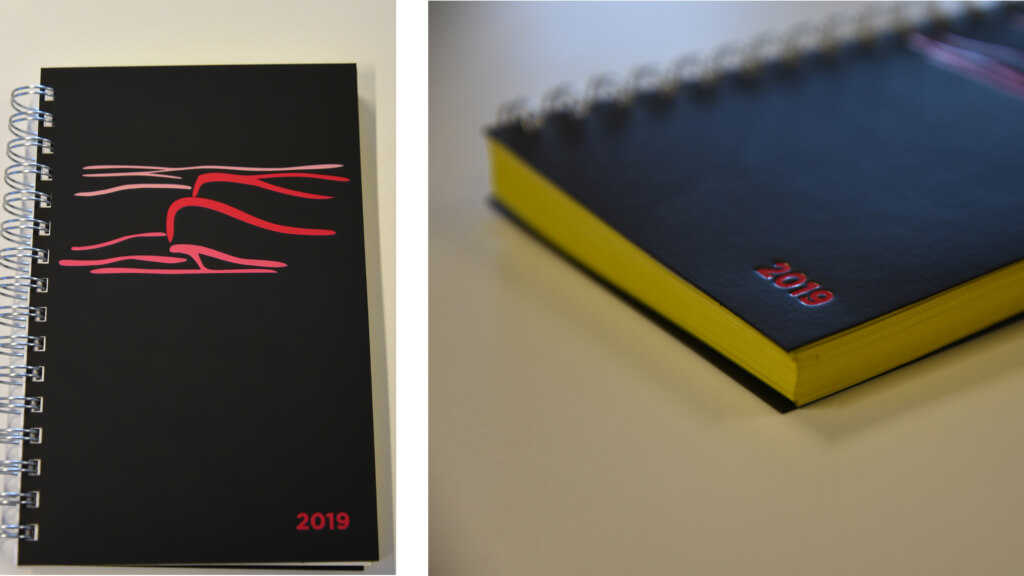
Over the summer, a team of architects and designers led by Principals Ching-Hua Ho and Leon Drachman participated in an international design competition for the opportunity to plan and design a new hospital in China’s southern Guangdong province. Their submission included a range of graphics – from beautiful renderings to technical energy and sustainability diagrams. What struck me was the team’s use of simple iconography to illustrate various ideas throughout the submission. The icons were initially sketched by hand with brush-like strokes and later digitized for the booklet. For the cover of the sketchbook, we opted to use the icon of the overall Hospital exterior nestled against the Hengqin Mountain.
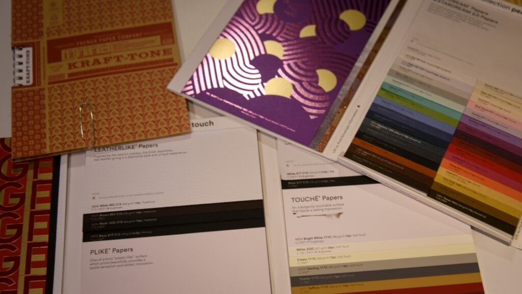
Isolated from the competition booklet, the icon doesn’t look like much. Knowing this, I wanted to create a sharp contrast. To do so, this required choosing materials and color for the cover to create a product that was both beautiful and tactile. In the past, we’ve sourced materials that are recycled, recyclable or have some sustainable use story. I received samples that ranged from mango paper to a waterproof paper made from finely-milled stone. The material chosen was a sturdy, black leather-like paper that was smooth to the touch.

The icon of the hospital was to be debossed into the cover using shades of magenta, creating a stark contrast between the imagery and material. To match, we added a yellow wash to the edge of the pages for an added pop of color. The newly-designed PAYETTE.com inspired the color palette.

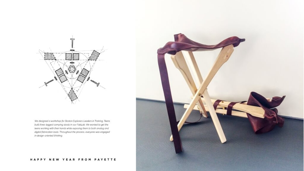
For the inside of the sketchbook, I chose a sketch of a three-legged camping stool developed when we hosted Boston Explorers Leaders in Training (LIT) program participants. Our staff designed a workshop where the LITs could build and customize these stools. The goal of the project was to get the students working with their hands while exposing them to using both analog and digital fabrication tools and engaging them in design thinking.

The opportunity to design this year’s sketchbook was special. Having recently joined the firm, I was inspired by the breadth of PAYETTE’s work, and 2018 was certainly reflective of that. Each piece of the sketchbook was intended to highlight the collaborative, interdisciplinary work of the firm – robust architecture, a commitment to contribute to our broader communities and making design accessible to everyone.


