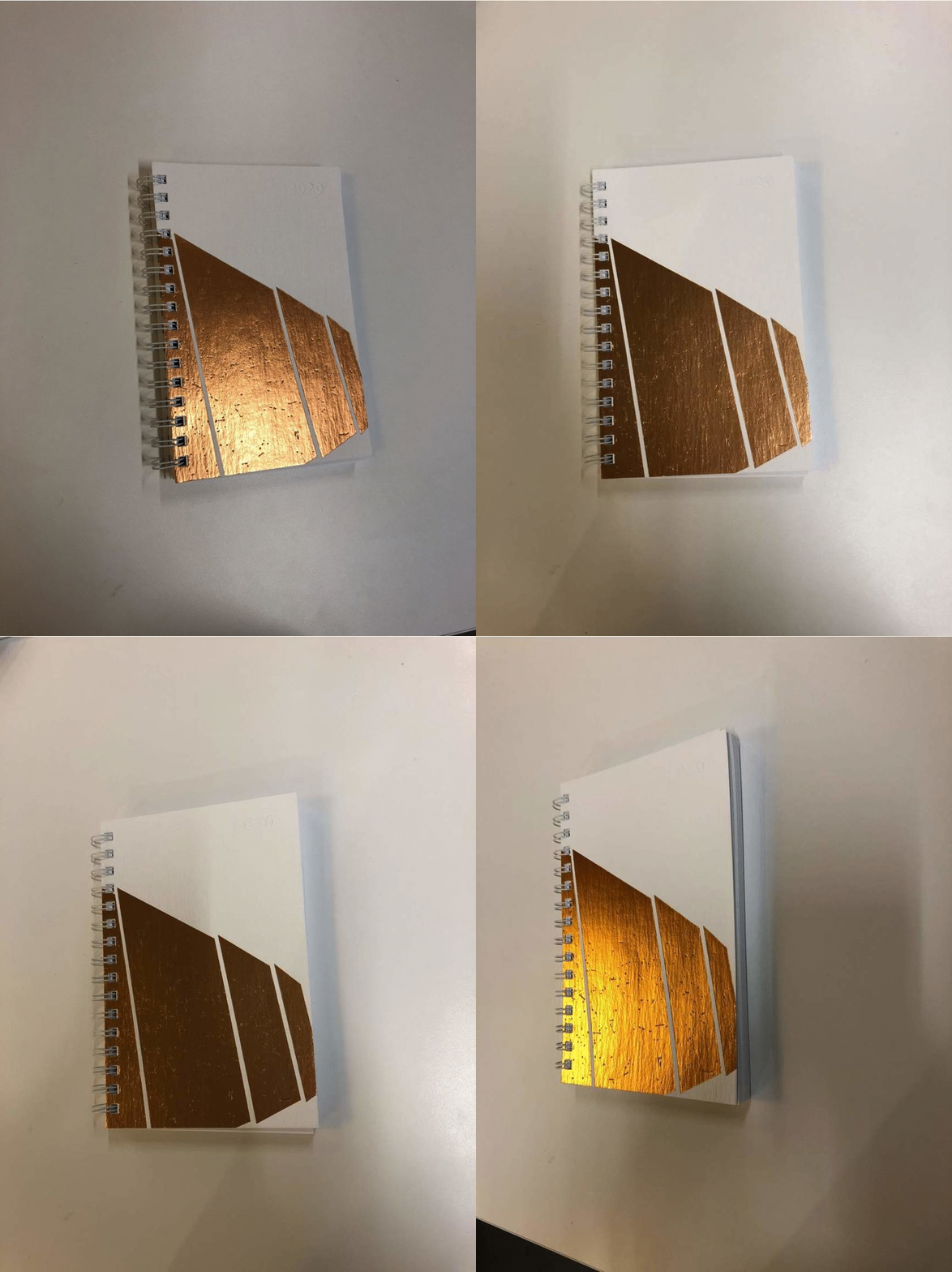
When I was assigned to design our annual holiday sketchbook for 2020, I knew it would be an incredibly fun process. PAYETTE sends a sketchbook rather than a card during the holiday season, a tradition that began in 2004. I immediately knew that I would somehow use the Pedestrian Bridge (PedX) at Northeastern as the featured project – a bridge that not only connects students, faculty and the campus community; but that also connects the surrounding neighborhoods to the city and beyond. Walking it is a moving architectural experience that one does not forget.
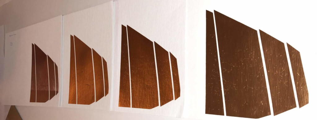
As I gathered photographs, sketches and materials for inspiration – looking for that special something that would generate the creative spark I needed to inform the design of the sketchbook cover – I asked myself “why not to create something new?” I let the creative process brew for awhile, and then picked up a pencil to draw a sketch based on one of my favorite photographs, an image of the bridge panels against a bright, perfectly clear sky. I chose to enlarge the drawing, making the panels the dominate cover element, so that no one could ignore the beauty of the panels regardless of the color and materials we would end up using.

Reproducing the materiality and feel of the weathered steel panels that form the bridge was a complex process, far too intricate to be captured by a single color stamp in foil. The vendors I worked with suggested that I might have to give up on this idea, but eventually we made progress. Working closely with the printer, we ran a number of tests using several different stamping techniques. This process prompted me to add layers of foil, instead of using just one, in order to enhance the texture of the stamp. I chose a highly tactile, creped white paper made from 80% post-industrial recycled waste as the sketchbook cover, to mimic the sky. The textured paper enhanced the mottled effect of the foil, evoking feel of the bridge’s steel panels. In addition, because the textured pattern of the paper varies from sheet to sheet, each sketchbook would be unique.
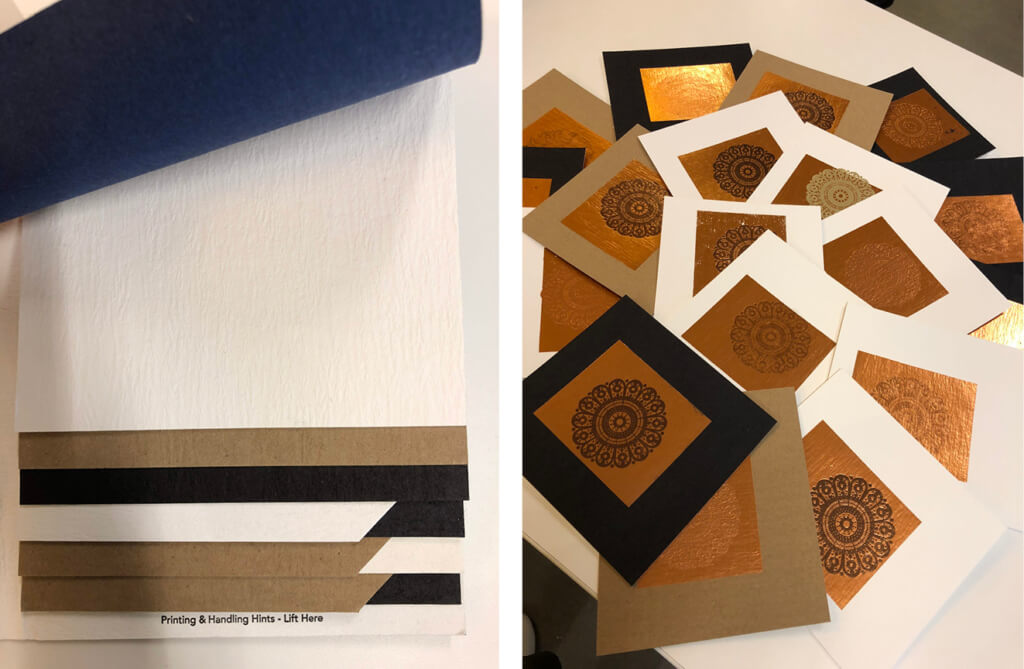
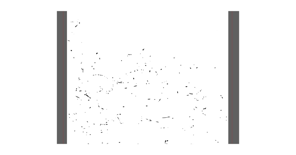
I then created another layer, a drawing with scattered lines and marks, to be stamped in a darker color foil to create definition and add more texture. We ran a few more tests, adjusting the force of the stamping during the process. The combination of multiple stamps in varying shades of copper on textured paper, while adjusting the stamping pressure, finally produced an imprint that successfully captured the artistic essence of PedX.
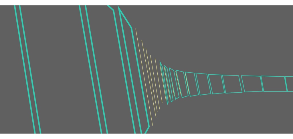
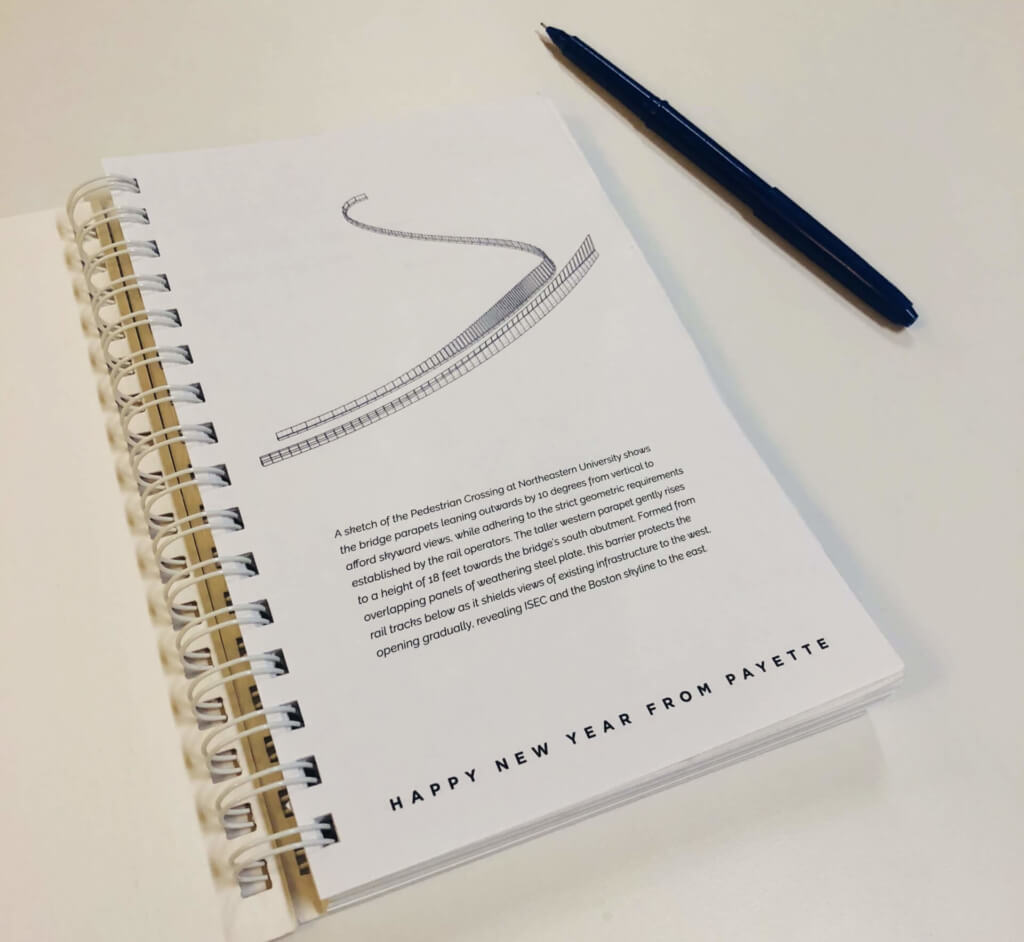
For the fly sheet (the first page) I purposely chose a sketch that was in contrast to the soft, large scale cover image – a sketch of the entire bridge that would capture its meandering, yet precisely geometric assembly:
A sketch of the Pedestrian Crossing at Northeastern University shows the bridge parapets leaning outwards by 10 degrees from vertical to afford skyward views, while adhering to the strict geometric requirements established by the rail operators. The taller western parapet gently rises to a height of 18 feet towards the bridge’s south abutment. Formed from overlapping panels of weathering steel plate, this barrier protects the rail tracks below as it shields views of existing infrastructure to the west, opening gradually, revealing ISEC and the Boston skyline to the east.
I hope our 2020 Sketchbook becomes a medium that not only showcases this project, but also reflects PAYETTE’s passion for architecture and shares the power of connection.
