Each year, our firm organizes a Studio Lunch Retrospective event, which features eight creative 12-minute presentations covering all of our projects undertaken by the firm in the year. Each presenter finds a common theme present their perspective of their projects.
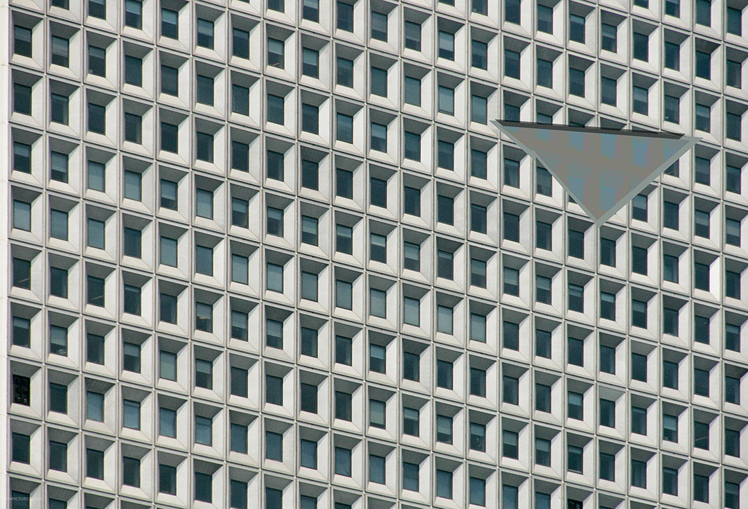
When trying to find a connecting theme between my projects, I ended up with a topic I would have never guess I would present on. Originally, I explored the idea of mapping a project’s texture, but this fell through on some of the projects that are in earlier conceptual phase and with projects that are more study based. The idea of abstracting the circulation was also explored, but again it was a theme that resonated with some projects, but not with all of them. By going through the iterations of trying to weave out a connecting theme – the element of repetition stood out.
Repeating elements appeared in all the projects in various manifestations. They varied in scale, in type, in physicality and in more abstracted forms. As I began to understand how each project was dealing with repetition, comparing them to musical themes became a vehicle to summarize the primary strategy they implemented. For each project, a new graphic was created that was my own interpretation or my “musical shorthand” of how the design dealt with repetition.
The duet \\ the dual stance on repetition
This project is a 3,200ft long, above ground corridor that connects several buildings. It is used by nurses, to transport supplies and for patient rehabilitation. The current design is one that is pretty relentless. In my eyes, the design team dealt with repetition by taking a dual stance on it. To break the homogeneity, they have brought identity to specific areas – at the intersections where the corridor connects to surrounding buildings, they have added different colors to the floor. And to further highlight these nodes, they have treated the ceiling plane differently. For the nurses, who enjoy tracking distance, they have added large signage to further identify where one is along the track. On the other hand, to highlight the repetition, they have added distance markers and a redesigned radiator panel cover which is executed along the whole length of the corridor.
The repetition is broken by bringing identity to certain areas of the project through floor coloring and signage, but the repetition is then enforced through the continuous radiator design and the steady beat of the distance markers.

Rendering of the corridor design Composite graphic
The crescendo \\ external forces acting on repetition
Dana Farber Cell Manipulation and Core Facility
From the early design sketches, it is clear that the idealized form of this design is one that is symmetrical and mirrored across two primary axes. For this 30,000 SF project, the programmatic needs are extremely demanding in terms of the establishment of a pressurization and a circulation hierarchy. A primary challenge is how to deal with all these constraints and demands while still maintaining the integrity of the concept sketch.
In my opinion, the design then tries to establish repetition where it can. It uses elements such as the labs and entry door panels to develop pockets of repeating elements and a cadence. When the idealized layout, in response to the demands, becomes more of a pixilation, the design maintains smaller pockets with repeating elements.
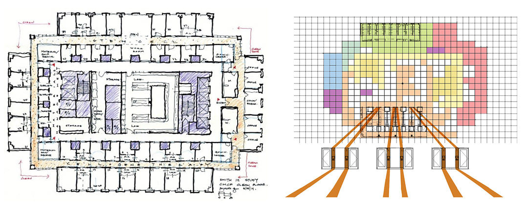
Initial concept sketch Composite graphic
The scale \\ repetition as an ascending order
The STEM Research Center
Our team is designing a new STEM research center on a 22 acre site that will mostly house material science and engineering. The building design has a curved façade that will overlook the woodland walk corridor and the lab bars will be nested into the hill. The development of the form can be mapped through the manipulation of a set of identical bars that sit perpendicular to another bar. The bars are split apart and then pushed and pulled to accommodate the program. From the current Level 1 and 2 plans, it becomes clear that the pieces that comprise the bars are repeated in each of them, but arranged in an ascending order. Much the same way that a scale is arranged in increasing pitch, but the notes are all related to one another.

Diagrammatic sequence of form development
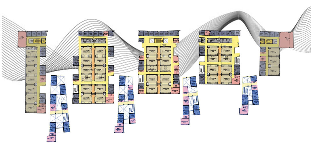
Composite graphic
When the beat drops \\ the singularity of releasing the tempo
Lafayette College Integrated Sciences Center
As part of the design process, Lafayette College Integrated Sciences Center Design team developed shoe box modules for the teaching and lab spaces. Built as a kit of parts, this regularity and repetition is translated into the façade in front of these internal elements. However, the design of the building is rooted in the concept of the heart, the intersection of two primary axes. At this intersection the manifestation takes form as an atrium space as a singular monolithic piece, which is also imprinted on the façade. So as the tempo consistently repeats on the façade with the regulated window spacing for the lab modules, the beat drops at the atrium both on the inside and on the façade.
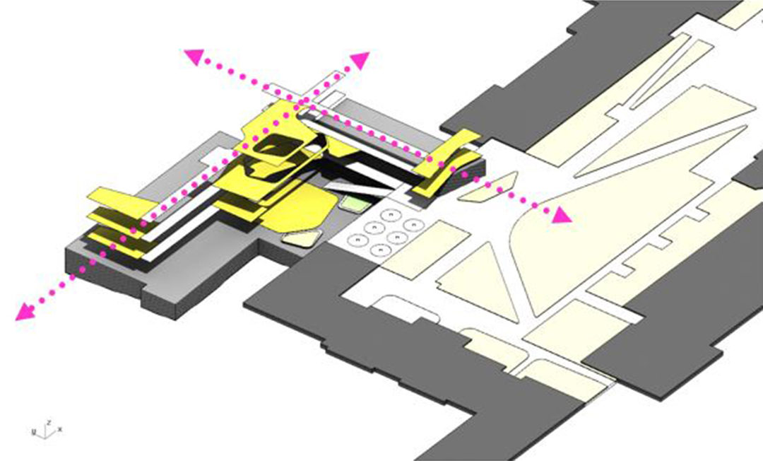
Diagram showing the two intersecting axes
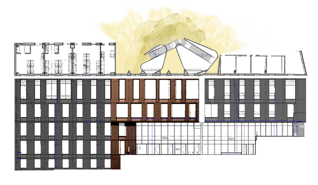
Composite graphic
Trying to find a theme between a wide range of projects was certainly a unique challenge. It was an experience that really evolved on its own, despite any desire to stick to familiar topics or preferred modes of presentations. It was a refreshing experience to pick out the lens from which to view and understand these projects and how they dealt with repetition. However, the most rewarding element was working with a group of people in the office I haven’t yet had the opportunity to work with before and to be able to try on their lens of the projects.
