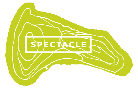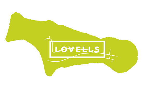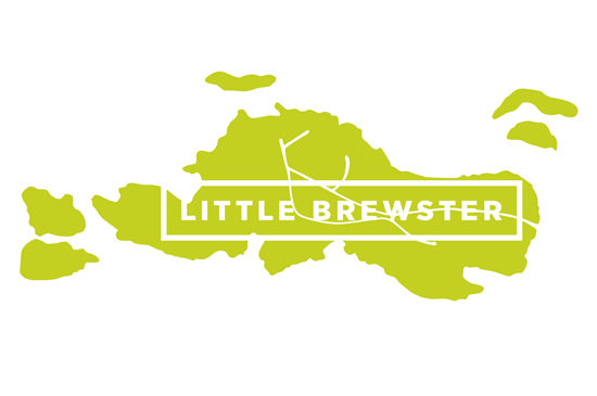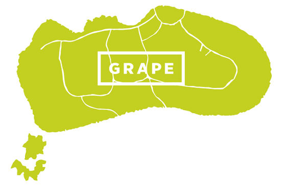
In 2011 we hosted a ‘name-that-conference room’ contest with the PAYETTE staff. We had “lived” in our new space just long enough to get a feel for its character and it was time to replace the typical numeric room signage.
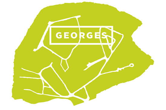
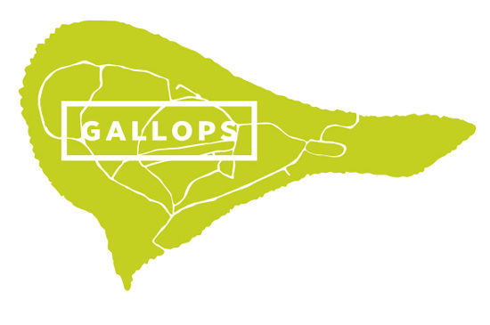
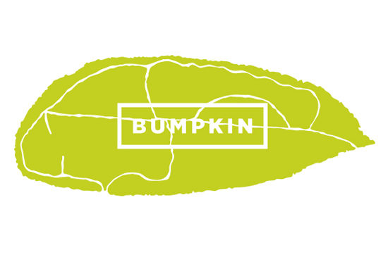
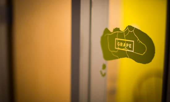
Our office is located on the Fifth Floor of the Atlantic Wharfs building and the Fort Point Channel and Boston Harbor beyond frame views out our studio windows. Inspiration emerged and the idea to name the conference rooms after the Boston Harbor Islands was born. The graphic design process began and we conceived simple vector drawings highlighting the island’s topography of walking trails and foot paths gave a graphic punch to the unique island shapes. The islands’ organic, meandering edge appears to float on the glass. Playing off the green that appears in our palette of office furniture and tack-able surface spaces, the decals appear on either glass walls or doors.
Boston’s waterfront had always been part of our daily lives – from our commutes to the office and in our new space with views to the channel and harbor beyond. Integrating the islands that complement our city was a meaningful way to celebrate our location’s legacy. Branding the signage to align with the aesthetic of our space and identity was accomplished; bringing greater meaning to the rooms where we work and meet elevates the signage system unique to PAYETTE and our deep roots in the city. Our island signage felt appropriate and timeless, qualities inherent in our identity.
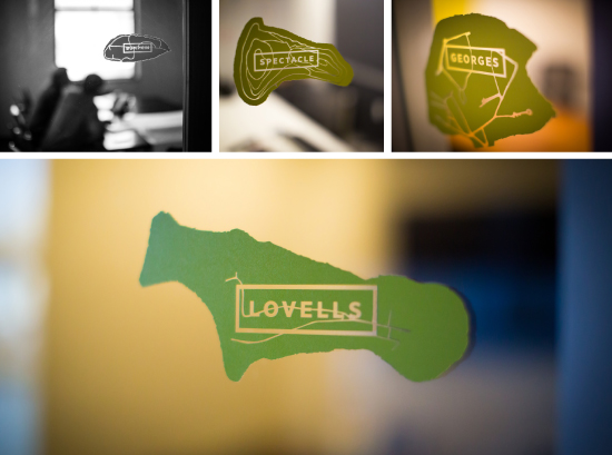
Our conference rooms: Spectacle, Lovells, Bumpkin, Grape, Georges, Gallops and Little Brewster.
Have you worked with any projects with a meaningful story or interesting environmental graphic in spaces?
Related
Boston Harbor Islands Pavilion Tour
A Brief Introduction to Deer Island
Signage Design by Rachellynn Schoen, Doria Nathanson and Kristyn Hill.
Photography by Liz Reynolds and Rashad Baniabbasi.


