As a student intern enrolled at Northeastern University, I have been struck by PAYETTE’s open design review process; it’s effective and fosters a collaborative culture. I observed this process most closely during the iterative design process on the Integrated Science Center at Skidmore College.
Over the past few months we’ve revised the design parti with a new massing scheme and clarified spatial relationships. The project then featured Bob Schaeffner’s organic solar screen and a floating internal object in the atrium space, the “Tech Tower.” This winter the team opened the project to one of PAYETTE’s most effective design tools; the internal pin-up. The Principal-in-Charge stepped back into the role of an architecture student and presented the work. The advice and criticism of principals and designers revealed to us the strengths and weaknesses of the design.
Tech Tower
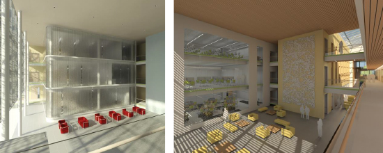
This component was conceptually envisioned as a floating volume inside the atrium space. The materiality and form had been investigated but not finalized. A lot of questions arose of how to define a mass as an “object” in a space. Specifically, we determined that in order to understand a floating form, the boundary in which it is floating must be very clearly defined. However, the Tech Tower was considered too large to be sense as an object within the atrium. In response we’ve since moved on to an idea of “slipping bars” – a series of large bars that are revealed and perceived as unique mass.

Tech Tower as object (left); Tech Tower as the “slipping bars” concept (right).
Exterior
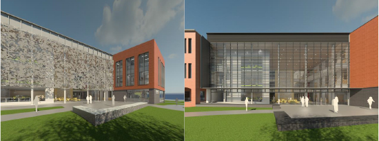
The fenestration of the 3-story building was characterized by a repeating series of long vertical windows in the upper two floors. The size of the windows was defined by the internal program (office or lab space). The first floor windows maintained the same spacing, separated by a stone belt course. The red brick was carried down to the ground, and only broken in the front, underneath the headhouse.
The reviewers scrutinized the relationship between the window size, brick and headhouse. The repetition of the windows seemed unresolved with too little brick surface and the “almost” floating headhouse. The critique pushed us to take a different approach. The windows have changed in proportion and the repetition of the windows is rationalized by the interior program and a concept of “stretching” windows that get larger in size, terminating at a picture window as the south end of the bar. The red brick no longer continues down to grade, but rather defines the upper 2-story volume which floats above a dark brick base.

Southeast corner: initial design concept (left), revised concept (right).
Screen
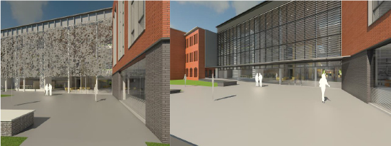
The critique also investigated the solar screen. The goal was for the design of the screen to resemble the tree canopy adjacent to the site. We explored several options for the pattern’s execution; fritted glass, laser-cut metal, perforated metal, ductal concrete, etc. However, we ultimately moved toward a more subtle design. The new screen is a simplified louvered system that allows for more transparency of the front curtain wall into the atrium space while maintaining the datum lines that connect the new east bar to the existing Dana Hall. It will optimize solar performance while balancing daylight and views with reduced heat gain.


South facade: organic screen (left); new louvered screen (right).
This process of internal review is essential to PAYETTE’s culture and the most striking part, in my opinion. The process is the personification of PAYETTE’s insistent focus on innovation and design, above all else. The review process allows for designers to step back and reexamine their work through a new lens. At PAYETTE it allows us to take advantage of the diversity of perspectives and knowledge in the office. The result is the high caliber projects that define the firm’s reputation. But, more significantly, the review process allows for everyone to participate, fostering a collaborative culture and mutual respect; something not only an intern, but everyone can appreciate.


