The new Ambulatory Care Building at Boston Children’s Hospital Needham is one step closer to being realized. The project recently transitioned from Schematic Design to Design Development, bringing new opportunities to further study the make-up and resolution of the brick building’s exterior façade.
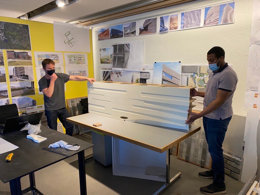
Assembling the 1/4″ mock-up in the project team alcove.
At Schematic Design completion, the building’s façade featured Arriscraft Architectural Linear Series Brick (Cedar Wood) with continuous 2” course projections that vertically gradated up the sides of the exterior. Additionally, the soffits integral to the two splayed corners of the building remained material-less and undefined. However, during Design Development, it soon became clear that the details of the projected brick and soffits were key to how one interprets the massing diagram of the building.
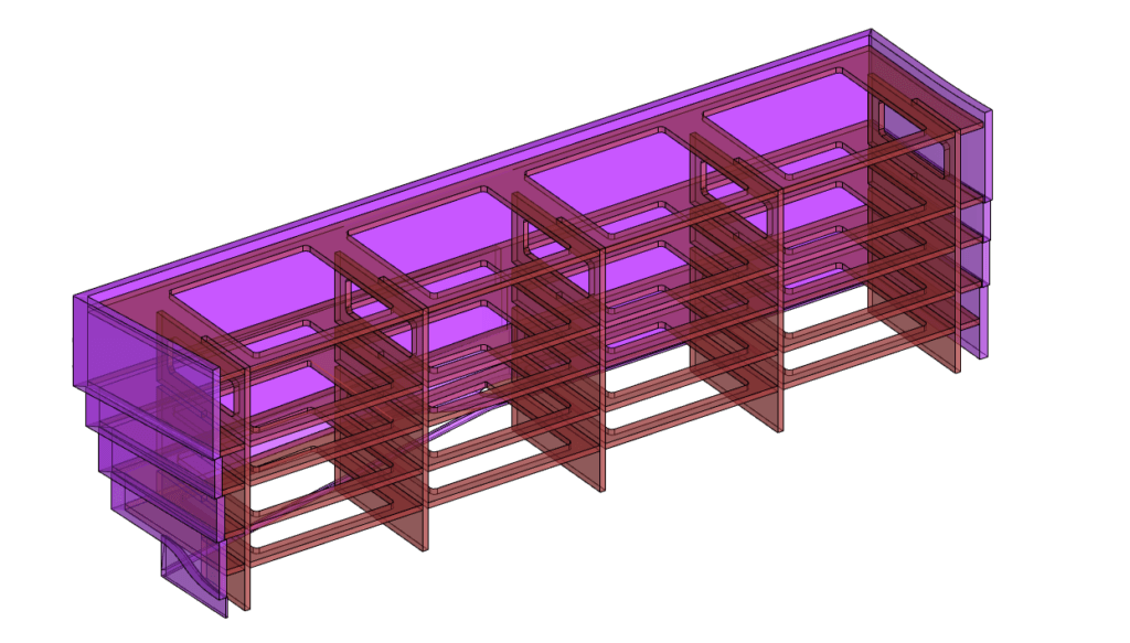
3D model of the mock-up’s MDF pressure-fit support structure.
Is the hospital an extruded shoebox, or a series of elegant cake layers? Well, it depends. When the 2” projected brick marches up the façade irrespective of the heads and sills of the hospital’s ribbon windows, a more whole and unstratified reading appears. Conversely, when those same brick projections and their shifts in gradation purposefully align with the ribbon windows, a more striated massing is the result. Variation in soffit shape and material are no less consequential. Thin metal soffits that sit flush with the exterior façade surgically slice the building into horizontal bands, while an inset soffit with brick trim suggests the building’s four façades remain continuous up the height of the massing.
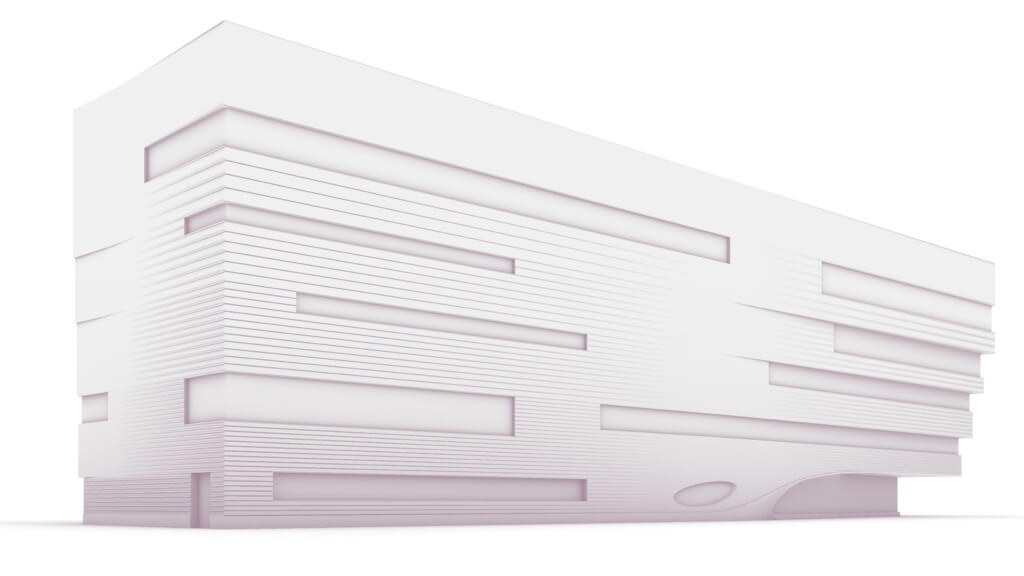
3D model of the south façade with brick insets that gradually transition into brick projections.
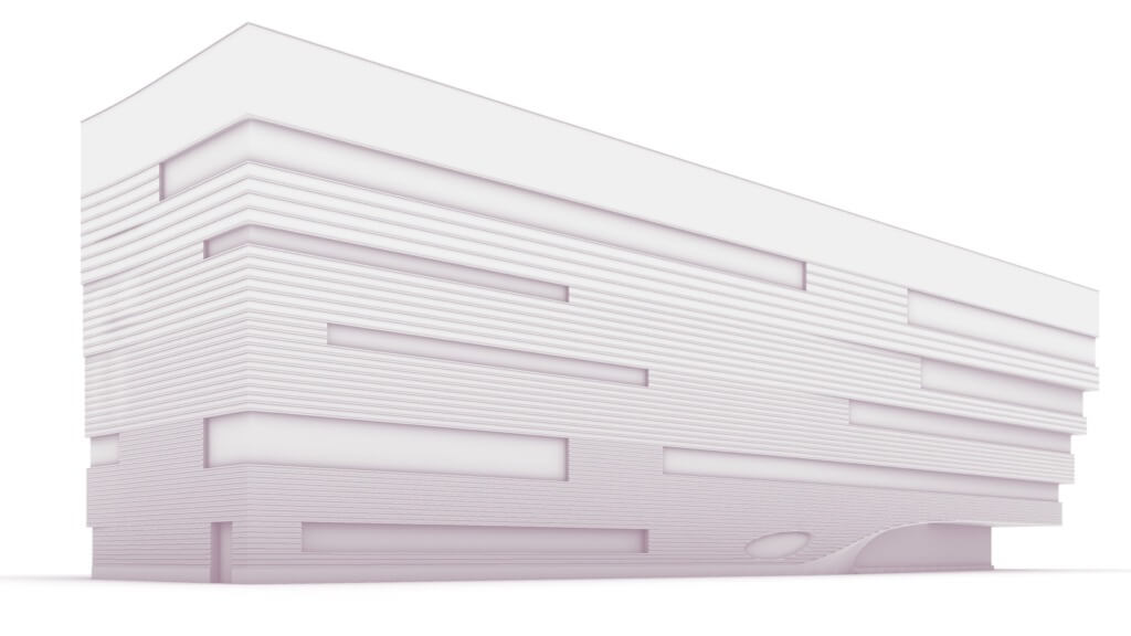
3D model of the south façade with continuous brick projections.
This array of strategies meant to give clarity to the design was primarily explored via 3D models and renderings. But after a few preferred options rose to the fore, the project team saw value in transitioning to physical modeling and even bumping up a scale (1/4”=1’-0”). And after a tremendous effort to relocate and properly accommodate PAYETTE’s CNC router to its new home in the Seaport, testing the building’s banded façade in foam seemed like an excellent chance to jump back into fabrication. o.
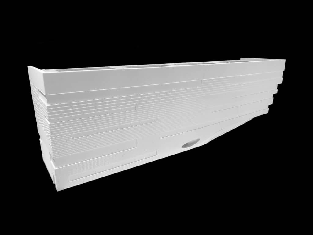
Final ¼” mock-up, southwest corner.
Soon, a few mini-Needhams at 6’-0” long and 2’-0” tall will be floating around the PAYETTE office. The models are composed mainly of the building’s south façade and half of its shorter two East and West faces. To achieve the models’ brick projections, 0’-3/4” sheets of foam were routed using an 0’-1/8” bit. Spacing the router’s drive lines less than 0’-1/8” apart allowed the stock material to be routed uniformly. Alternatively, strategically spacing the router’s drive lines more than 0’-1/8” apart left thin bands of material at the brick projection locations.
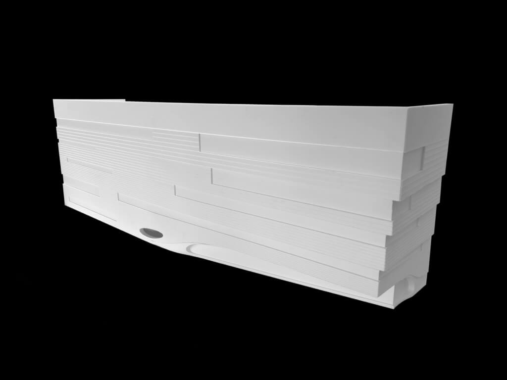
Final ¼” mock-up, southeast corner.
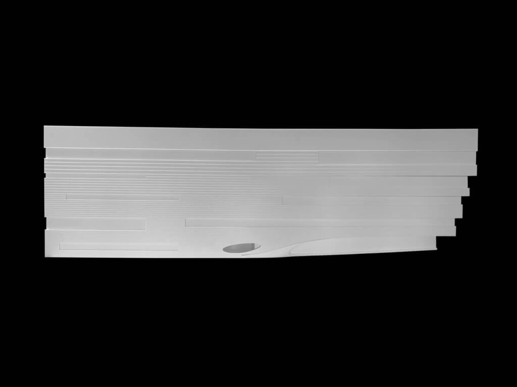
Final ¼” mock-up, south elevation.
All in all, the models allowed the team to judge the aesthetic impacts of certain brick manipulations more accurately, as well as explore more technical details like expansion joints. In our minds, this brick study is just one of several methods we are considering as a means to integrate playfulness into the forthcoming Boston Children’s Hospital and raise the overall craft of our architecture.


