Recently healthcare institutions have expanded their campuses by adding several buildings to the main facility. It is important that the overall architecture of the new and old facilities match in order to avoid chaotic systems of connected corridors and gates that impede wayfinding, especially for new users. In addition, the old compact facilities commonly provide very limited access to outside views and daylight for the occupants, thus creating even more obstacles for the occupants to orient themselves in the buildings.
I worked on a project that dealt with the above-mentioned challenges. Our team conducted research to learn different approaches to improve the wayfinding experience among occupants. One of the main challenges in this project was facilitating wayfinding for patients who are not native English speakers. To address this issue, we realized that wayfinding had to happen on multiple levels so that users did not need to rely on only one method of getting around, such as signage or maps.
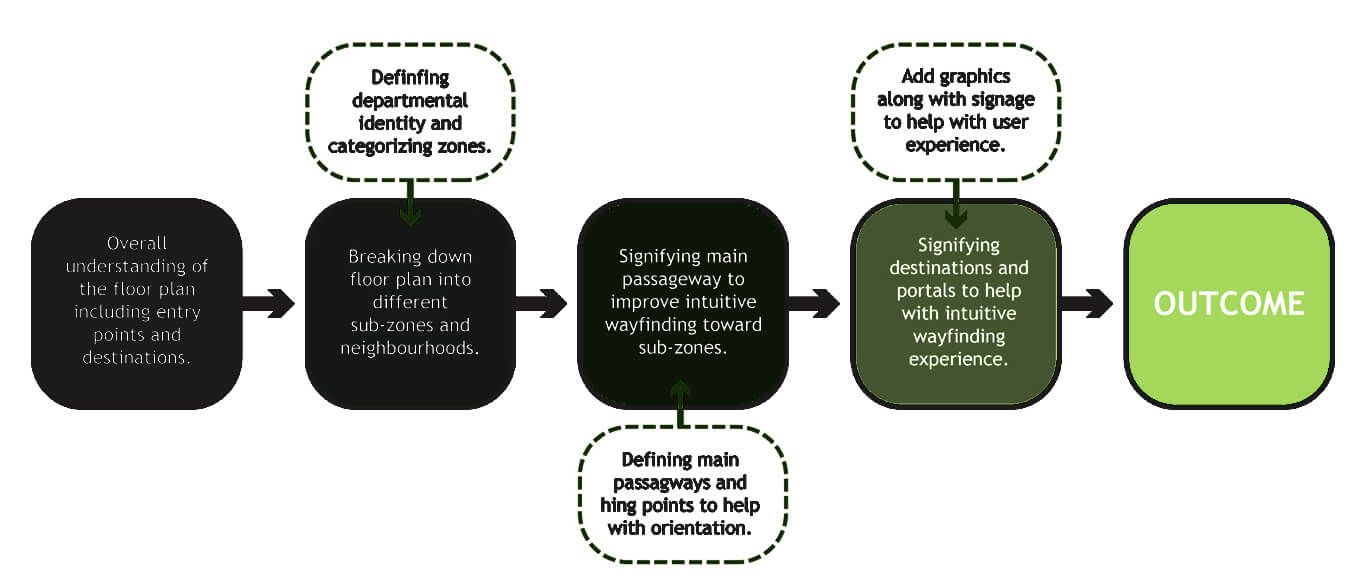
 The primary level of wayfinding design entailed granting users a general understanding of overall floor plan, departments, moments, entry points and destinations by using graphical maps on entry points. This could not happen without signifying high-traffic areas and defining departmental identity.
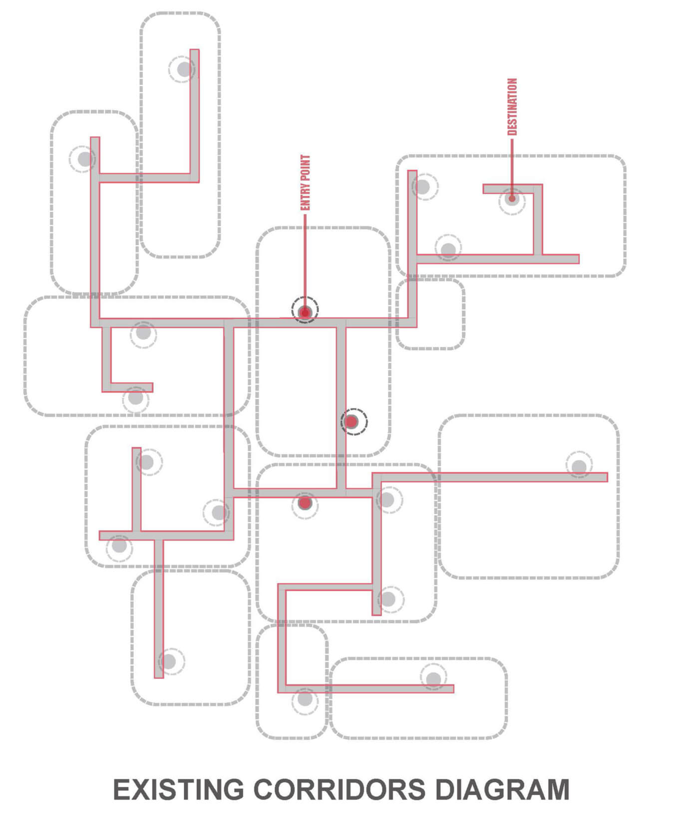
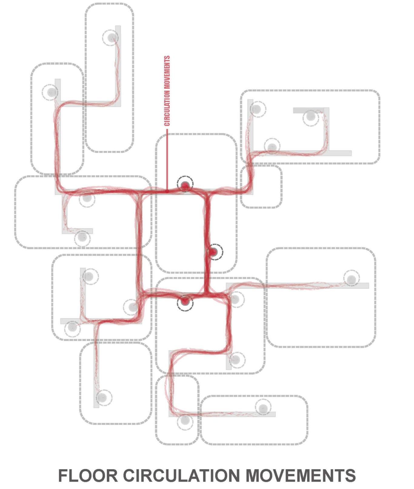
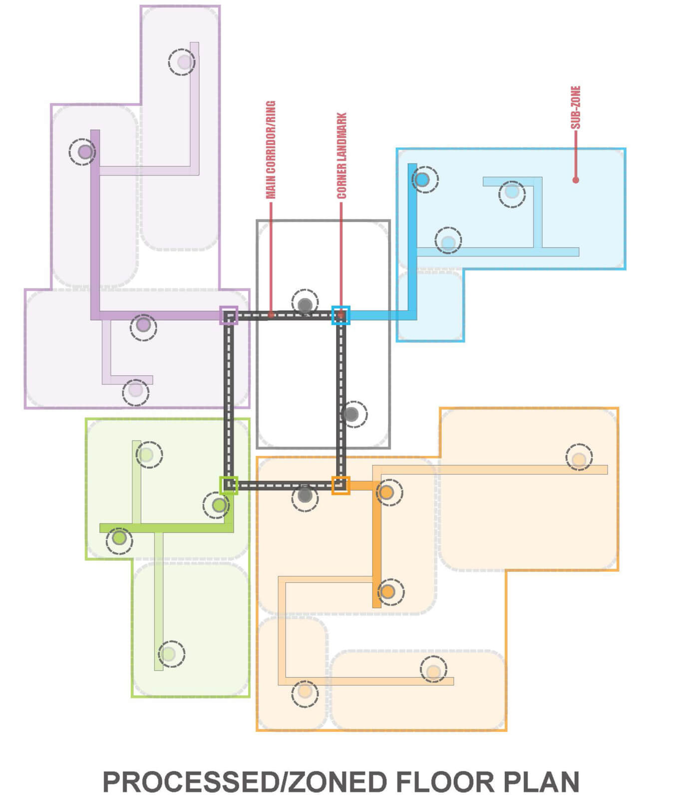
 To achieve this goal, our initial step was to make a map of all major entry points and destinations and analyze the general flow and overall floor traffic. Graphical results of this analysis enabled us to better understand the major flow passageways and identify the ones with the highest traffic. Eventually, we chose a rectangular set of corridors that tied the central departments together and used it as the main passageway. Instead of defining a single significant point and branching corridors off of that, we created a rectangular ring as the base corridor so that other corridors leading to different destinations branched off of those four main corners.
 In the next level of wayfinding, we defined the departmental identity using different colors associated with each corner. By tying departments and corners together using a specific color, new users just needed to follow the ring and get to a colored corner associated with a specific department and then follow the corridor that branched off that corner to get to their destination.
 We developed a graphical language as a third level of wayfinding. The graphics are meant to supplement the other wayfinding strategies and provide an intuitive guide to users. Since there is almost no access to daylight and outside views from the main corridors, we added abstract graphics of nature on the walls to bring a slight sense of nature to the environment. Then, we added animals in wall graphics and tied each species to a specific color associated with each corner to facilitate connection between different wayfinding elements. For instance, if users saw an orange elephant on the main ring and were trying to get to a destination somewhere on the orange corridor, they could simply follow the elephant to get to that corridor and then walk down to their destination.
We also implemented signage, which informed users when they had reached their destination.


However, it doesn’t end there: we added another dimension to the wayfinding experience by connecting the hospital floor plan and the city masterplan. We overlaid the enlarged hospital floor plan on the city masterplan and named all those moments based on intersection of floor plan moments and master plan neighborhoods. Through this approach, if users were in “midtown” and they needed to go “downtown,” they could have an approximate understanding of the distance and direction that they had to walk to reach their destination.
Through a variety of studies and wayfinding methods, we were able to achieve a system that will help accommodate and direct all the users who visit the expanded hospital campus.

