This is the third and final in a series of posts diving into the design of all-gender restrooms and current obstacles to building them.
Once signage and building code are brought up to speed, what does an all-gender restroom look like? Single-occupancy restrooms can be exactly the same as they look now: a single room with a toilet, a sink and a mirror (and various other required pieces of equipment for ADA compliance). The typical single-user restroom can right now be re-designated as all-gender with almost no physical change, besides updating the signage outside it. The main obstacle in implementing single-occupancy all-gender restrooms remains building code, and that barrier is rapidly coming down.
What about multi-stall all-gender restrooms? Now that they will be permissible in the 2021 IPC, what are the design considerations in building a public facility that will be used by multiple people of different genders at the same time, while still allowing everyone to feel comfortable and private?

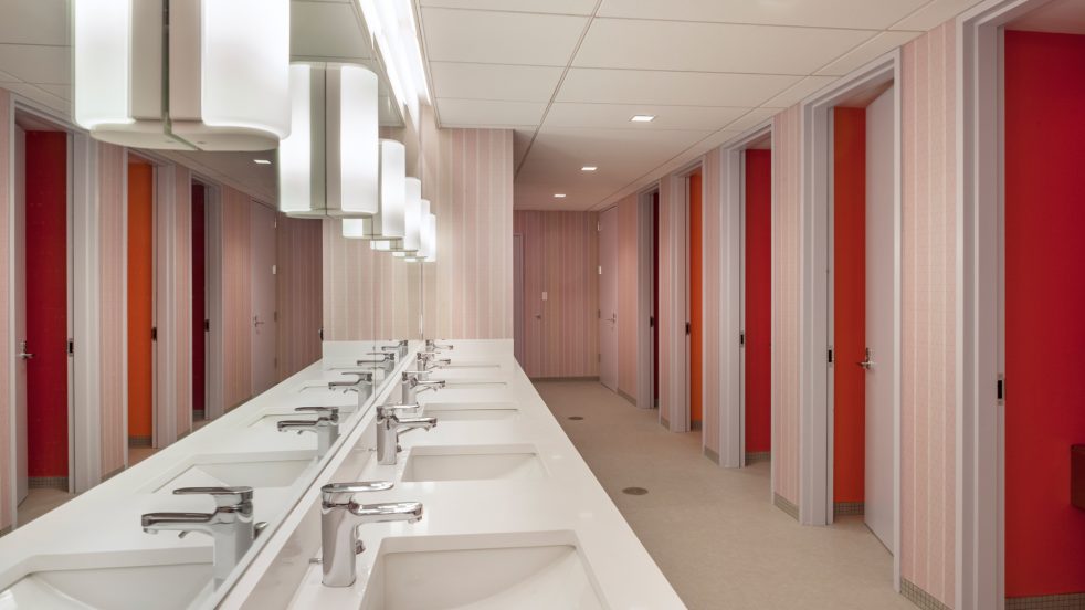
The multi-user all-gender restroom at Congregation Beit Simchat in New York, designed by ARO
Let’s return again to the multi-user all gender restroom designed by ARO for Congregation Beit Simchat Torah in New York. At first glance, the facility looks like any typical restroom designed for multiple users at once: ganged stalls along one wall, a row of sinks with a large mirror on the opposite wall. The stalls themselves, however, are not separated by the usual flimsy floating partitions. Each stall is individually enclosed by walls and a full-height door, essentially like a row of single-user restrooms with the sinks separated out. This restroom provides a helpful case study for the biggest factor in increasing privacy and comfort in stalls: partition height. By virtue of being fully enclosed, each stall includes the same level of privacy that one would expect in a single-user restroom. From a privacy standpoint, full height doors for each stall are most preferable, but even floating stall partitions with no gaps between the door and the divider make a big difference. User comfort and privacy are the key elements to keep in mind when designing an all-gender facility, and the conventional multi-user restroom layout doesn’t need to radically change to accommodate those things.

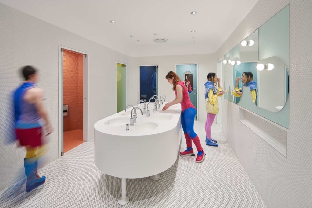
The multi-user all-gender restroom at the new Student Center at RISD, designed by WORKac.
Some facilities are taking this opportunity of the changing restroom paradigm to reconsider how a multi-user restroom is laid out. The new Student Center at RISD, designed by WORKac is an example of one such facility that keeps inclusivity and privacy in mind while bending the rules of how restrooms operate. Six individual stalls are enclosed by full-height doors which swing open when not in use, easily communicating which stalls are open and eliminating the need for a user to inspect each stall and potentially disturb someone inside. Each stall is brightly painted a different color and has a unique shape in plan. The common area features a central island of sinks with mirrors on the remaining wall. The restroom is at once more public, removing initial barriers of entry into the facility, and more private, by including full-height doors and clearly communicating use patterns. The same kit of parts is all here, but here the end result is a thoughtfully reconfigured layout that prioritizes openness and accessibility.

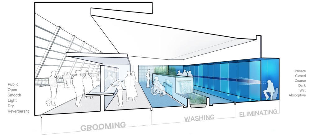
A prototype all-gender restroom for an airport, from Stalled!
Stalled!, the design and advocacy group whose work in the area of all-gender restrooms is foundational, took the tenets of inclusivity and privacy even further in their prototype multi-user all-gender restroom for an airport. The restroom here acts as a pocket off the main path of circulation, rather than a room enclosed by doors or a vestibule. The facility codes its use by a gradient of privacy, transitioning from the most public uses (grooming and washing, with separate countertops with mirrors and plantings) to the more private (individual stalls with toilets). Occupancy signals outside each stall, which allow the user to easily see which stalls are vacant without having to peek through a crack in each partition, reduce the likelihood of unwanted interaction. In exploding the restroom into its essential component parts and placing them in a prominent location, Stalled! is changing the narrative around restroom design and gender and critically rethinking the restroom’s place in our society. Once gender is unmoored from space, why can’t other coded paradigms of public space be rethought?
Building all-gender restrooms is challenging at this specific point in time, but it doesn’t have to be. Education about how to navigate code and best practices for signage and design can remove basic barriers in implementing all-gender restrooms. Active conversations with key stakeholders—with members of the trans community, with people whose lives are directly affected by exclusionary policies built into code or legislation—are crucial. Simple signage updates, tactical code amendments, and redesigns of public facilities all contribute to the fight for trans rights, a fight in which architecture has a key role to play. Because when it comes down to it, this is about civil rights for trans and nonbinary people, the right to exist in public space, to feel comfortable and to thrive. And what’s more fundamental than that?
Related Posts in this Series:
Part 1: Gender and Signage
Part 2: Navigating Building Code
Bibliography
“Congregation Beit Simchat Torah.” Architecture Research Office, www.aro.net/congregation-beit-simchat-torah/.
“Design.” Stalled!, www.stalled.online/design.
“RISD Student Center.” WORKac, www.work.ac/work/risd.


