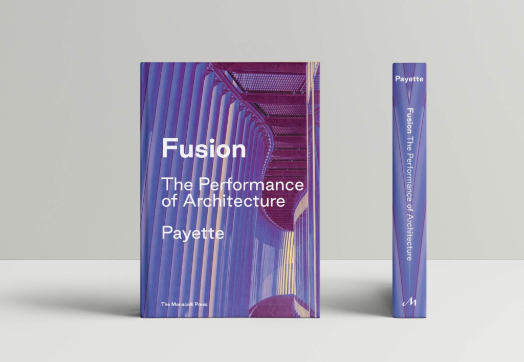
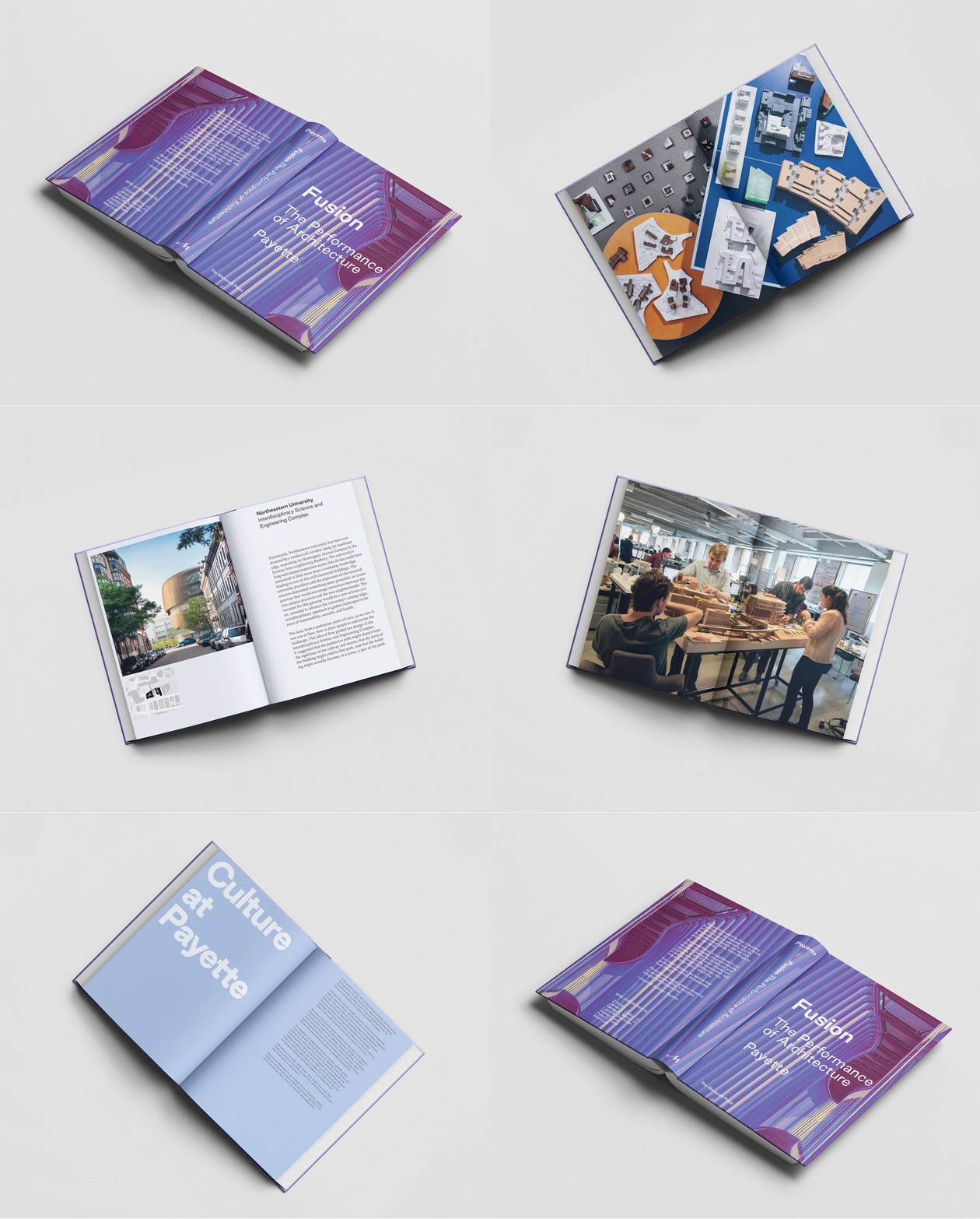
After much anticipation, PAYETTE’s newest monograph, Fusion — The Performance of Architecture is finally out. This book is the final product of a huge team effort, a collaborative writing and design process that is representative of the firm. I was lucky enough to be a part of the design team, and to have ownership of a unique section of Fusion.
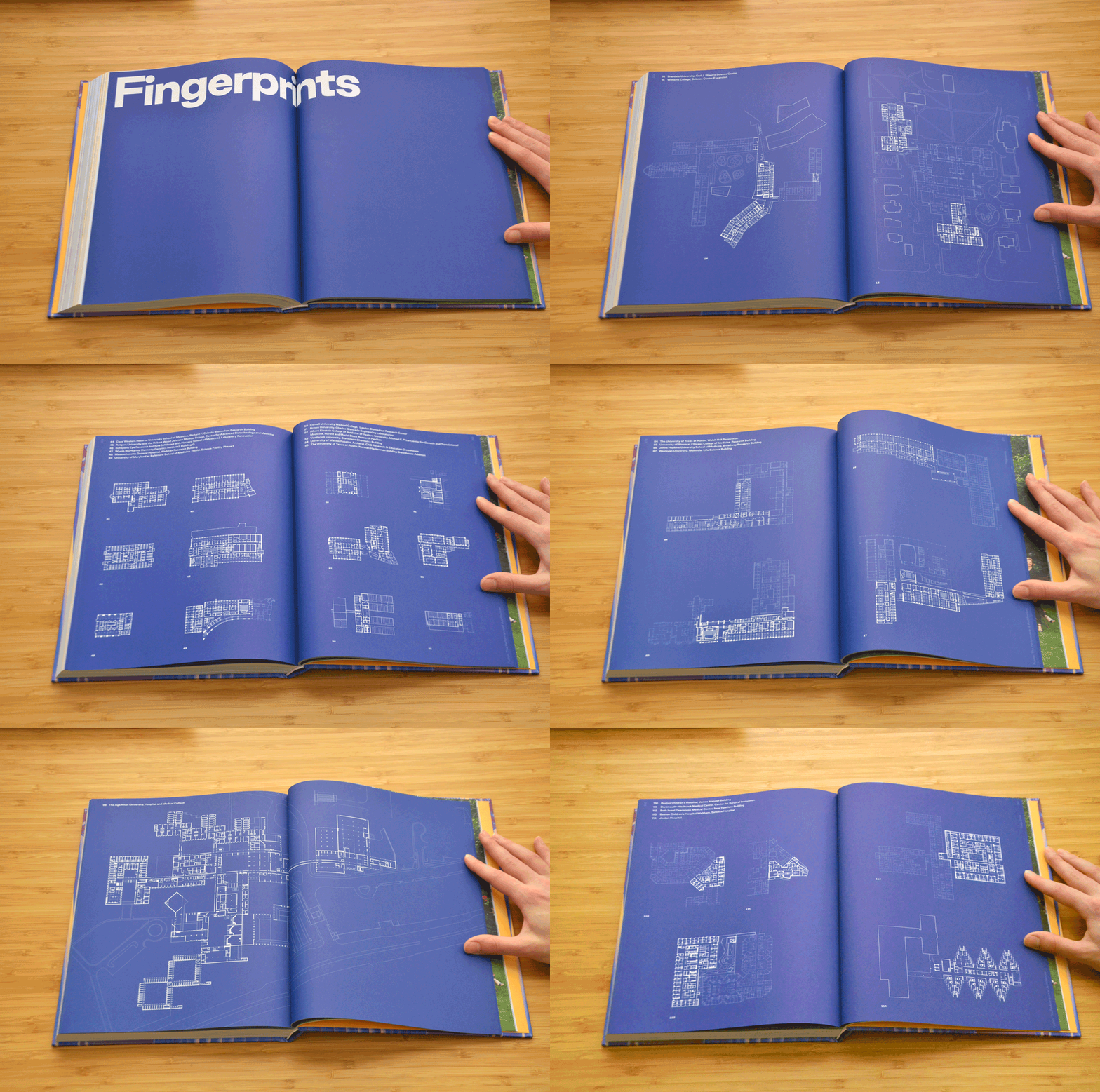
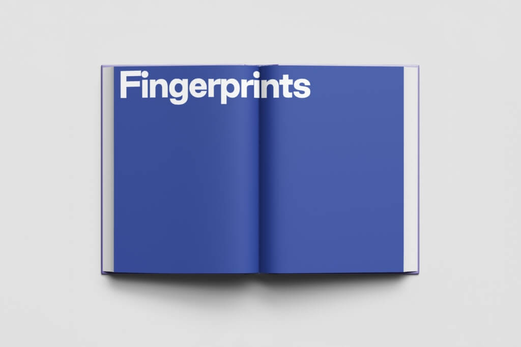
The largest single section of Fusion is the Fingerprints, a collection of 114 floor plans of projects from the firm’s past and present, representing the firm’s history. The Fingerprints came about as a continuation of a section in the previous monograph, published 17 years ago. That book contained an index of every major project throughout the firm’s history, organized by typology. The white linework against a black background felt a little outdated, but the impression they left—being able to compare projects across typology and easily register the firm’s history visually—was powerful. When it came time to start designing a new monograph, fresh from the 2019 AIA Firm Award and at a time when the firm was already reflecting, including Fingerprints in the new book was an easy decision.
Gathering the drawings proved to be no small task. Approximately 45 drawings had already been cleaned up and standardized for PAYETTE’s website redesign in 2018. Current projects were easy enough to export from Revit or CAD, or to pull an existing presentation drawing. Many of the firm’s older projects were redrawn for the previous monograph, and though they had to be edited to fit with the new graphic style, at least they were all similar among each other. The real challenge was finding usable drawing files for many of the firm’s projects that fell in the gap between the two monographs—projects recent enough that they were developed after the 2003 monograph, but old enough that they were designed using different software than we use today. For these projects, we had to sift through our archives, sometimes pulling out old CDs from cardboard boxes, to find files that were robust enough to be edited in the new graphic style.
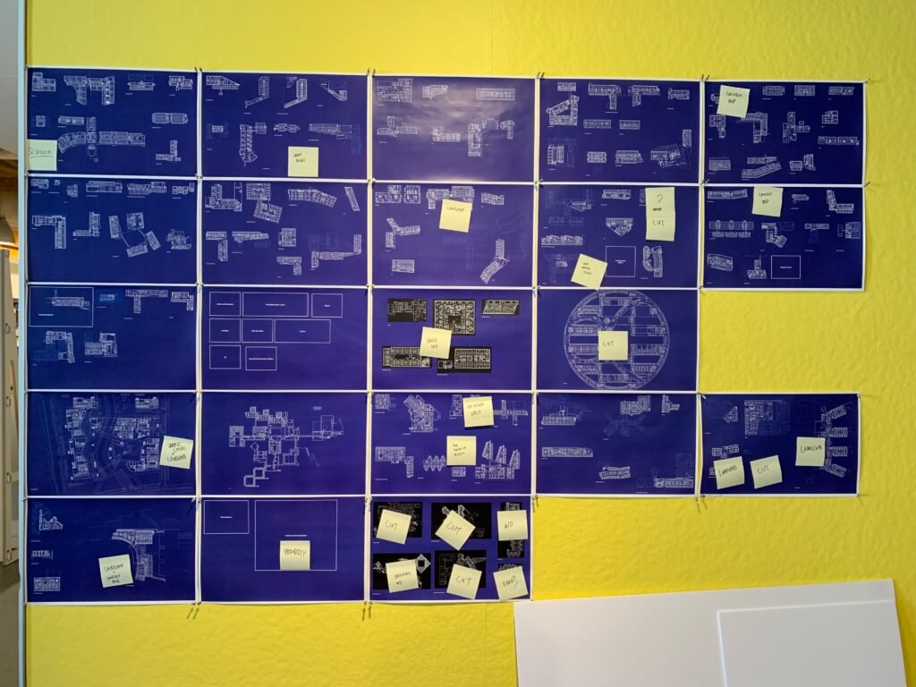
Once the drawings were assembled, the work of cleaning them up and formatting them in a single, unified graphic style began. We had multiple rounds of pin-ups with the entire design team, obsessing over every detail.
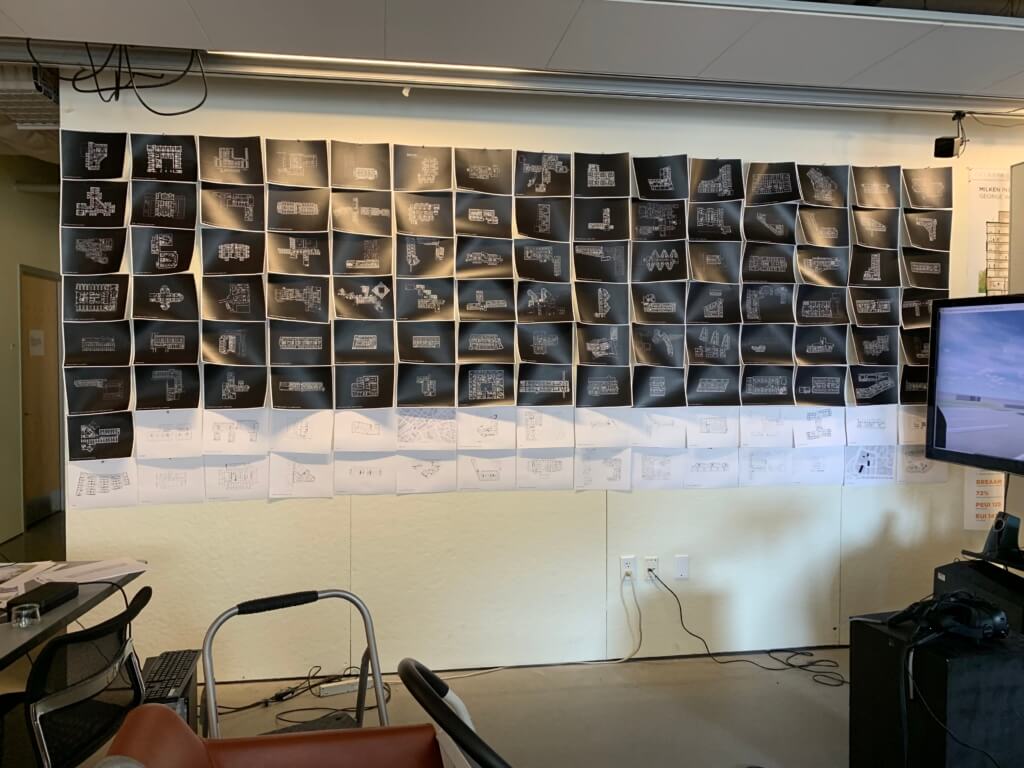
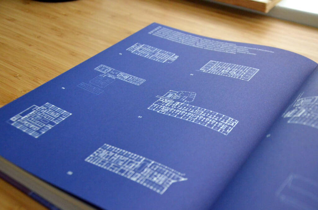
There were two levels at which the team looked at the fingerprints. At a higher level, we began by asking the big questions: What was the overall impression we wanted to convey? What did we want the eye to register when looking at a collection of floor plans on a page? What was most important-the form of the architecture or the layout of the labs? These questions led to specific graphic ideas: Should the walls be filled in or left purely as outlines? How much detail in furniture blocks was appropriate? What color should the background be? The final graphic approach—walls filled in, minimal linework for furniture and casework, blue background—reinforced the ultimate reading of the Fingerprints as a uniform documentation of the firm’s history, easily referenced and compared amongst itself at a glance.
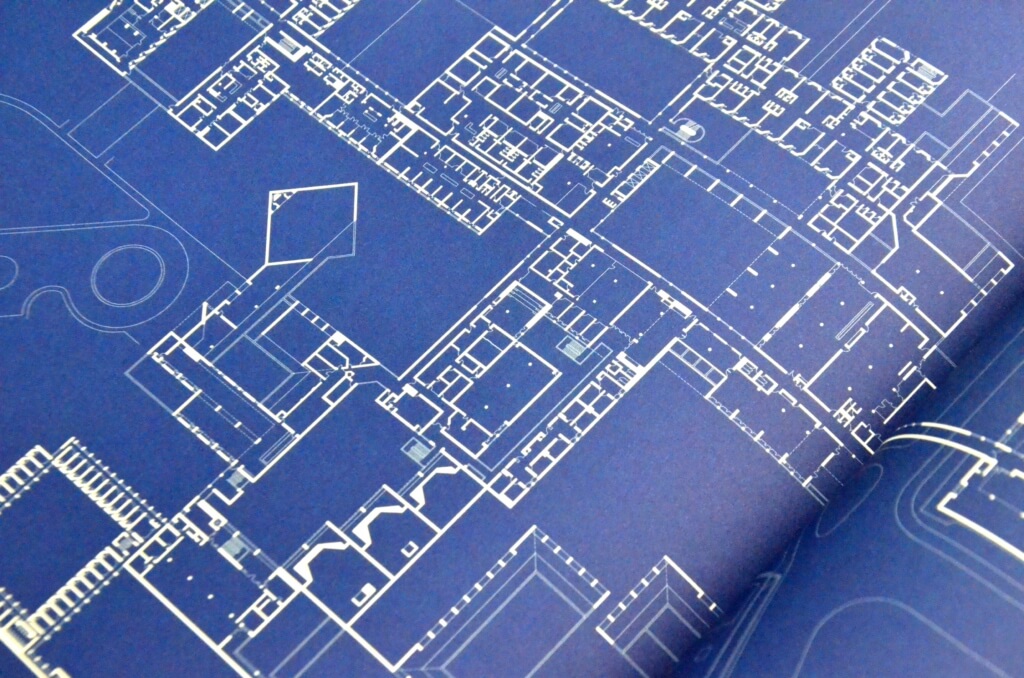
At the mechanical level—the workflow and graphic standards each drawing would be held to—no detail was too small. Every element was vitally important: the scale (1” = 100’), the number of different line weights to include (two, 0.5pt for walls and 0.18pt for details), the specific shade of blue (Pantone Reflex Blue U), the tint of linework for existing structures (65% tint). It took countless test prints in the office and multiple wet proofs shipped from Monacelli’s office in New York, using the actual paper and ink that the final book would be printed with, to iron out all the details.
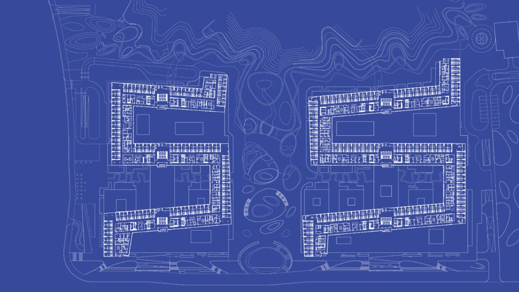
The list of floor plans was whittled down over time, from an initial 160 to the final 114. The smallest Fingerprint is the Brandeis University Superconducting Magnet Facility, a single room housing a highly powerful and specific piece of equipment. The largest Fingerprints are six hospital projects, each taking up an entire two-page spread—my personal favorite of these is the Fifth Xiangya Hospital.
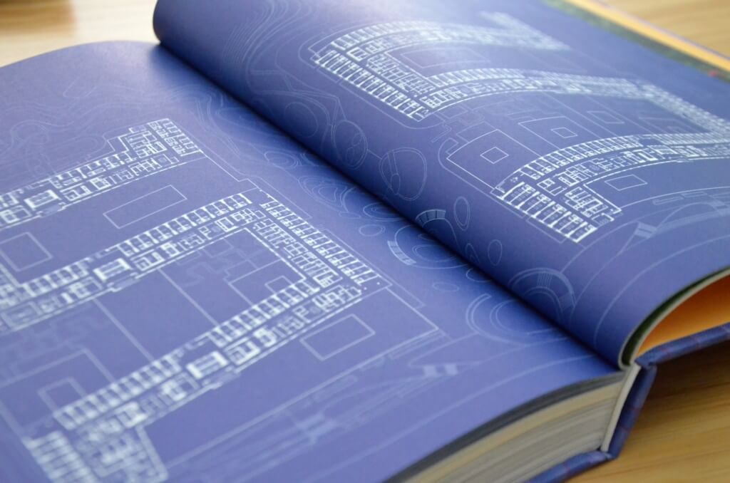
The Fingerprints are organized first by building typology—Science or Healthcare—followed by programmatic similarities. This subcategorization is somewhat subjective and varies from one spread to another. Work for the same client is grouped whenever feasible—six major projects for Harvard University take up an entire spread. Sometimes projects are grouped by contextual site responses, not necessarily by program. Interventions into large existing academic buildings at Bryn Mawr College and MIT, done years apart, sit opposite each other. New buildings at Williams College and Brandeis University both act as significant extensions of existing campus complexes, and therefore are juxtaposed. Education buildings for smaller universities and community colleges are grouped together, emphasizing their similarities in program and differences in form. Each spread tells a story, each grouping of work drawing connections across time.
I now feel like a local expert on an enormous range of projects from the firm’s history, and I am confident in saying I wouldn’t have that institutional knowledge had I not been part of the team behind Fusion. I am so grateful to have part of such an interesting project and to have played a role in shaping such a unique record of PAYETTE’s work.
