Design Week is an annual PAYETTE tradition when we as a firm collectively explore projects we have worked on during the previous twelve months. In the following weeks we will be recapping the presentations given by our colleagues.
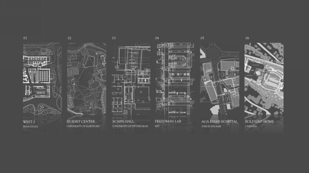
Learning how buildings respond and react to their unique sites can help us as designers to enrich environments or support existing infrastructure in better ways. Each of the buildings showcased here have varying contexts, so how each project coexists with its site changes from one project to the next.
West 1
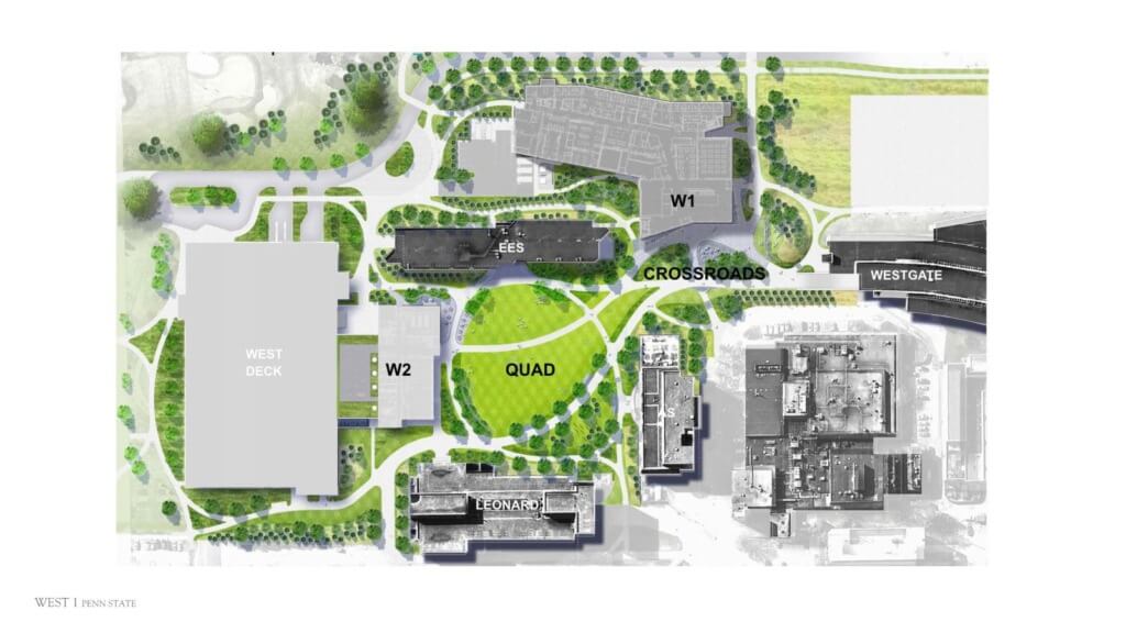
As reflected in the master plan, Penn State College of EngineeringWest 1 is part of a much larger system of buildings. The building interlocks itself around the existing structures, reaching toward the campus center, and hugging the surrounding green space. The pedestrian paths within the landscape seamlessly weave themselves through the architecture and back out.
The form responds to various site forces: pedestrian traffic, vehicle access, how the building is perceived visually from the Quad and other spaces of the campus. Like most academic projects, it is crucial that the building also fits into the campus context through material choices and approach to color. West 1 uses copper anodized aluminum, resembling the color palette of the existing brick buildings on the Penn State campus.
Hursey Center
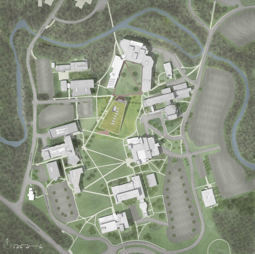
Unlike West 1, which is tucked away, the Hursey Center is situated within the University of Hartford’s quad. One might think placing a building in the center of a campus would be a bold move, but this project makes a gentle gesture. It is partially disguised by embedding itself into the ground and becoming one with the greenspace. Peter Vieira describes this approach as “they pulled up the rug, placed the building underneath and replaced the carpet.”
The form of the new academic building was a dual response to both the topography and the surrounding buildings. Taking advantage of the natural slope of the site, it rises in height to match the existing buildings on the north side and falls back into the ground on the south, blurring the boundary between building and landscape. When the building does reveal itself, it almost dematerializes in the way that the surfaces reflect the surroundings. Lending itself, in another way, back to the environment.
Within the sleek form, the programmatic elements are arranged in a ‘wood block puzzle’ type of arrangement, leaving behind a staggered remnant that allows views to pass through the entirety of the building.
scaife Hall
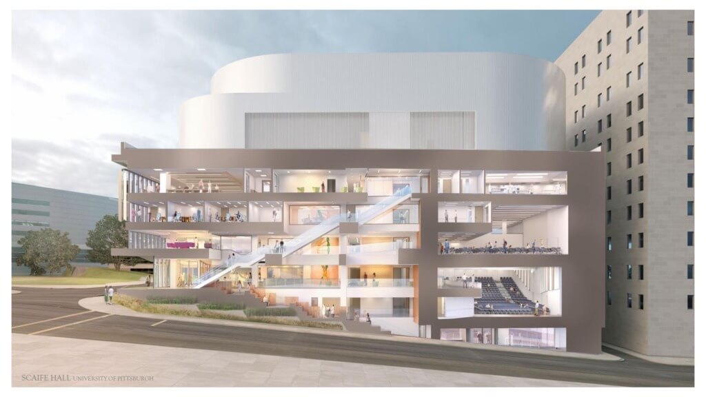
Within an urban context, the new Scaife Hall addition at the University of Pittsburgh School of Medicine has a similar sloped site condition to the Hursey Center. The hilly topography of Pittsburgh appears to bleed into the interior. The section shows the incline of the stairs follows the slope of the street, connecting two entry points that are two levels apart. The angle of the sun shading devices peels away from the street, mirroring the natural slope.
The predominant limestone material of the Pittsburgh campus is reinvented through the elegant canopy at the corner entry that invites students into the building. The addition also supports and is an extension to the existing medical building, fitting the two structures together like the pieces of a puzzle.
Freedman Lab
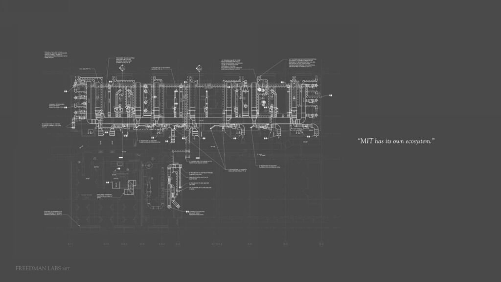
The MIT Freedman Lab integrates itself into Building 6 of the Main Group of MIT’s campus. However, rather than being an extension to it, it had to fit into it. In many ways MIT has its own “ecosystem” and adding an intensive lab without disturbing the complex systems that were already in place was a complicated process.
With a quick deadline and tight budget, the Freedman Lab nestles itself into the building framework without adding ceiling penetrations or major changes to the existing corridor. It was a strategic decision to leave the existing terrazzo floor and “the MIT white brick walls” on one side, while adding pops of color to the ceiling and interior wall, creating two distinct aesthetic themes that notch together.
Aga Khan Hospital, Dar Es Salaam
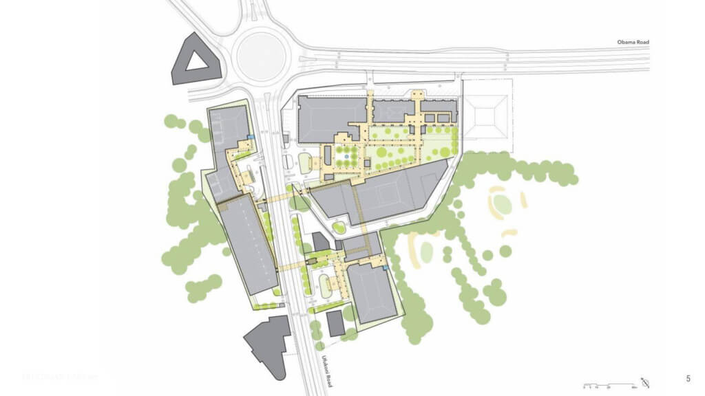
Similar to the “MIT White,” the Aga Khan Hospital in Dar es Salaam, followed the color direction of the existing “blue pitched roof.” The entire master plan blurs interior and exterior with a network of bridges that meander through the site’s green spaces and gardens while connecting all of the buildings together. The bridge system allows patients and visitors to effortlessly transition between indoor and outdoor spaces. The new TCCP building housing the linear accelerators has a pocket garden at the entrance and outdoor waiting areas on the second floor, fostering a constant relationship to the ocean beyond.
Chelsea Soldiers’ Home
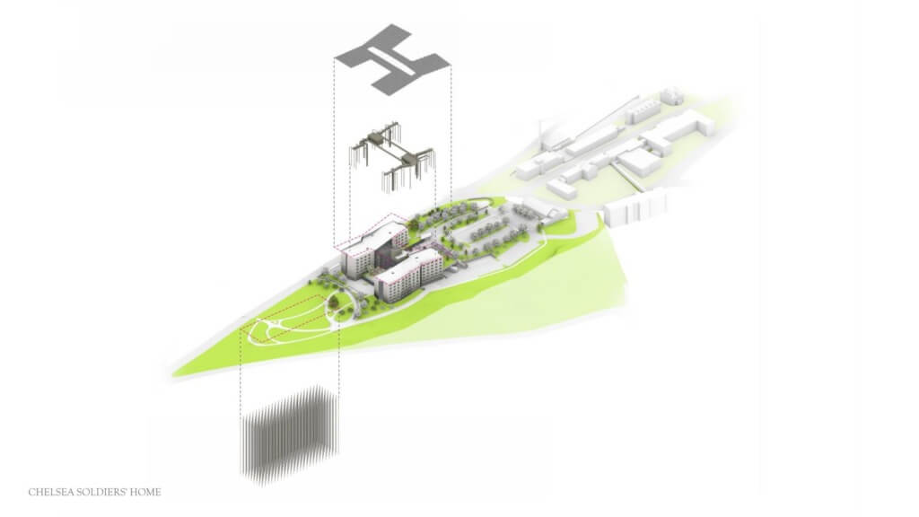
The Chelsea Soldiers’ Home was designed to stand out, rather than notching itself into an existing building or blending into the landscape. The building replaces an iconic water tower, so it was crucial to the design a symbolic building sitting on top of the Powder Horn Hill to contribute back to the site and to the skyline of neighborhood. The photovoltaic panels and roof structure are lifted higher, adding an airiness to the building and accentuating the existing hilltop site.
Check out these previous posts in this series!

