Design Week is an annual PAYETTE tradition when we as a firm collectively explore projects we have worked on during the previous twelve months. In the following weeks we will be recapping the presentations given by our colleagues.
This series contains a variety of projects ranging from new construction to renovations and conceptual design studies to master plans. Each project has its own unique features and challenges. The following observations aim to appreciate some key take-aways from each project that resonated with me.
NEIGHBORHOODS

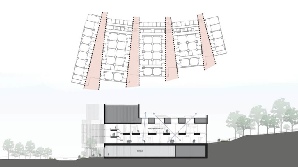
The University of Connecticut’s New STEM Research Center will be the new front door to campus. Neighborhoods are the hearts of this building. Like a family, they share core DNA, but each one is unique. In-between the lab sectors, these 4 double-height neighborhoods extend through the entire building providing moments for collaboration. With such deep floorplates, the skylights allow natural light to pour inside from above. In addition, the ends of these neighborhoods provide spectacular views of the Woodland Walk beyond.
LOCATION

Location is what makes the MGH Imaging Suite at Assembly Row particularly unique. Located in a popular mixed-use development only makes the project feel more accessible to the public. Inside, the team created a calming space for patients. Utilizing wood, carpet and artwork throughout makes the suite feel comfortable and warm. Inside the scanner rooms, backlit ceiling panels provide relaxing ambient lighting or simulate a view to the sky above providing a pleasant distraction for patients.
pedestrian circulation and open space

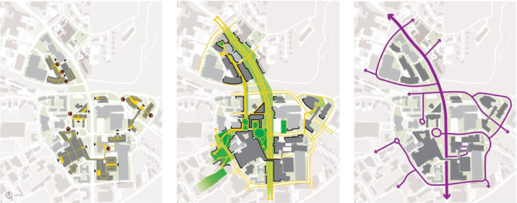
The goal of the Emory University School of Medicine Master Plan initiative is to improve faculty recruitment and retention by developing a master plan that organizes spaces in support of growth for facilities across all four of the School of Medicine’s campuses. Some of the studies the team conducted look at how to improve pedestrian circulation, open space, access and loading. The result is a series of site diagrams that are as beautiful as they are telling.
NATURAL LIGHT AND VIEWS

Tulane University’s Paul Hall embodies the idea of science on display. Facing the campus quad it creates its own presence, despite being surrounded by four existing campus buildings. Because the site is only 8” above sea level, flooding is a major concern. The solution was to raise the building 30” above grade, making it reminiscent of a stage, with only a thin glass barrier dissolving the boundary between inside and out. The result is a physical and visual connection to the quad beyond. The upper floors contain a variety of lab spaces maintaining views outwards to the quad, allowing natural light to pour inside. An animal facility, which would traditionally be located in the basement to avoid natural light, is located on the top floor. While the facility itself has a solid boundary, circulation was placed outside the facility along the glass exterior walls, providing occupants with access to natural light.
MULTI-PHASED RENOVATION

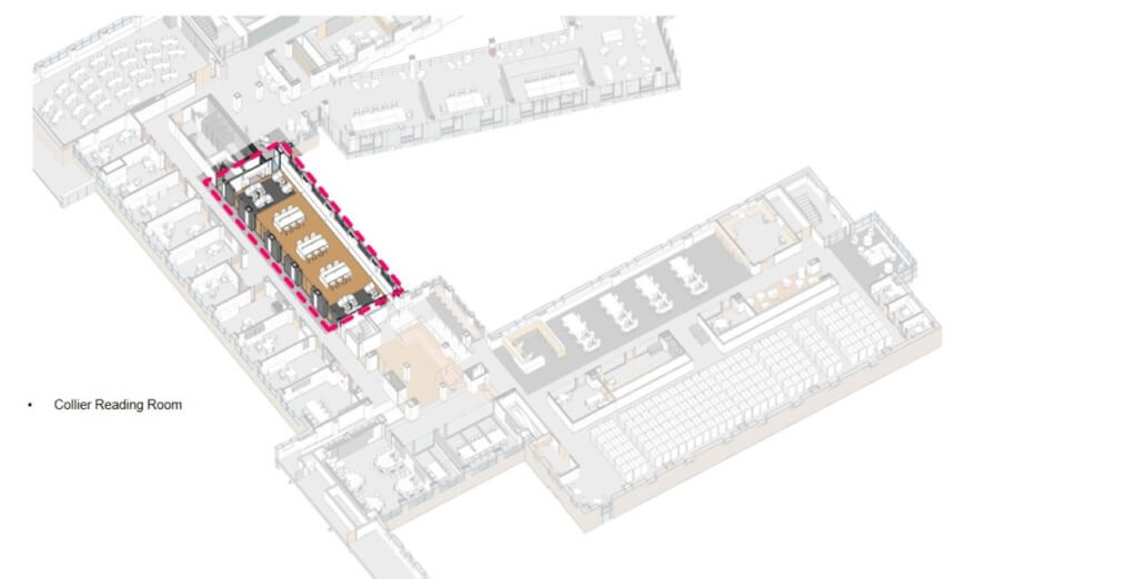
Bryn Mawr, a small women’s college located outside Philadelphia, is famous for its strong science program. PAYETTE was tasked with a multi phased renovation that allows for the building to be open during projects. We recently completed Phase I, which consists of a three-story addition housing physics teaching labs, study spaces and student social spaces. Phase II is currently with completion expected in 2023. It will include renovations to classrooms, offices, and the Collier Science Library and Reading Room.
SCALE AND CONNECTIVITY

Lastly, is a collection of conceptual design studies for a confidential client, who is expanding their facility to an existing warehouse building. The area of design focus is the administration building that serves the warehouse. One of the most significant design challenges for this design project is scale and employee connectivity. The entire building is a single floor, and the administration building alone is a little longer than a football field. The team was tasked with creating a series of renovation and addition scenarios for the client to evaluate. Developing a list of criteria helped the team tie their proposals back to the key project goals as well as providing the client with a way to equally weigh the options.
Check out these previous posts in this series!
Design Week Series #1: Surgical Moves in Architecture
Design Week Series #2: Designing Buildings as an Extension of Their Surroundings

