Design Week is an annual PAYETTE tradition when we as a firm collectively explore projects we have worked on during the previous twelve months. In the following weeks we will be recapping the presentations given by our colleagues.
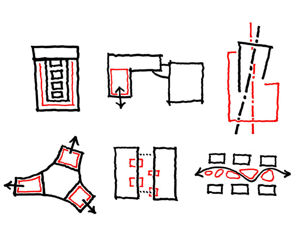
The following projects exhibit qualities of plan clarity and demonstrate how the beauty of concision works effectively for designs from the most thrifty and small-scale of projects like an infusion room renovation to ambitious hospital complex master plans.
Simple and Comfortable
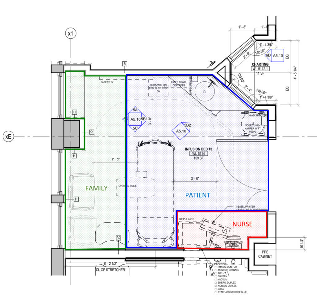
The client brief for the renovation of the 5th floor of the Boston Children’s Hospital in Waltham included doubling the quantity of infusion rooms while also accommodating for a new pharmacy, reception and waiting room. All in just a little over 10,000 SF. The new layout wraps the infusion rooms along the perimeter, giving all patients much needed exterior views during treatments that can take up to eight consecutive hours. Triangular charting alcoves are placed between every two rooms, allowing nurses to monitor two patients simultaneously. What most impressed me was that despite the utilitarian organization of the new plan, great efforts were made to make spaces as comfortable as possible for patients and their caregivers. Rooms are separated into zones for nurses, patients and their visitors with using different finish materials. The rooms are also replete with patient amenities and digital artwork that can be controlled by the patient for a more custom environment.
Push and Pull
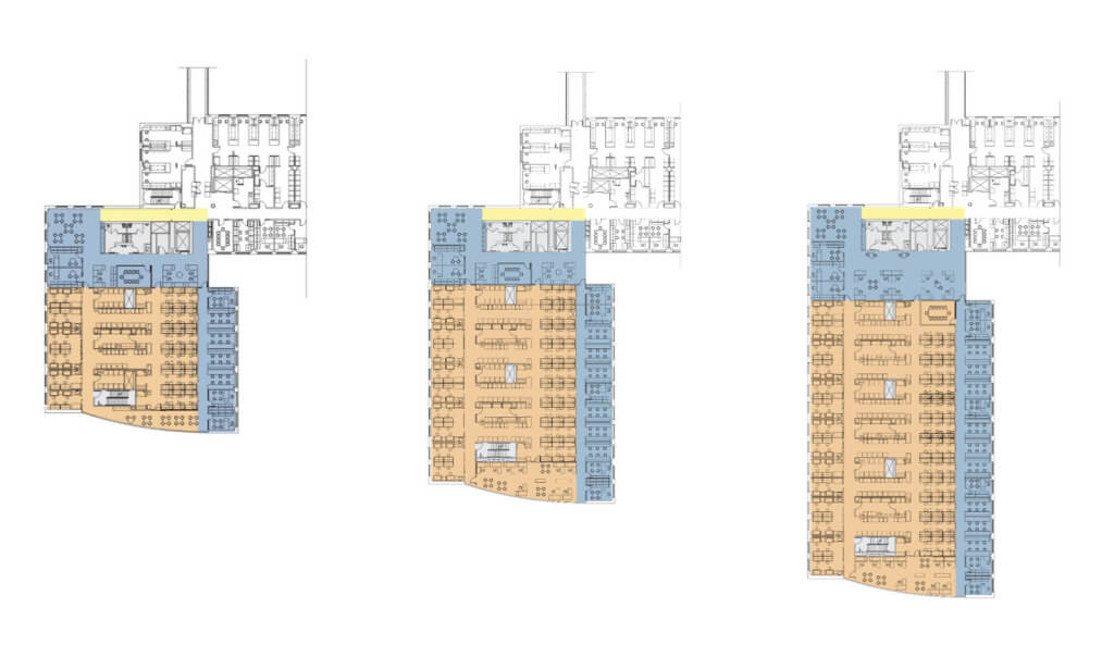
The University of Vermont Research Lab and Given building is another project that prides itself on being cleverly thrifty with limited resources. The team was asked to design an additional wing to the health sciences research facility designed by PAYETTE in 1999, as well as renovate the adjacent Given Building, designed by SOM in the 60’s. This involved converting the Given Building from wet labs to dry labs and office space. The team studied a floor plan that could be pushed and pulled as needed based on the client’s requirements. Knowing the size of the new addition directly impacted the extent of renovations, the flexible plan served as a tool to arrive at the right level of compromise between the two facilities.
Outside Influences
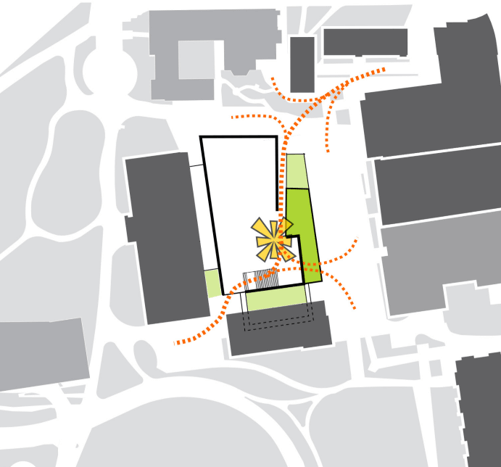
The University of California Berkeley College of Engineering had an interesting method of arriving at its massing and façade strategy. First, the team developed a friendly relationship with the site’s neighboring buildings, allowing the neoclassical McLaughlin Building to be prominent and unobscured, and giving ample space to the student plaza. The kinks in the mass are informed by the immediate axis of the city grid and a larger axis in Olmsted’s Campus Master Plan, which directs a grand view out to the Golden Gate Bridge. The lab’s bay width divides evenly to the human scale of 3’-8”, and this dimension informs the cadence of the façade that wraps around the entire building. To vary the façade’s effect, the frames extend to different depths and are infilled with materials of different opacities, allowing for varying levels of privacy and light.
Dynamic and efficient
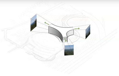
Another great example of a project with a powerfully simple plan that is both dynamic and efficient in its footprint is for the Soldiers’ Home in Holyoke. The building is spread into three wings, each housing 12 beds per floor, with separate support programs dedicated to their respective wings. The tips of the wings also feature den libraries where patients can take in the gorgeous views of the landscape, while the center of the building houses a shared neighborhood. What I found particularly fascinating about this project is the tapestry of landscape that surrounds the building. When the current facility is demolished, the site will be left with a large hole, which will be turned into an aesthetic water feature for stormwater management. The north courtyard that faces the woods is also thoughtfully designed to be removed and quiet, providing patients of dementia with the security they require.
Lively Atrium
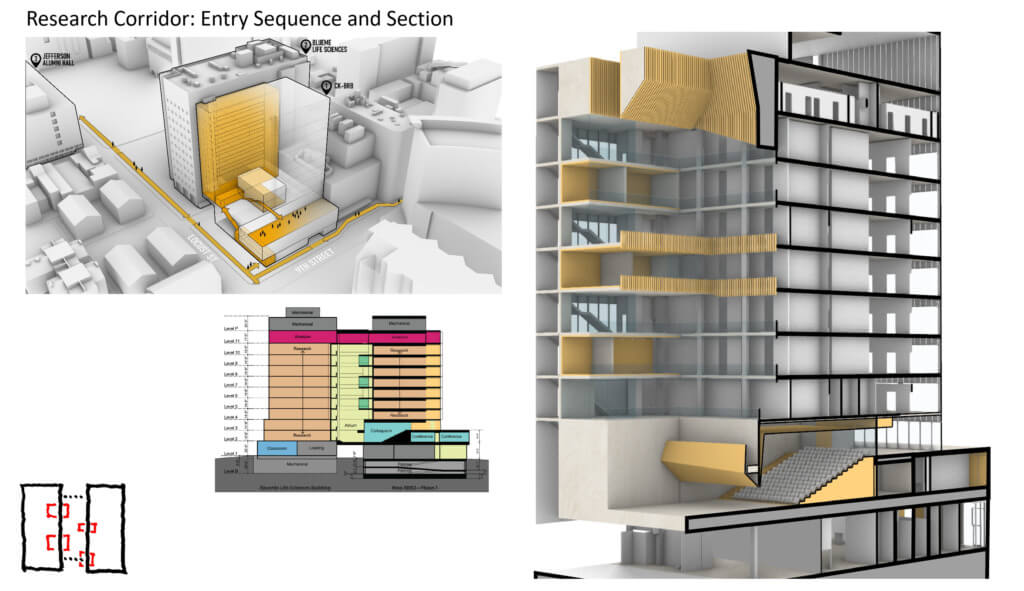
While the final two projects in this series also demonstrate clarity in plan, they are enriched by a vigorous sectional exploration. The Thomas Jefferson University Biomedical Research Building will become the new centerpiece of the University’s research corridor. The project features seven lab floors, with high-intensity labs located in the center of each floor with write-up and office spaces wrapped around the perimeter for effective daylighting. The podium of the building includes a 250-seat colloquium space, a conference center and gallery, all at different scales creating a very dynamic composition. But this building is particularly interesting in section because its main feature is an atrium connecting the building to the adjacent Bluemle life sciences building from the second floor all the way up. The atrium is rendered even more lively by the masses of different sized conference and meeting rooms that protrude not only into the atrium space but also through the façade.
Bridging two facilities
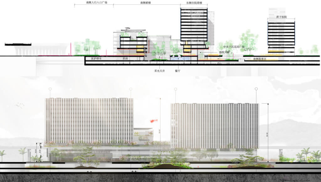
The Conghua Hospital Medical Campus is a large campus located thirty miles from Guangzhou, China. Set between a future medical school to the west and medical campus to the east, the client has a strong desire to bridge the two facilities with this new hospital complex. After showing several design options, the client was inclined towards the scheme of a field of zen gardens and another idea of flowing curves to connect the east and west. This resulted in a field of clear orthogonal grids of different scaled gardens and landscape features, with an organic landscape ravine and sunken garden that burrows through the campus which facilitates pedestrian travel on the upper levels and vehicular traffic and parking on the basement level. The idea of the field and the sunken gardens sprawls three dimensionally onto the language of the main hospital building, through terracing and the addition of skylight courtyards, enriching the spatial qualities of the outpatient podium, and creating a dynamic view for the in-patient towers.
Check out these previous posts in this series!
Design Week Series #1: Surgical Moves in Architecture
Design Week Series #2: Designing Buildings as an Extension of Their Surroundings
Design Week Series #3: Unique Features and Challenges
Design Week Series #4: Longstanding Client Relationships
Design Week Series #5: The Orchestrated Performance of a Building


