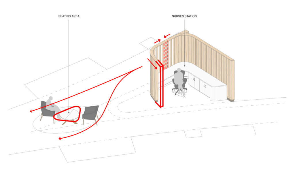
The Holyoke team worked alongside the Fabrication team to produce a quick but effective mockup of the nurse stations inside the resident wings at the new Soldiers’ Home in Holyoke. The configuration of the nurse stations have been a critical component since the beginning of the project: they are located at the intersection of the arcs that define the visitor entry corridor and the home’s service corridor, providing optimal visibility and proximity to each resident room.

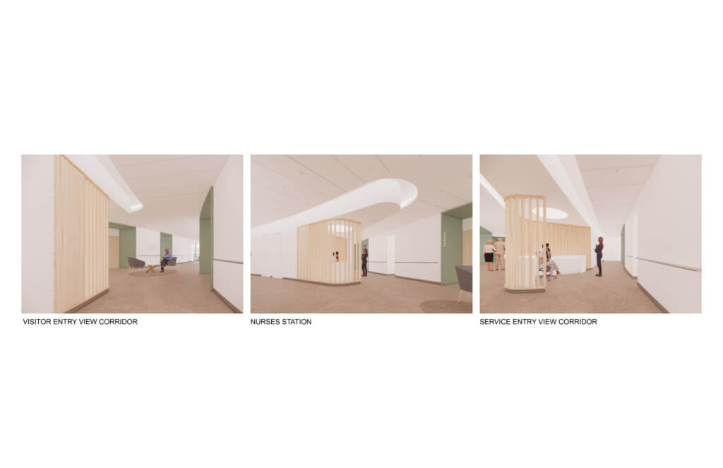
This node is the true center of each house, and as such, the design team has strived to maintain the feeling of ‘home’ as much as possible, while maintaining the functions that the nurses need. Wood fins wrap the stations and introduce a sense of warmth and softness at the core of the home. They are reminiscent of the fins that extend along the entrances and public level of the home in dialog with the natural landscape. The fins provide different levels of privacy and transparency as one walks through the corridor, allowing for the nurse station to share a space with a small seating area for visitors and residents alike.
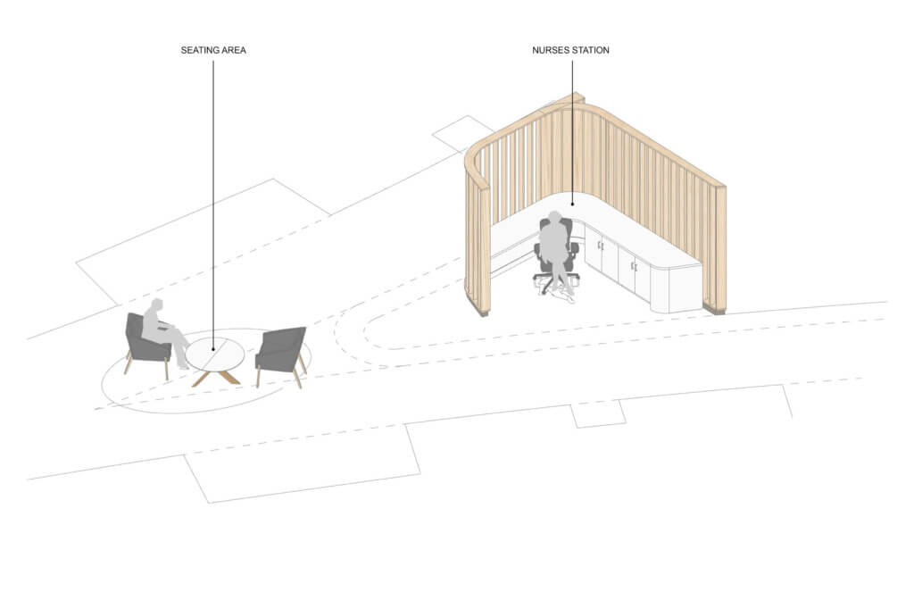
The mockup of the nurse station proved immensely helpful to test the details around the design: how does the scale of the space feel? Do we need to further calibrate the spacing of the fins to optimize privacy/transparency? Is the seating area comfortable? Is the nurse’s station and desk sized appropriately? What are we missing?
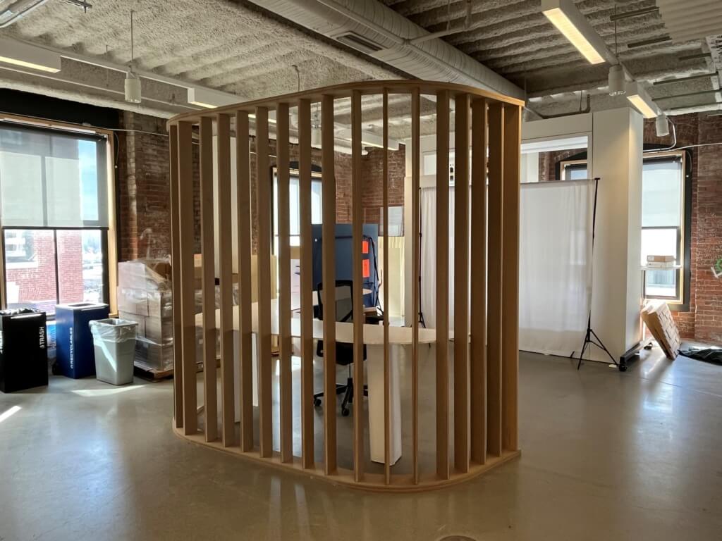
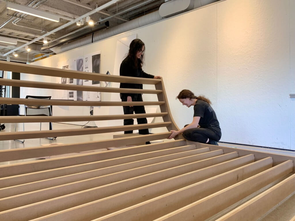
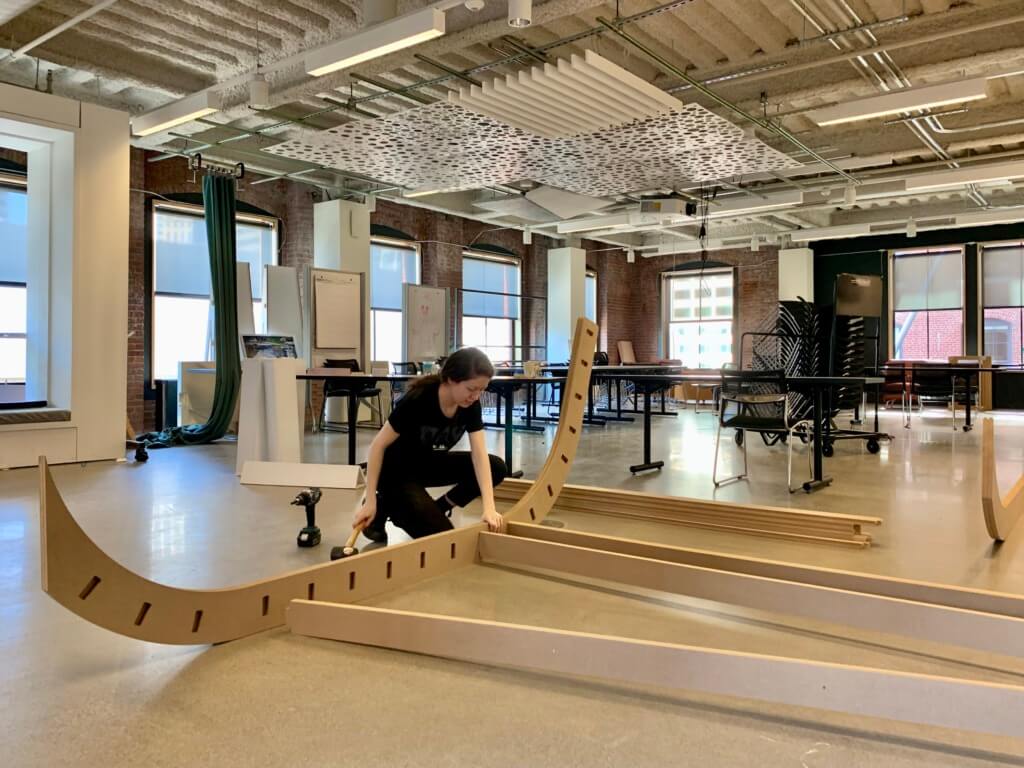
Experiencing a ‘live’ version of the design resulted in fresh observations from the design team that would have been more difficult to sense in a 3D model or rendering. The fabrication team taped out the corridor in the space and mocked up a portion of the wood fins in MDF along with the desk counter, and we used furniture from the office that approximated the size of those in the design for the seating area. The mockup included the right amount of information for the team to draw conclusions on short notice.

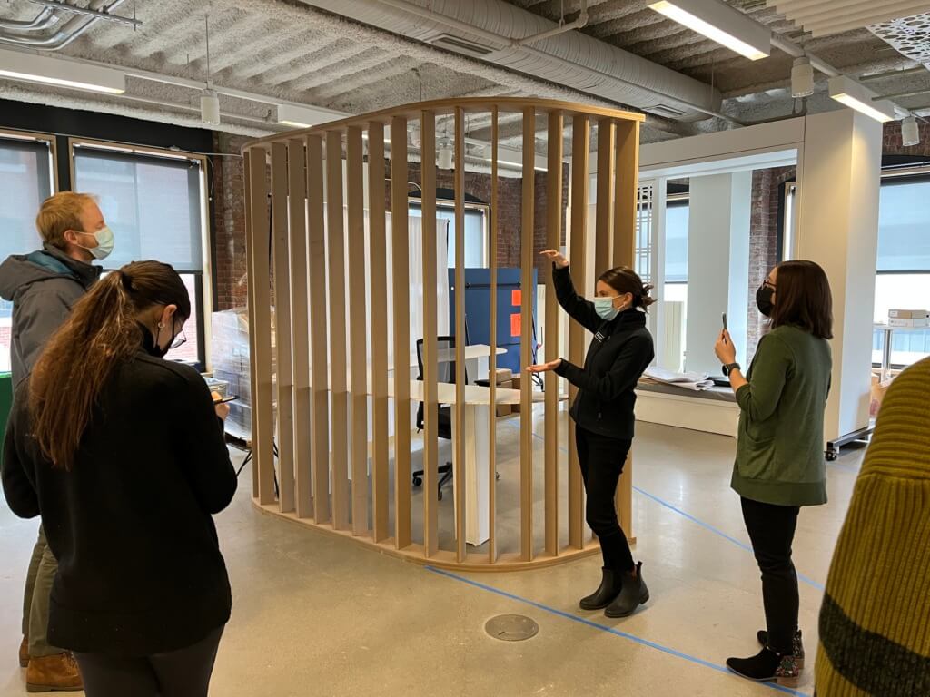
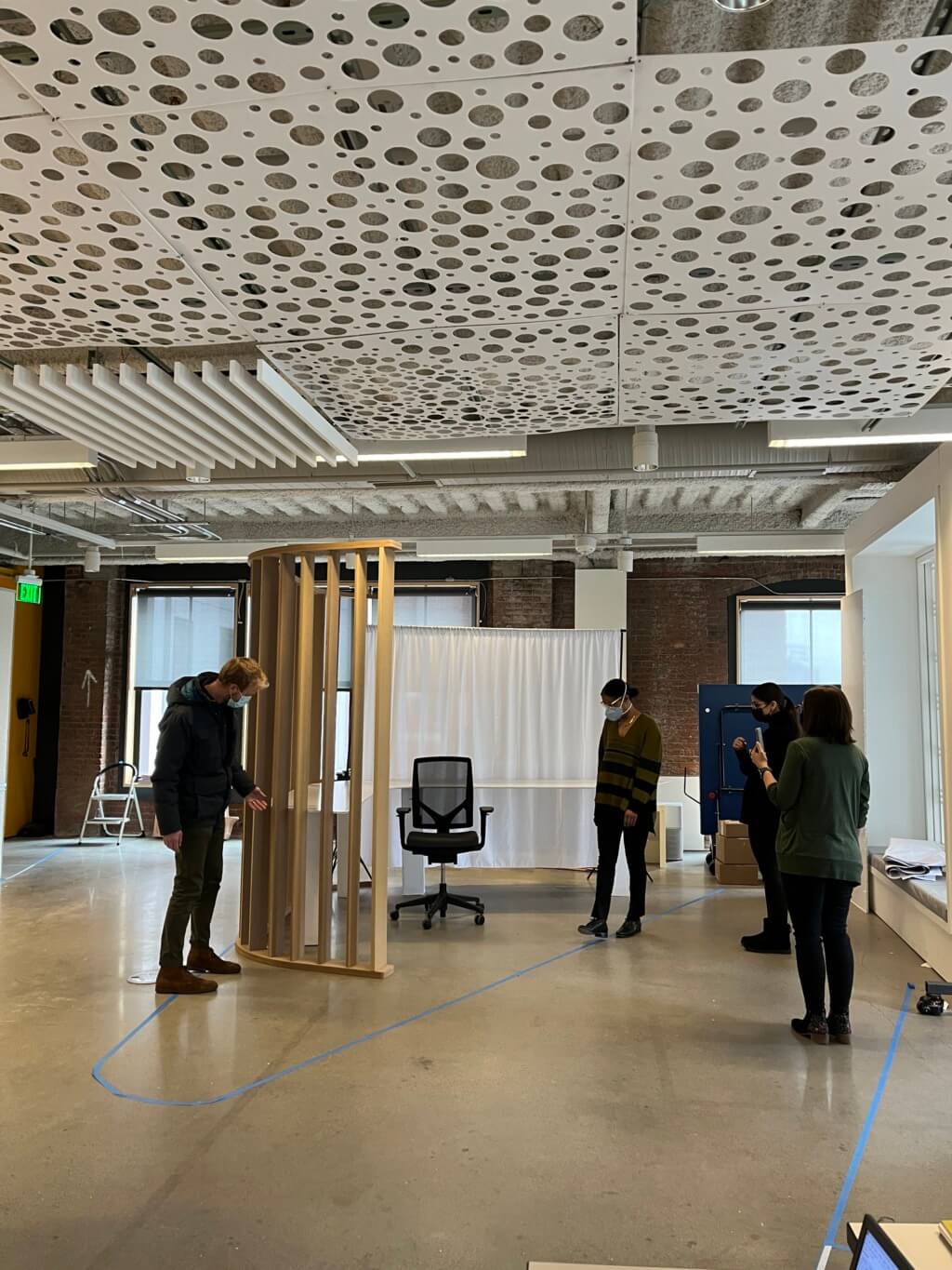
The team refined the design based on the key takeaways from the mockup: we have decreased the spacing of the wood fins and extended the screen to create more privacy and separation while allowing full visibility from within. We used the same mockup to test different degrees of fin separation to further verify their effectiveness. We also determined that shaping the table in the seating area created a stronger sense of circulation and helped generate new and unexpected seating configurations that are not constrained by the space’s axiality, but instead compliment natural flows of people moving through the space.
The mockup also prompted the team to look at the way the desk interacts with the fins and to make them architectonically integral to each other. The Fabrication team’s intuitive system of assembly enabled us to reconsider and simplify our assumptions about the way these fins ought to be detailed and efficiently constructed as a built-in piece of millwork.
