The first in a three-part series looking at façade strategies, focused primarily on more opaque assemblies (façade as wall), in three academic science projects.
PROCESS – ITERATIVE – ONE PART INFORMS ANOTHER
With any architectural project, there is (or one could argue, should be) a design intent or parti. The utility of a parti during design is a means of framing thinking and intent for each part of the building’s design. The complexity of building design has a pernicious way of forming itself into illegibility without the guide of some clear intent or agenda developed by a project team over the course of the project. Some of the most challenging and satisfying parts of project development involve attempts to engender an idea or intent into the constituent parts of a design. As architects, we often work towards clear and purposeful “part to whole” relationships that both reaffirm and enrich the building design intent. In my experience, the iterative process of architectural design is rarely linear, and the exact origins of any single component or idea are often difficult to pin down; the façade is no different. The overarching design parti can inform how one thinks through the façade design. But just as often, the façade design can cause one to reassess the logic of the overall building design. No matter the origin, in the end, the façade often gives clues to the building parti.
In this series, I will illustrate three recent science buildings that capitalize on specific part-to-whole relationships that further refine the larger design parti. I will not dwell on origins (the chicken or the egg), but rather attempt to speak about the larger design intent of these 3 projects by simply explaining the façade design. Though these façades are for similar project types, within similar campus contexts, and of similar material (primarily masonry walls), the design, and thus the techniques deployed, were quite diverse.
The first project leans more towards a traditional solid and singular mass that, through subtraction and form, reveals its contemporary ethos. The next focuses on the planar, attempting to be as thin as possible in a masonry medium not traditionally associated with thinness. The final project deploys strategies of materiality and oblique readings to blur overt distinctions between a binary façade system in favor of a series of fades from one system to the next.
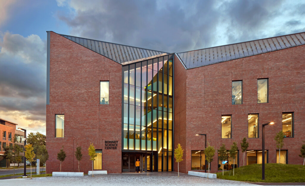
Bates College, Bonney Science Center
DESIGN INTENT Solid/Singular
OPERATIONS Subtraction/Cutting
The new Bonney Science Center at Bates College is a small science building on a traditional liberal arts campus in Maine. Respecting the campus fabric, while creating a contemporary academic building, was a central theme of the project.
FORMAL CUES FROM CONTEXT – WHAT ARE THE LIMITS AND OPPORTUNITIES?
The façade strategy for the new Bonney Science Center is all in service to the primacy of the building’s singular form. The Bates campus context is comprised of a series of discreet masonry buildings; the simplicity of their forms reinforce their solidity and mass and in concert, unifies the campus. Not dissimilar to many northeast campuses, the buildings project solidity, permanence and heft. While the individual building masses are of a singular disposition, the roof lines celebrate idiosyncratic formal flourishes – gables, hips, dormers, spires, chimneys, etc. The Bonney Science Center learns from both. It is a strong singular mass with an animated integral roof form.
There was never a question as to what the material for the façades of the Bonney Science Center would be; nearly every façade on campus is comprised of water-struck Morin brick. The challenge for the design team was how to re-interpret and make contemporary ideas of permeance and heaviness. Early design explorations posited the idea that expressing the building as a singular form, in opposition to ideas of multiple forms connected by gaskets, would help give the building a sense of weight. Our earliest studies were purposely carved and cut out of foam. By using a medium that is monolithic and singular, our methods of shaping it were purposely limited to subtraction. This modeling material helped us quickly hone onto forms that resonated a sense of mass. To reinforce the legibility of a singular building form, the façade was treated as the edge or limit of a solid mass rather than a wrapper around programmed space.
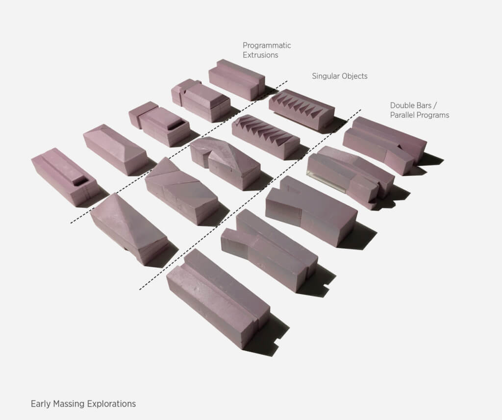
STUDY MODELS – early investigations into solidity & subtraction.
Addressing the Quad & Marking Entry
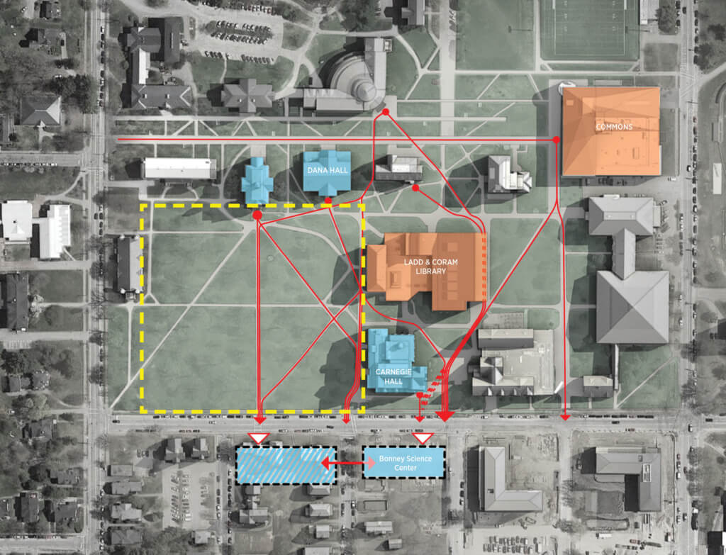
TWO PRIMARY CAMPUS PRESSURES While the project sits on the southeastern corner of the historic quad, students access the building through the middle of the north façade. These two moments lead to the most dramatic aberrations of the building’s form and masonry façade. The mid-block north entry is defined by a large vertical subtraction from the building mass. To address the quad, the northwestern corner of the building stretches north towards the quad and a strategic cut positions a triple-story window, the Beacon, for views onto the campus green.
THE ENTRY VOID The entry notch geometry works at both the campus scale, alluding to traditional gable forms and the building scale, concealing a vestibule into a monumental stair with expansive views. The primary student approach from the north is through a small courtyard abutted by gable ended façades and dormer windows. The subtractive entry figure is a contemporary nod to these traditional forms; the on-axis approach flattens the figure into a simple gable but oblique views reveal a more complex geometry. The subtraction or cut at the entry reveals a material change from masonry wall to glass curtainwall façade. Just behind this glazing is the building’s primary stair. Conceived as a ‘ship in a bottle,’ the stair contorts and turns to fit within the tight boundaries. The folded stair becomes a playful figure that can be seen as one approaches the building, creates varying dynamic views out towards the campus and conceals an interior conditioned vestibule within the first run of stairs.
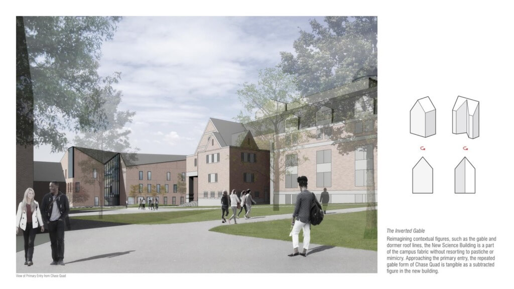
ENTRY NOTCH – inverted/phenomenal gable ties building geometry to context.
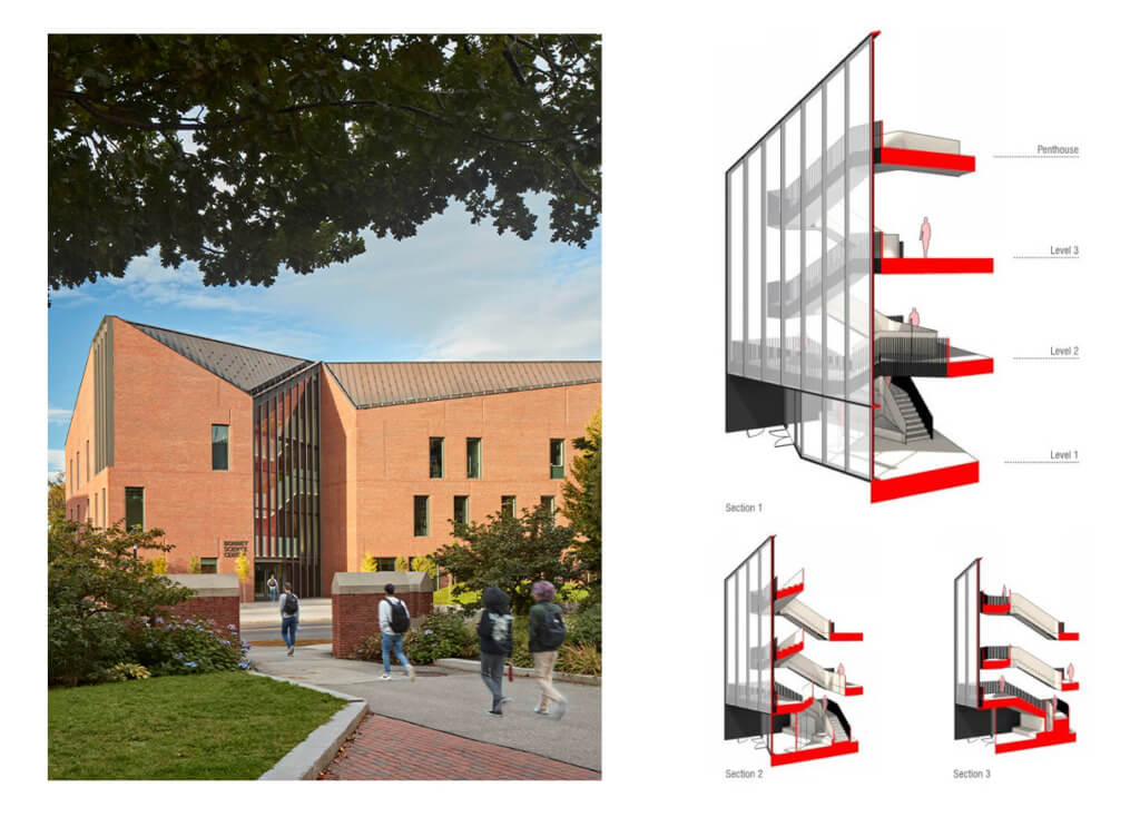
ENTRY NOTCH – ‘ship in the bottle’ stair.
THE CAMPUS BEACON
The siting of this project gives the building a corner in the historic campus quad. Making the most of this location, the building form has been designed so that the northeast corner extends towards the historic green space as far as site setbacks allow.
Located at this corner, a multi-height shared commons space is perched above the quad with a triple-story window framing an expansive view. From the campus, the large window is a glowing beacon inviting the campus in and holding the corner of the historic quad. Tectonically, this aperture is treated as another incision into the solid brick mass. The glass curtainwall figure is expressed on both the north and eastern façades. Along the north it is a typical 2-sided glazed curtainwall, but on the east, the frame of the glass wall is expressed as a 16” deep system giving the curtainwall a 3-dimensional presence. It is as if the first 16” of the brick mass were cut away and a secondary system (the curtain wall) was ‘tipped into’ the void.
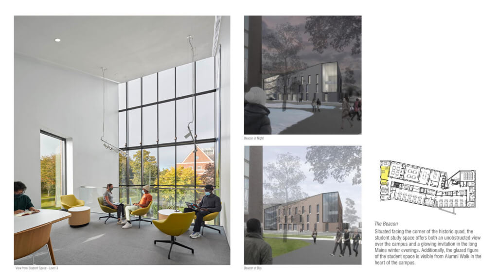
BEACON – northeast corner of the building holds the corner of the historic quad with multi-height shared commons space.
BEACON – a more precise incision at the NE corner objectifies the curtainwall and supports the reading of solidity.
SMALLER SCALE – MASONRY TECTONICS
The subtractive strategies as described above give a language that is both contextual and contemporary within the campus context, but taken alone they result in a large brick mass with little to no articulation. As with most historic buildings, the Bates campus is replete with structures that delight in craft and detail at the middle to small scale – intricate and varied brick coursing, inset stone details, corner coining, window lintels and keystone, etc. The Bonney Science Center uses a series of masonry techniques to bring care and attention to the craft of the building, reinforce the subtractive design strategy and address the technical mandates of a masonry veneer wall.
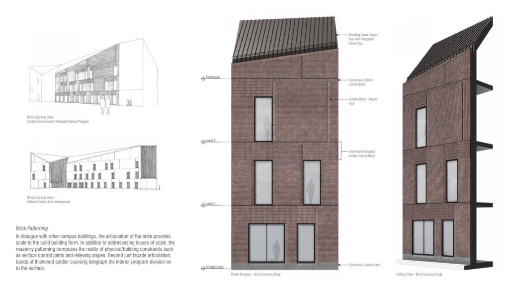
MASONRY WALL TECTONICS – early intent sketches and partial renderings.
SOLDIER COURSE BANDS The 3-4 story façade wall is broken up into a series of single-story zones by bands of soldier coursing. These bands coincide with the floors of the building, giving an overall perceivable scale to the building and allowing the idiosyncratic floor to floor window placements to move as dictated by the programs inside. Furthermore, these soldier coursed bands vary from a single course high to 6 courses high. The staggered starting and stopping of the expanded soldier course bands is a direct projection of the programs just behind the façade, starting and stopping with each room/programmatic division. Beyond an aesthetic flourish, these horizontal datums align with the structural steel relieving angles that support the masonry walls and help to conceal the necessary joint and wall flashing.
CONTROL JOINT “CUTS” Further reducing the scale of the wall are a series of vertical ‘cuts’ into the stone wall. These are custom formed bricks with an angled face that visibly recesses into the masonry wall. These interruptions to the fabric of the wall help to break down the scale of the wall, add some light and shadow play at the windows jambs, and help to further animate the monolithic building. In addition to the desired visual effects of this custom brick, the vertical ‘cuts’ conceal a movement control joint in the masonry wall. Often the control joints in a masonry façade can betray the reading of solidity, instead making a brick wall feel like a panelized façade. By combining the location of movement joints with a subtractive strategy, the masonry façades retain their ‘heaviness’ and perform as required.
THE FIFTH FACADE
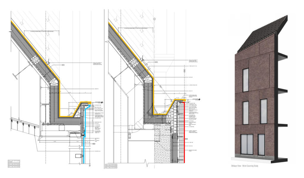
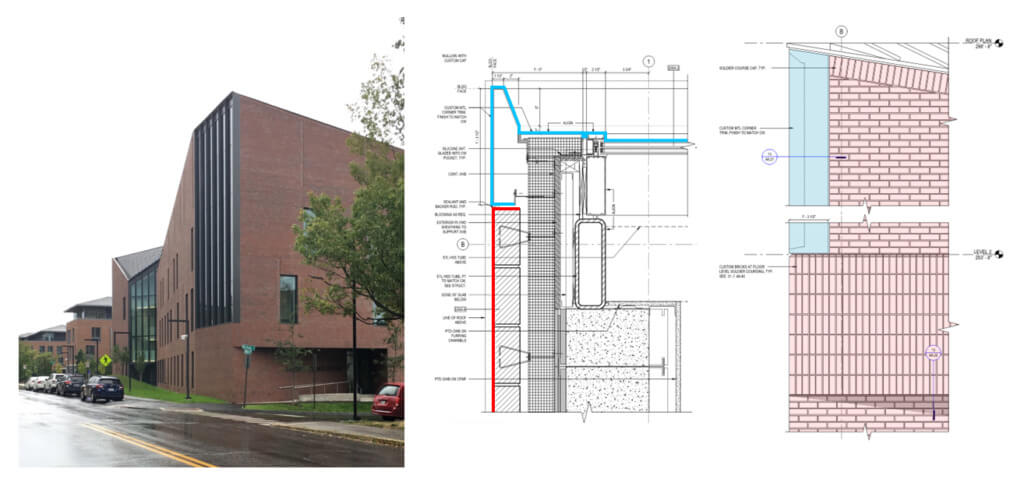
PERIMETER GUTTER ASSEMBLY – detail at masonry wall and curtain wall.
Following contextual cues, the roof of the Bonney Science center is the most animated of all the building surfaces. Sharing a single continuous apex, the roof conceals a mechanical penthouse offset from the perimeter of the building form. From that space the building form is carved. In order to read the building as a singular mass, the roof becomes a 5th façade. The transition from the wall to the roof must read as a fold in a façade, not a parapet in front of a roof or, worse, a roof plane extending beyond the face of the façade. The most challenging detail, both technically and aesthetically, was to ensure the functioning of a steep pitched roof in Maine while making the interface between roof and façade read as nothing more than a corner of a single mass. Concealed behind a continuous brick soldier course, the water and snow management are controlled in a continuous perimeter gutter. This brick course defines the top edge of the façade wall but also the corner of the building form that changes from masonry wall to copper roof.
The challenges of the façade at the Bonney Science Center were complex and involved deep collaborative investigations with our consultants and client. However, there was very little disagreement about what the intent for this façade was. The early study models cut from foam led to clear ideas about form. Those simple studies were a constant touchstone for evaluating form, technique and aesthetics.
In the next installment of this series, we will look at another academic building that used brick to support a very different design intent.

