Over the past year, I was involved in a design opportunity for a computed tomography space for Massachusetts General Hospital alongside Senior Associate Susan Blomquist. The project renovated an existing CT scanner space and its associated control room, both of which were needed an aesthetic refresh and an update to efficiency and functionality. MGH was extremely passionate about designing a new, functional space that represented the complexity of the imaging equipment while also creating a calm and soothing experience for patients and staff.

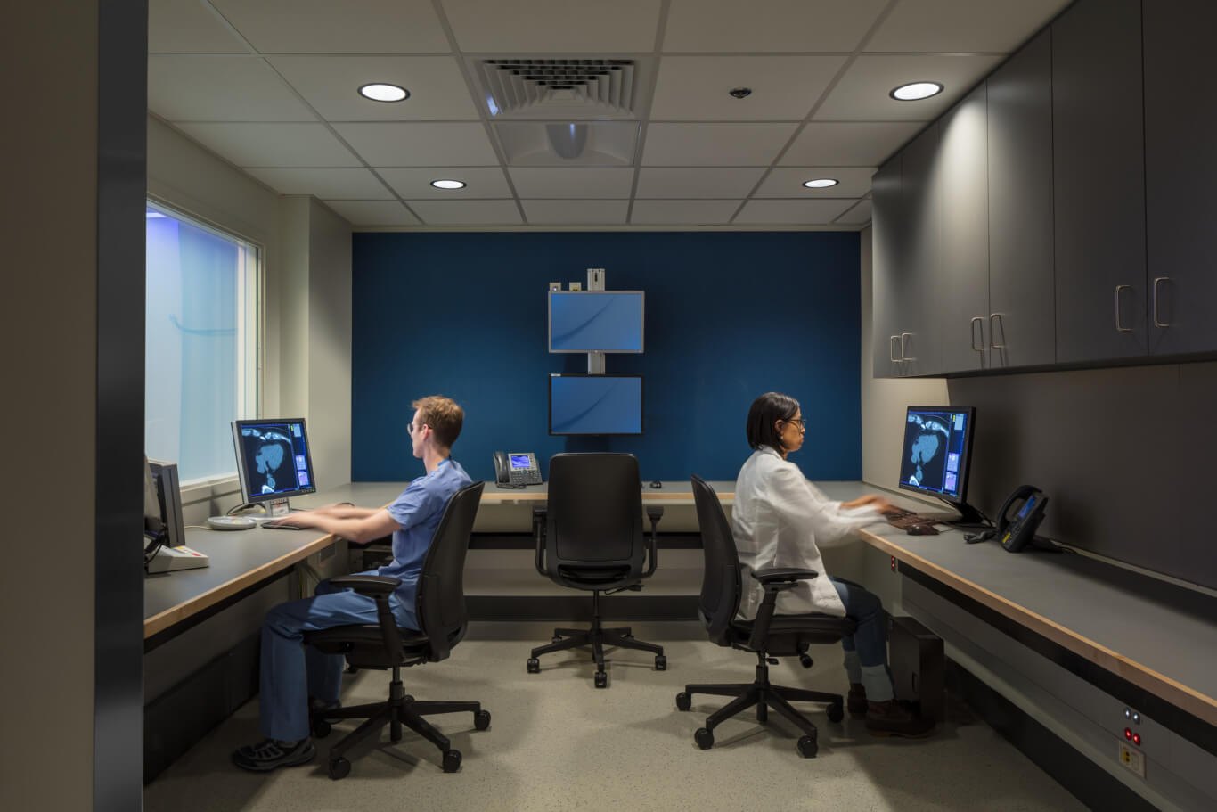
We began by redesigning the control room to put all the workstations on one side. There was plenty of space to consolidate the workstations back to back, maximizing staff collaboration. The staff made it clear to us that plenty of storage space was a must, so we allocated space to store documents as well as personal belongings, such as winter coats and boots (since the project is in Boston, this is a necessity), in the control room.

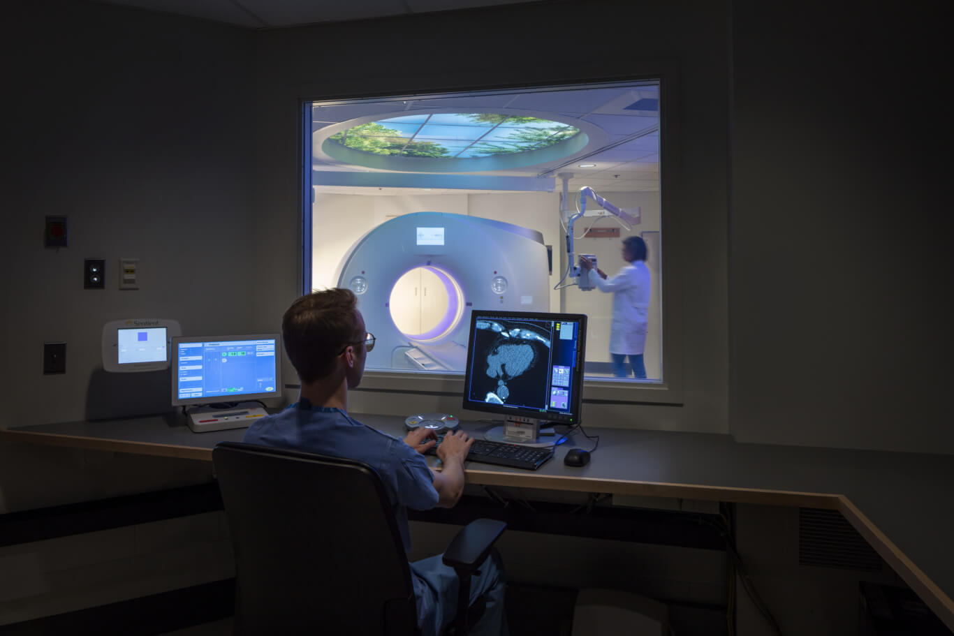
To avoid having curtains or blinds over the view window into the scanner room, we used privacy glass that can go from transparent to opaque when flipping a switch. One detail that we’ve been adding to all our control rooms recently is designing the counter to pull away from the wall in the control room to prevent having to put grommets on the countertop. We’ve found that grommets really limit where staff can put their equipment, so having a continuous gap between the wall and the counter allows for maximum flexibility and adaptability for workstations in the space. We also have a continuous power/data raceway and wire management system that help clean up the clutter under the counter.

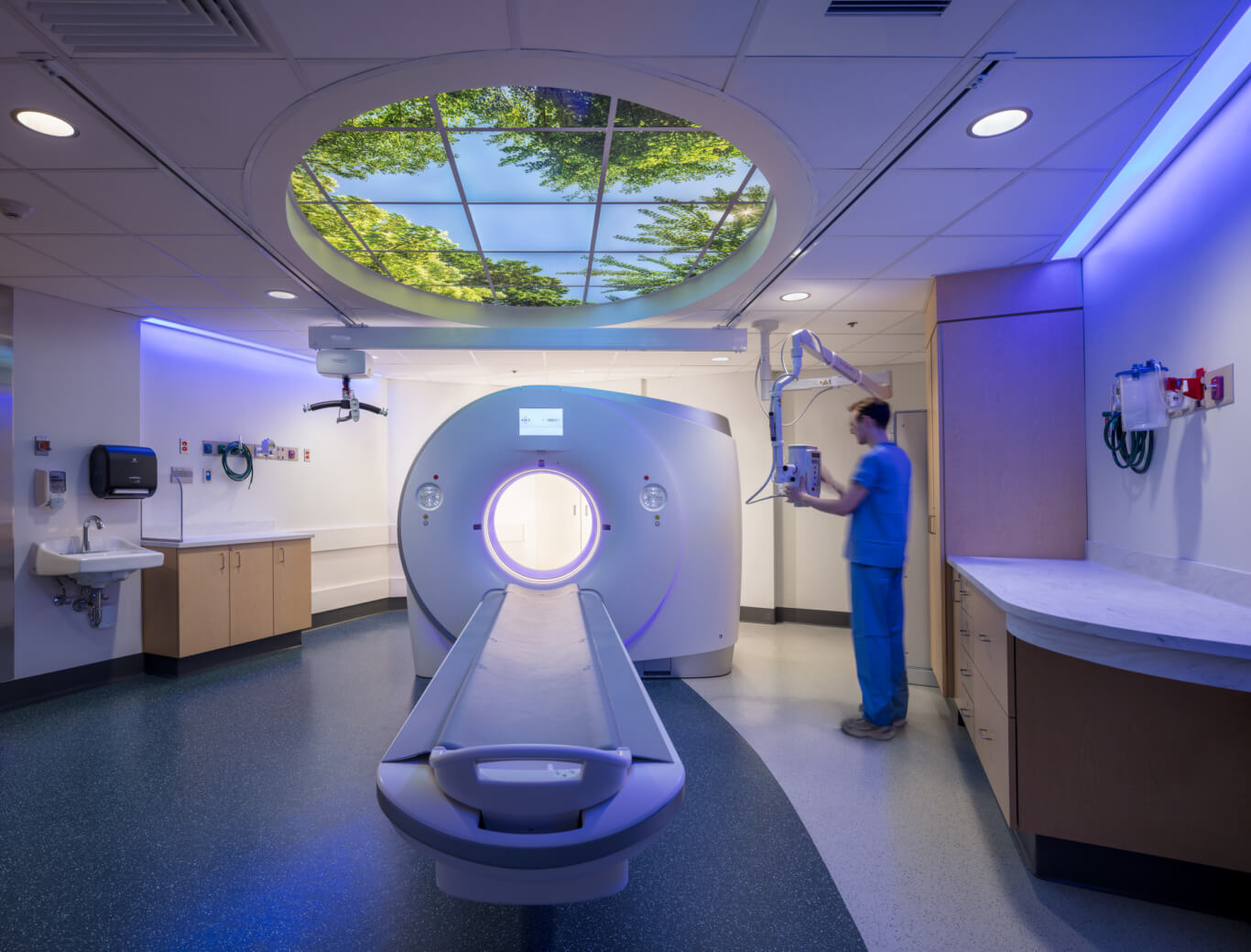
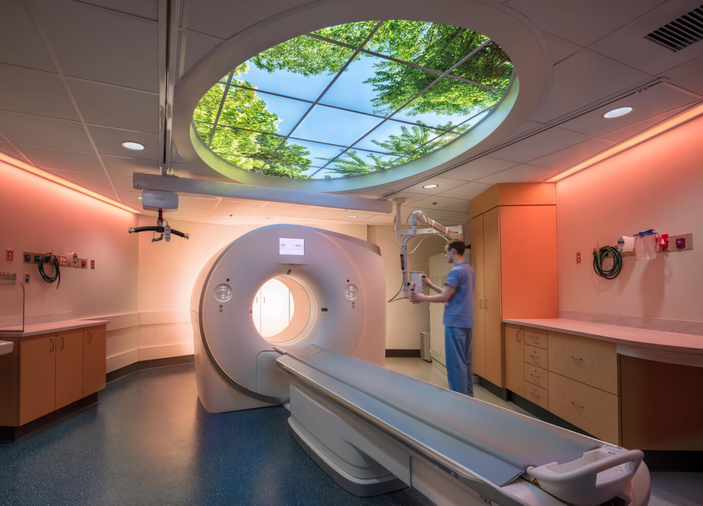
Because we reorganized the control room, we had to rotate the CT from its original orientation in the scanner room. This reorientation gives staff a better view down the scanner table towards the CT gantry. The staff needed storage and counter space on either side of the CT table in this room; we saw this as an opportunity to bring in warm wood textures to create a nice contrast to the sleek white texture of the equipment. One of the main featured elements that we added to improve the patient experience was a backlit image panel in the ceiling. Patients can be laying on the CT table looking at ceiling for quite a while, so we – along with MGH – wanted to provide the patient with a soothing visual above the table. In an area of the hospital that doesn’t get any access to nature, this feature creates the feeling of gazing through a window at a natural scene, which in these photos was picked by the staff, because they also benefit from looking at this scene from the control room. We continued to enhance the ambience in the room by adding color-changing lighting on the periphery of the room. It was important to make the walls in the space white to really make the colored, linear lights as effective as possible.

We received a ton of positive feedback on the design of the room from MGH. The staff in particular really enjoy the lighting and oval ceiling features while working in the space. One of the users also shared a story with us about a pediatric patient who was initially scared to get a CT scan. This particular patient was very upset about having to lie on the table, but really liked the “big window” in the ceiling. Staff also asked the patient what their favorite color was, and changed the ambient lighting to that color. The patient thought it was so cool that they had control over their environment, which helped to take the scare out of their scan.


