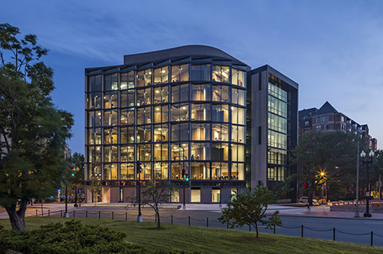
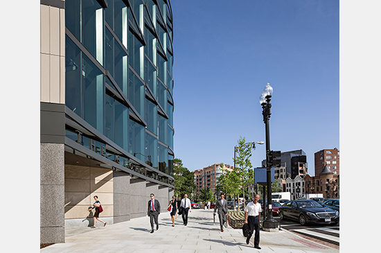
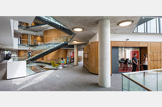
Most academic buildings offer few opportunities to enliven the street the same way that commercial buildings do — with retail space, cafes or restaurants. As a result, the Milken Institute School of Public Health at the George Washington University engages the public space surrounding it in other ways: through careful placement of key components of its space program; thoughtful massing and façade articulation; architectural craft and attention to detail; and the creative treatment of the building’s base.
Many Contexts
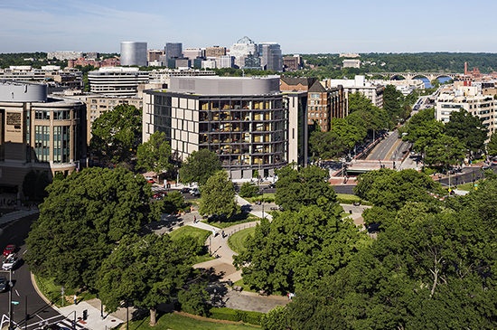
The urban character of this relatively small and oddly shaped site is very unusual. Each of its four principal edges presents a completely different urban context.
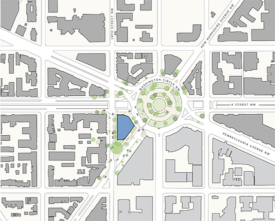
24th Street NW is quiet and residential; mid-20th century apartment buildings sit side-by-side with historic 19th century row-houses, marking the transition between the university campus and the Foggy Bottom Historic District. Here, rhythmic patterns of smallish punched windows and projecting bays, coupled with the predominant use of yellow and brown brick, soften pronounced differences in scale.
By contrast, the buildings lining New Hampshire Avenue are larger and more uniform. Directly opposite the site, the university’s colossal medical center commands this stretch of New Hampshire Ave, extending all the way from the Circle to I Street NW and the GWU Metro station. Whereas its ground floor is tall and largely bereft of fenestration, its upper façade is heavily articulated by deep, multistory window recesses.
The site’s curvilinear third side faces directly onto Washington Circle and the leafy park at its center, forming one relatively narrow segment of the circle’s broad circumference. K Street defines the site’s shortest edge. It splits into two travel lanes at this location, a surface road and an underpass which diverts traffic under the Circle.
One Building
While the footprint of the new building is only 19,000 GSF, it is free-standing and completely fills the site. As a result, the central challenge for the project was to design a building that could be highly responsive to each side of the site’s unique character, yet somehow also mitigate these differences to form a cohesive whole. This strategy differs from the way in which many Washington, D.C. buildings maintain relative uniformity, irrespective of comparable changes in context.
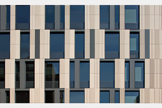
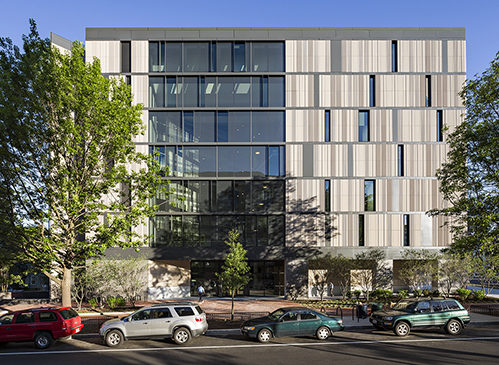
Although each of the building’s principal façades is very different in feel, each is composed of common elements: vertical terra cotta rain screen panels, which are similar to yellow brick in earthiness yet similar to limestone in scale and monumentality; metal trim bands and panels, which provide scale and horizontal continuity from side to side; and transparent glass, employed in both punched windows and large expanses of curtain wall.
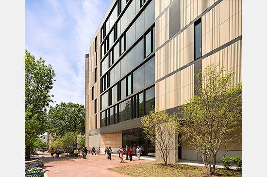
The building’s mostly terra cotta façade along 24th Street is interrupted by an alternating pattern of tall window openings set in deep frames. Coupled with a planted setback zone, low shrubs and a row of meandering birch trees, the treatment side of the building is appropriately deferential to residents of 24th Street, yet still provides them with the liveliness and variety of a neighborhood thoroughfare. Because it is home to faculty offices, this side of the building will be relatively dark at night.
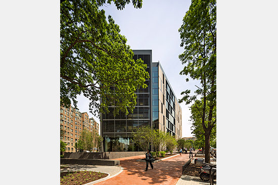
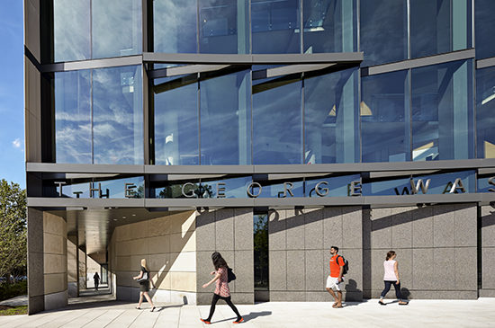
Along the New Hampshire Avenue façade, this pattern of punched windows becomes more erratic, giving way to a 6-story picture window marking the building’s entrance. The building’s scale along this side responds to the enormous recesses on the medical center across the street. This façade is also recessed along a portion of the ground floor, where a covered arcade, clad in reclaimed limestone from the prior building on the site, connects the building’s entrance to the Circle. Unlike most public buildings in this neighborhood, the ground floor is deliberately modest in height and articulation, deferring attention upwards to the activities visible therein. Where made possible by the building’s internal classroom distribution, tall windows allow glimpses of the school life inside.
The terra cotta panels on these two façades feature an alternating pattern of narrow ribs that subtly project from their face. Depending upon sun position and other atmospheric conditions, variations in the shadow patterns created by these ribs can cause the building to progressively alter its appearance over the course of the day. Sometimes the ribs cast deep shadows; at other times, their edges create bright pin-stripes of light. Far from being gratuitous, these visual effects are important attributes of an urban campus building. While some people will only experience the building from a passing car, a great many more people will interact intimately with it every day. These unexpected variations enliven their daily experience.
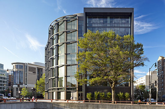
The building’s most dramatic façade is reserved for the site’s most important side, facing Washington Circle. Following time-honored historic precedent, it is conventional practice to reinforce the urban geometry of a monumental civic circle by presenting either a convex or concave face to it. There are multiple examples of both these conditions on Washington Circle.
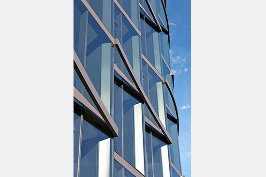
Here, recognizing that the underpass precludes any development along K Street north of the site, the building presents an unusual double-curved glass wall to the Circle. Half of its length follows the shallow expected concave arc, generated by the Circle’s radial form. The other half, however, is convex in shape; it bends outwards towards the K Street corridor. Moreover, the glass wall is not a conventional, continuous plane of glass, but rather an array of nine individual facets, stepped along the double curve in a saw-tooth pattern. The continuous metal bands which denote each floor level on the taut New Hampshire and 24th Street façades here suddenly become three-dimensional, taking the form of segmented arcs that carry the building’s kinetic energy around the Circle and west along K Street.
This last theatrical aspect of the design also has its roots in the belief that urban buildings have a special obligation to enliven the cities in which they sit. While the long sides of each projecting saw-tooth bay are glazed from floor-to-ceiling, providing unobstructed views of the student study spaces and bamboo-clad classrooms beyond, solid panels fill in the short return leg of each bay. What looks like an entirely transparent building when approached from the east, unexpectedly presents itself as a solid building when seen from the opposing path of travel.

