This week, our Women in Design group spotlights the work our firm has done in the field of fabrication and modeling. They have organized a series of events intended to re-introduce the role of fabrication in the office and to foster more inclusive fabrication practices firm wide. Our blog this week will feature some of the most recent things to come out of our FabLAB. Keep an eye on @PAYETTEpeople on Instagram and twitter for more!
Hengqin Innovation Center Brick Mock-ups
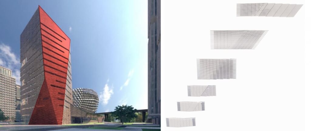
As the centerpiece of the science city on Hengqin Island, the client tasked us with creating an eye-catching building for their Innovation Center. In typical PAYETTE fashion, we took that request a step further by telling a story with the building about the elevated landscape park as it winds around the neighboring buildings and into ours, where it becomes a nest for a precious jewel to sit atop. The tower and landscape plinth have a mountainous language that is in conversation with the elevated greenway. We chose brick to further evoke the feeling of an old, rough mountain that has stood there for centuries.

The team was convinced that a long, thin brick would best relate to the horizontal striations throughout the project. These striations are particularly evident in the ribbon windows around the brick façades, the long concrete balconies across the east façade and the elevated landscape plinth at level 3. Initially, the only additional texture to the brick was the introduction of a variety of earthy tones, influenced by ancient Chinese pottery.

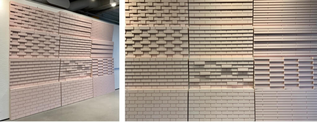
After studying several fanciful brick patterned projects in China, we explored the utilization of different brick laying techniques to further accentuate the facets of the tower geometry. We studied various approaches in both a standard brick and a longer roman brick. Both were tested in a traditional stack bond. Additionally, the standard brick was tested in a Flemish bond (popping the end brick in/out), and we tested the roman brick by rotating about its centroid to pixelate the faced. We also tested variations of corbeling (when bricks step in/out at each course), as these were the façades we were most interested in adding texture to.

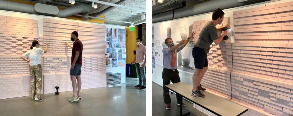
After studying numerous brick layouts and patterns, we decided to cut a full-size mock-up to better understand the reality of what we had drawn digitally. Our digital renderings focused on how the bricks turn corners. But, our mock-up focused on the wall faces (both flat and tilted/cobbled) because these are the most common conditions. Through digital modeling we learned that using roman bricks makes it difficult to resolve the complex seams of the tower, because they provide a lower fidelity translation of the pure form. They are also shorter, so each step in cobbling is less noticeable than with a standard brick.

Upon entering the room to view our mock-ups the team quickly decided that a standard brick in a standard running bond worked best. We realized that all the decorative patterns we studied were nice in a small sample – but would be an overzealous approach to an 85m tower. There is a lot that we can design, model and imagine in 3D, and although the tools we use don’t exactly replicate reality, they get us close and lead us to asking the right questions that ultimately guide us to a better design solution.


