As part of the Space Strategies group, PAYETTE’s software development team creates custom internal and external software applications and data analysis studies for various project teams at PAYETTE. Building Science asked the software development team group to develop a tool for performing Life Cycle Assessments early in the design process.
The result is Kaleidoscope, a user-friendly web application designed to help architects perform Life Cycle Assessments (LCAs) which measure the environmental impacts (including embodied carbon) of materials, including all the energy used from extraction of natural resources to the emissions caused at the end of a material’s useful life. In this post we will discuss creating Kaleidoscope from a software development perspective.

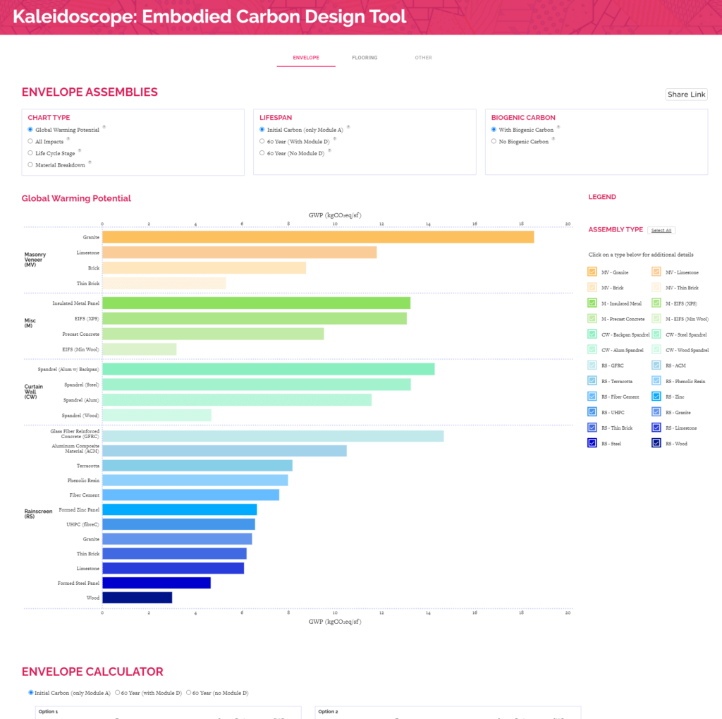
Screenshot of final Kaleidoscope tool with tabs allowing user to toggle between envelope (façades) and flooring. Users can also adjust chart types, LCA modeling options, and an interactive barchart.
While several existing tools to study LCA already existed, most of them first required architects to create a detailed model of the system. The Building Science team wanted a tool that could be used very early in the design process before a building model was even created. When we first met with the Building Science team, they had already created a process for comparing the LCA of various façade systems (learn more about that process on the Kaleidoscope page). They had the underlying data in Excel along with some sample charts. What they wanted from our software team was a user-friendly interface for exploring the data and comparing façade systems.
Our first few meetings focused on learning about the process the Building Science team had created for performing LCAs. We then created a list of features and goals for the tool. We sketched some user interface ideas on paper, created digital mockups, and then began creating the first prototype.
We first tried building Kaleidoscope in Microsoft Power BI, a tool that lets you easily create web-based dashboards of charts and graphs using a drag-and-drop interface. We were already using Power BI for other data analysis tasks at PAYETTE so we wanted to see if we could make it work for Kaleidoscope as well. We knew from the start that it might not offer us enough flexibility (in terms of user interface design) but it would allow for the very quick development of a first prototype. We did a few iterations of our Power BI dashboard and built a similar version in Tableau (another drag and drop data visualization platform with the ability to create data dashboards).
Ultimately, after creating a few variations of Kaleidoscope in Power BI and Tableau, we decided that in order to achieve the level of flexibility we wanted we would need to build a custom web application. Some of the final features built included a custom popup dialog providing additional information about material systems, a highly customized interactive bar-chart with custom hover states, a customized chart legend that served as a legend, material toggle and detailed material. Although we did not end up using the Power BI and Tableau dashboards in the final product, it was a valuable exercise enabling us to quickly refine our software requirements, learn how to work with and visualize the data and have a tangible working application to communicate ideas and get quick feedback from the Building Science team.

A highly compact legend serves multiple purposes including chart color labeling, checkboxes for enabling/disabling various material systems in the chart and providing links for learning more about each material system.
At PAYETTE, we develop most of our web-based software applications using the Node.js JavaScript based front-end framework React. It is popular, well supported with an active community and reliable. For simplicity we wanted the entire application to be a front-end app with no database backend. Building Science releases all of their applications as open-source software so we did all of our development for Kaleidoscope on Github. We used the npm plugin `gh-pages` which allowed us to create a script for deployment. By just running `npm run deploy` we can generate a static efficient build of React, which then gets automatically copied over to the Github pages branch. Our app gets hosted in Github pages and we just include it on the PAYETTE website at its canonical URL using an IFRAME.
Since our entire application is client-side we include all the Building Science team’s data in CSV files committed directly to git. Although this approach requires a developer to commit and re-release the code anytime the files are updated the simplicity of not having to create and maintain a backend server and database makes the tradeoff worth it (at least initially). Over time we have discovered that the Building Science team does want to make more frequent updates and test revisions more independently. Although the scope and frequency of updates probably still does not warrant creating a backend administrator interface (in terms of programmer time) we are currently exploring options for making the process of adding materials and updating CSV files more seamless and feasible for non-developers to perform.
In addition to user interface controls, the main feature of the application is a highly customized bar graph that allows users to compare different LCA metrics for a variety of façade and flooring materials. With our React apps we typically use Nivo, visx (formerly vx) or SVG. Nivo is a high-level charting library that contains many pre-built charts and graphs for React. Visx is a low-level library that provides thin wrappers around d3 and SVG that allows d3 and SVG to interact with React state. Finally, we sometimes just code vanilla SVG directly into functional React components (re-rendering the entire SVG graph on all state changes).
For this project we knew we wanted to highly customize the charts, so we built all our graphics using the visx library. For our main bar chart we started from their bar chart example and then began customizing, and then did the same with our pie charts.

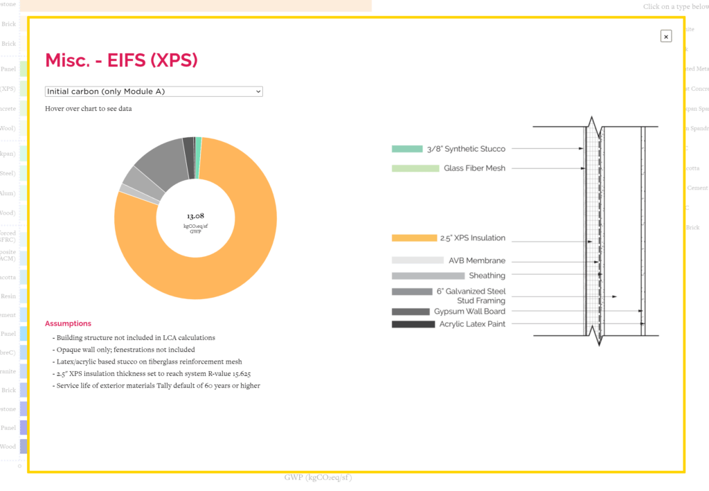
Detailed material system dialog giving the user additional details on how each material system was modeled and providing more detailed breakdowns of how individual materials within the system contributed to the overall LCA.

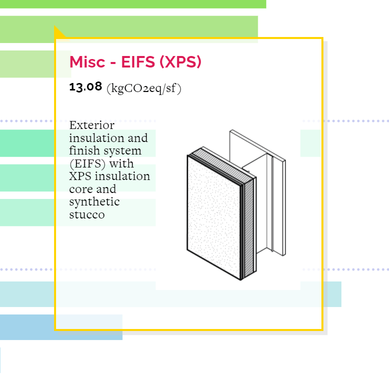
Custom hover states allow users to view detailed material information and design when they hover over bar chart bars.
We created a development version of the tool and released it regularly to a staging server with a private URL. The Building Science team viewed the staging version and gave us feedback and comments every few weeks. Whenever we were confident with the state of the staging application, we would merge our changes to the production application. We followed a very iterative approach, adding features and tweaking the user interface as we received feedback.
As with all PAYETTE Building Science tools, we released Kaleidoscope as an open-source tool on Github.


