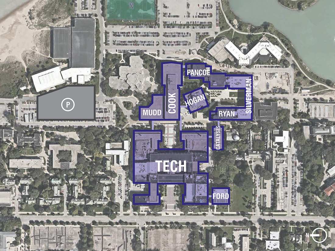
Master Planning for research can be a formidable task, because you are faced with an enormous number of variables from the outset. It is easy to dive too quickly into the fine details and lose sight of the big picture. To help our design teams and clients synthesize the information, we’ve created a visualization process that can be understood easily and it’s a method that offers potential solutions.
The first step of the process is to collect information about the University’s existing research spaces and brainstorm about meeting their needs. In the example project depicted here, the client provided information regarding existing connections and hierarchies between their institutes, centers and cores. Based on the information provided, we worked to re-visualize these connections to be clearer and more graphically appealing.
To help synthesize information, we created and evaluated a number of diagrams using the visualization tool D3 JavaScript. D3 stands for Data Driven Documents, and two of the advantages of using D3 are that the diagrams are interactive and coded, making it easy to edit when changes are implemented.
To create the diagrams, we searched on the D3 website for existing diagrams that paired well with our information and then copied their open source code into our own JSON file to edit the code to display our information. It takes some deductive reasoning to figure out how the edits to the original code will display in diagram form, but once that aspect is resolved, the rest of the process is simpler.
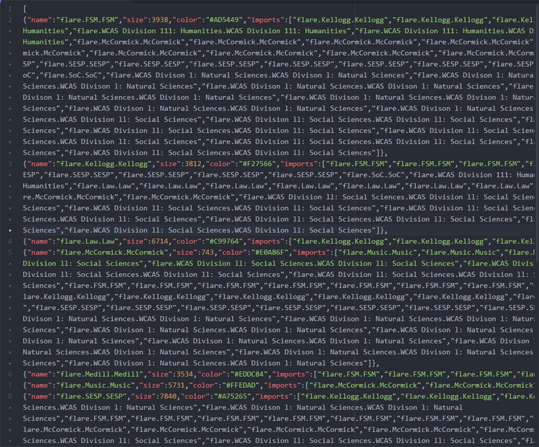
Checking to see if the code properly translates to a diagram is very important, so after every couple lines of code, we saved the JSON file and opened the HTML file to check if it worked. After all of the information was coded, we did one final check to see if the diagram that we produced was a clear representation of our data.
To edit graphic elements of the diagram, there is an extension that allowed us the save the diagrams as SVG files that could be opened in Adobe Illustrator.
For example, we originally received a chart from the University that broke down the number of collaborations between the different schools based on coauthored publications written. Using this information, we created a chord diagram demonstrating the frequency of collaboration across disciplines and mapped the number of papers coauthored between schools.
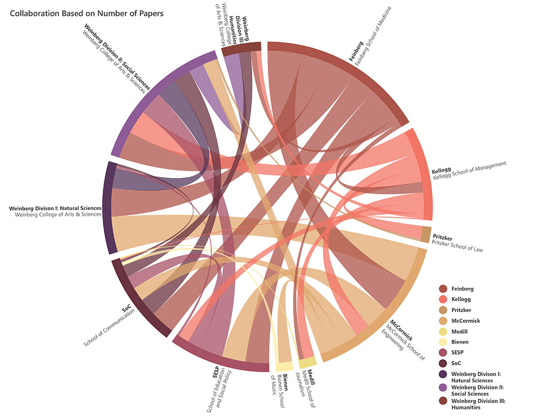
We edited the code to create connections between each school. The difference in the code for this diagram is that there is a number for each connection. By editing the number based on the number of papers shared between schools, the thickness of each line changed accordingly. What makes this diagram slightly unclear is the colors, because they are connecting two different schools but only take on the color of one school. There are also a lot of overlapping lines which makes the diagram a little harder to read.
We also tried a hierarchical edge bundling diagram:
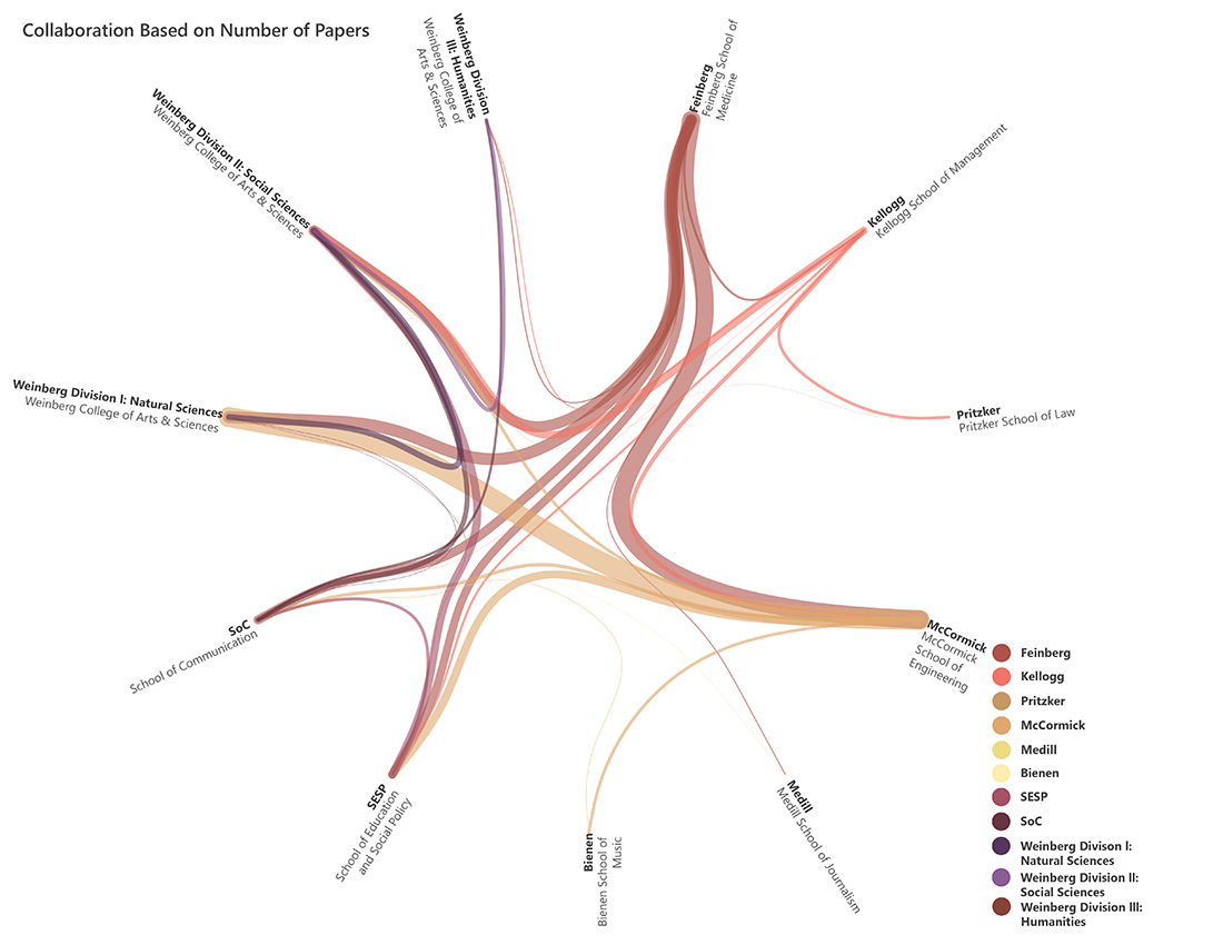
The information for this diagram is the same as the previous diagram, but the original source code is different. We needed to input the same information but in a different format for the diagram to display correctly. This diagram was popular with our client because of how clear the connections between schools is. With the lines beginning and ending at a point rather than a bar, it makes the information easier to read and understand.
Another diagram that worked well was the unit/school organization diagram:
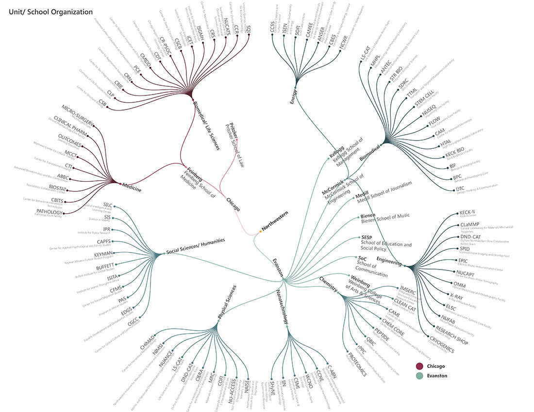
The organization of the centers, departments, schools and campuses is complicated and this diagram clarifies some of that information. Again, the source code for this diagram differed from the two previous diagrams, thus with a little trial and error we figured out how to edit this code to display the organization of the campus.
We are now working on a set of diagrams that show the net square footage of research space each school has. The more diagrams we work on using D3, the better we get at coding and choosing the best visualization technique for each set of data.


