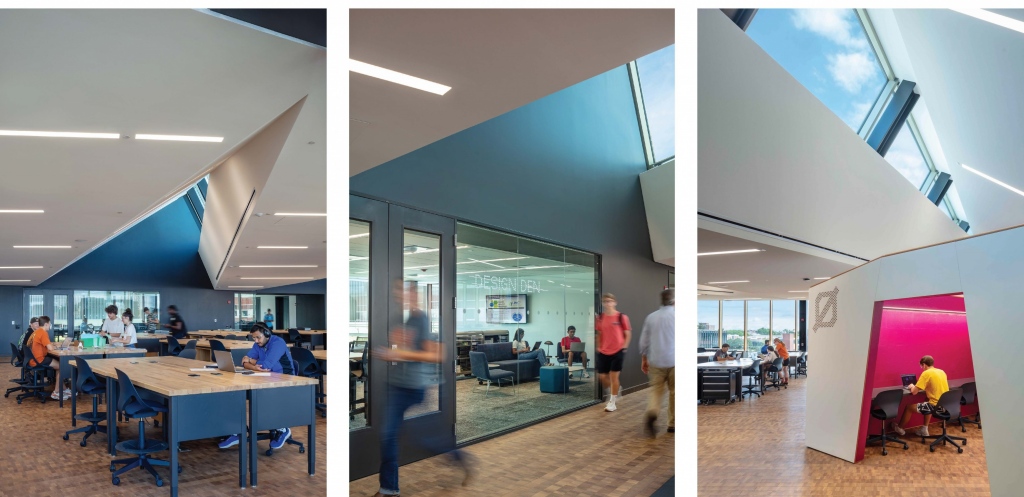
I had heard about so many amazing features about the Engineering Design and Innovation Building (EDIB) we designed at Penn State University, but seeing it in person was even more impressive. As the first component implemented from PAYETTE’s College of Engineering Master Plan, the EDIB offers flexible classrooms, multi-use design studios, “cornerstone to capstone” makerspaces, high bay research labs, faculty offices and research cores to benefit multiple engineering disciplines.
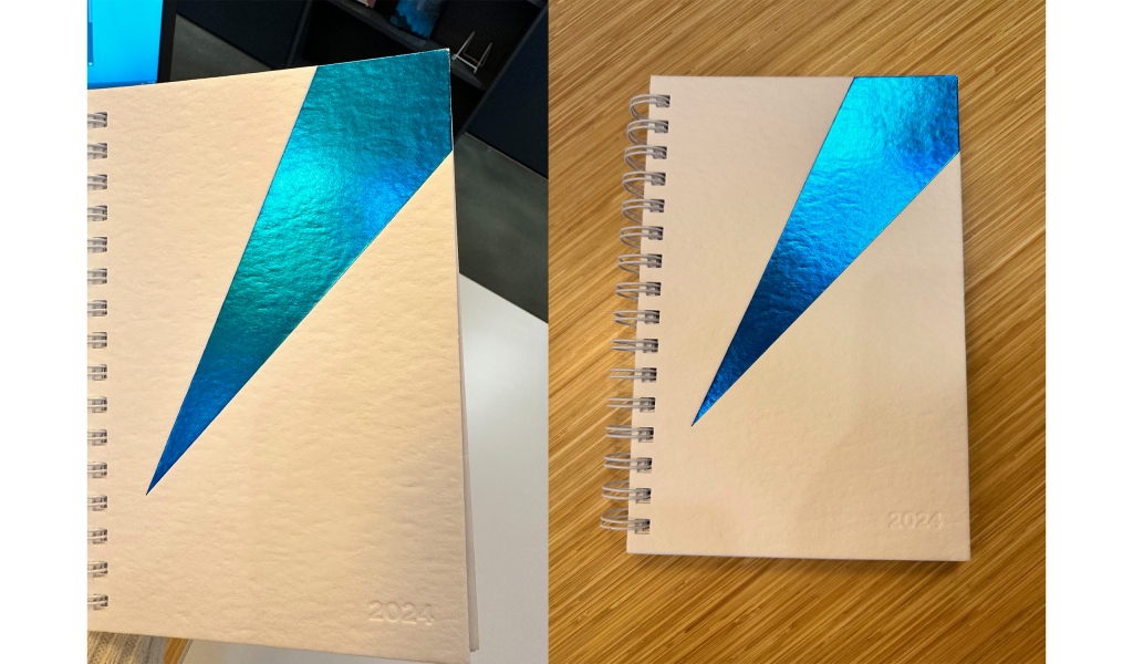
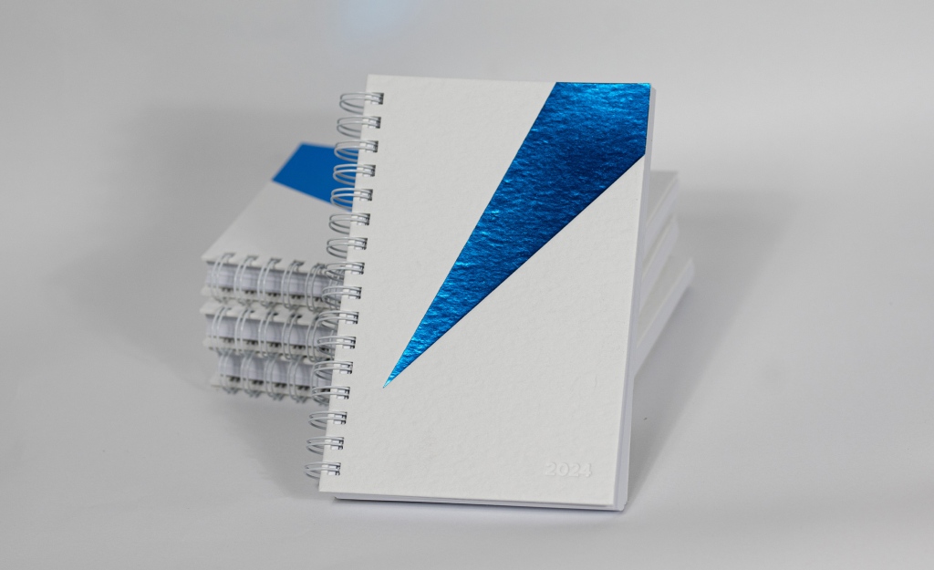
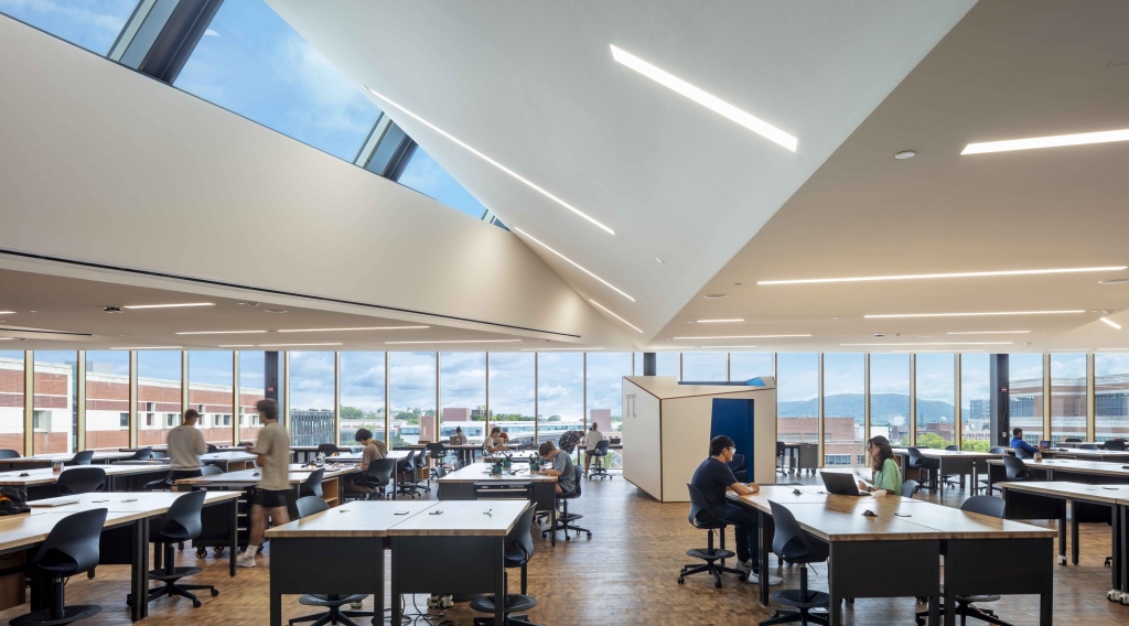
During our first photoshoot for the building, I was immediately drawn to the unique origami-inspired ceiling. It is dramatic, expressive and inspiring. I knew I had found my cover for the annual PAYETTE Sketchbook.
Photography (c) Warren Jagger Photography
I sat down with Lu Zhang, the Project Architect, to better understand the ideas behind the space. The initial design concept for the top floor was creating a signature maker space that is accessible 24/7 by the students. The hybrid steel-timber structure allows for a column-free space, which provides distinct design advantages. Introducing roof monitors enables infusion of natural daylight into the open space, reminiscent of the architectural style of traditional industrial buildings. The origami ceiling, wrapping beneath the roof monitors, creates an undulating surface that enhances the sense of vibrancy and infinity within the space. Notably, it is one of the most prominent features that can be seen from a distance through the building’s main façade.
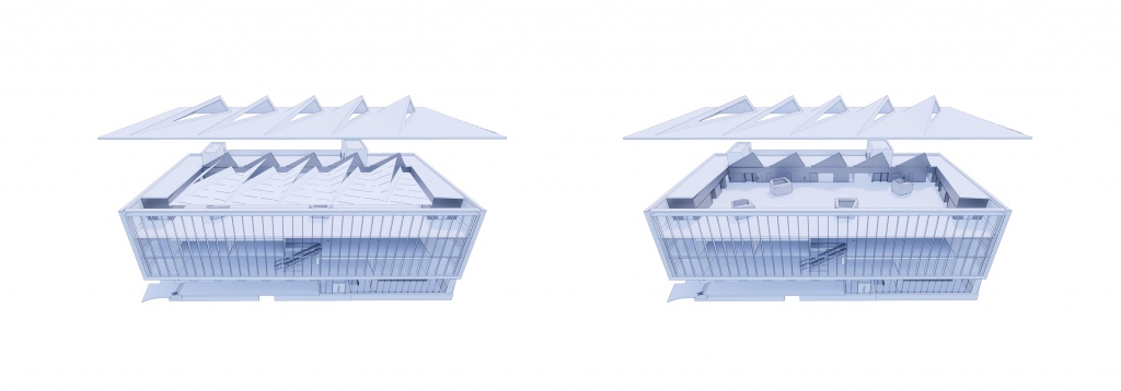
Together, Lu and I explored a few options from complex drawings to simplified linework. Then, an idea struck me: what is so special about this ceiling that I can’t keep my head down? To me, it is the relationship between the dramatic ceiling with sharp angles and the skylight we integrated into the building. The ever-changing sky and clouds add dimension and surprises – just like life. When you have deadlines to meet, papers due, or models to build, things that keep your head down and hands busy. When life gets too busy, it serves as a reminder for us all to make time for a pause and look up. Wonder a bit, dream a little and enjoy the harmonious environment designed for all.
I then worked with our supplier, embossing expert and printer to explore a few options for the paper stock with different thicknesses, textures and their responses to the stamping process. The paper stock I chose offers very firm support with a subtle texture, representing the wall. It is quiet, strong and supportive. For the color splash, I chose a high-gloss metallized hot stamping to connect with the ever-changing sky. It interacts with the lighting and responds to the surrounding environment. At my desk, with a yellow wall and subtle lighting with yellow tones, my cover brings me a gorgeous shade of emerald green, plus all the beautiful shades of blues it naturally presents. It is reflective, uplifting and responsive.
I hope the cover not only creates connections between our project and the audience but also serves as a reminder that life is beautiful. Whenever you have a moment, remember to look up – to discover, to appreciate and for the unexpected. And if you are ever in the area of Penn State, check out this amazing project. You may find more surprises that our building brings you.
