PAYETTE’s color palette and space taxonomy for science and research enables us to create beautiful drawings and data visualizations that communicate design ideas and space metrics to clients who rely on our buildings for critical functionality and daily inspiration.
In the Fall of 2020, a group of PAYETTE planners and designers came together to develop a new series of standard colors for our science and research projects that reflect the space taxonomy and are beautiful and accessible to people with varying degrees of color vision deficiency. The goal is to communicate building plans, diagrams, and data visualizations clearly and consistently to clients and stakeholders. A complementary palette and space taxonomy for our healthcare buildings is currently being developed.
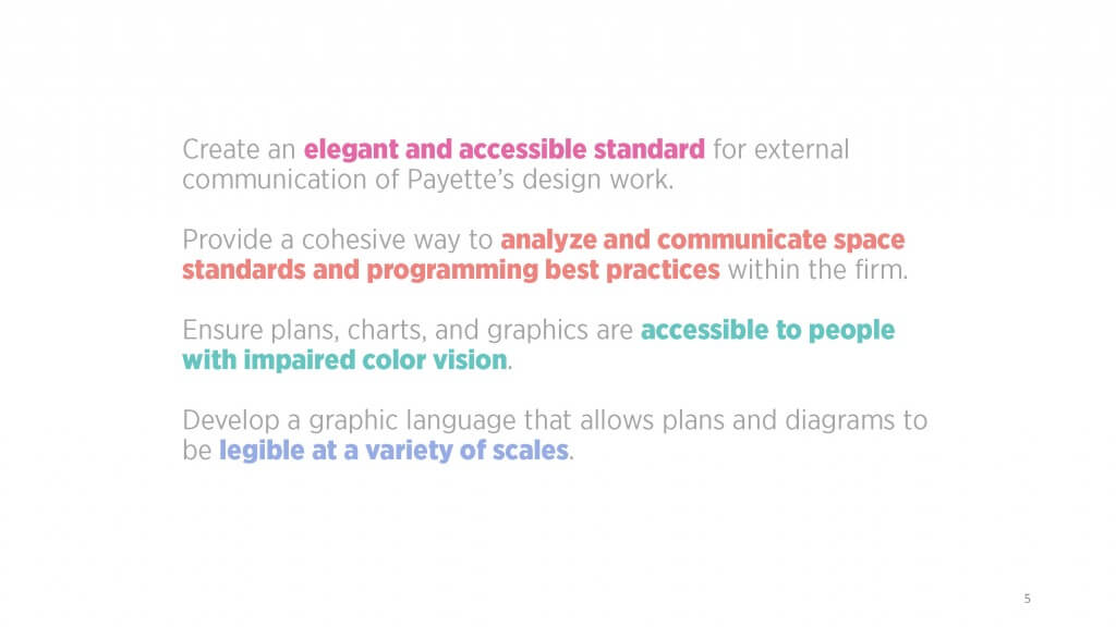
The specific objectives of the new color palette were as follows:
Color Logic
We approached the problem as a design challenge and deployed the same rigorous, iterative process we use to design buildings. We knew we wanted lively, brilliant and timeless colors. We also wanted the colors to be clear, legible and accessible. After researching sources for visual inspiration—the natural world, pop art, exemplary diagrams from within the office—we coalesced around creating a logic for grouping hues and saturations.
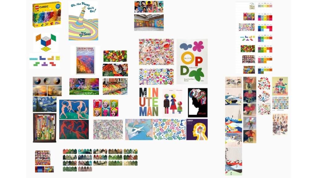
Color inspiration—Mural page
Yellow, which represents circulation, became the foundation of the color set. Yellow tones for circulation are an informal industry standard, and at PAYETTE it has served for many years as a neutral baseline for the corridors and connecting spaces within buildings. Anchored by yellow, we expanded in either direction towards warm and cool colors. We decided on overall space type categories and established a home color for each: red and orange on the warm side for research labs and specialty spaces, green and blue on the cool side for teaching environments and office spaces. Each overall category could be split into subcategories, to represent different specific sub-program types by varying the saturation level of the prime color — differentiating offices from conference rooms, for example, or open lab benches from lab support spaces.
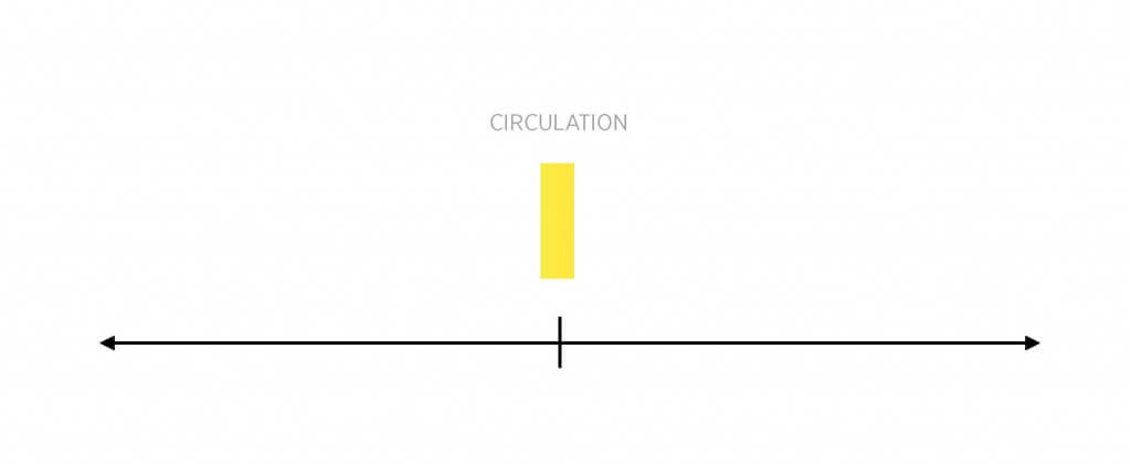
First color, yellow as circulation
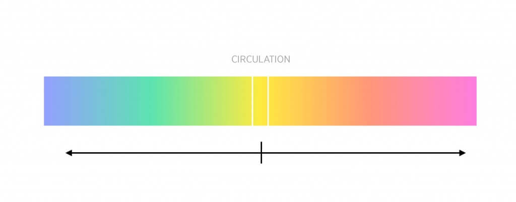
Full color gradient
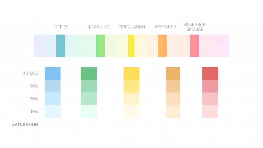
Overall colors with four saturation levels
After we created the base categories, we made a few key color moves to make the palette more interesting. First, we shifted the greens further away from yellow and towards teal, to remove any chance of confusing our program colors with colors used for landscape or trees, which typically use warmer green-yellows. Second, we began to hue-shift each color group. Instead of only increasing in saturation and keeping the base hues static, each level would now move slightly farther on the color spectrum. Pure oranges became orange-red, reds became red-magenta, greens became teal and turquoise, and blues became blue-violet. Beyond emphasizing the difference in intensity between each level in a stronger way, hue-shifting makes the palette broader and feel more dynamic, vibrant and visually interesting.
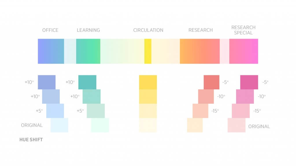
Hue shift in overall colors
Color Validation
In addition to having a color palette that has a clear semantic meaning and precedent, we wanted to create a color palette that was both visually harmonious and accessible to those with color vision deficiencies (at least 10% of the population).
There are some general rules that can be used to help create harmonious color palettes. If all of the colors in your palette have similar saturation, hue (analogous), or lightness they will often feel harmonious. Complementary colors (opposite each-other on a color wheel) will usually feel harmonious, in addition to other positions on the color wheel like triad, square and split complementary. Our five overall colors form a set of harmonious colors that are close to a split complimentary set around the overall circulation color yellow. Additionally, the overall colors (excluding yellow) have a very similar lightness which again re-enforces their visual harmony.
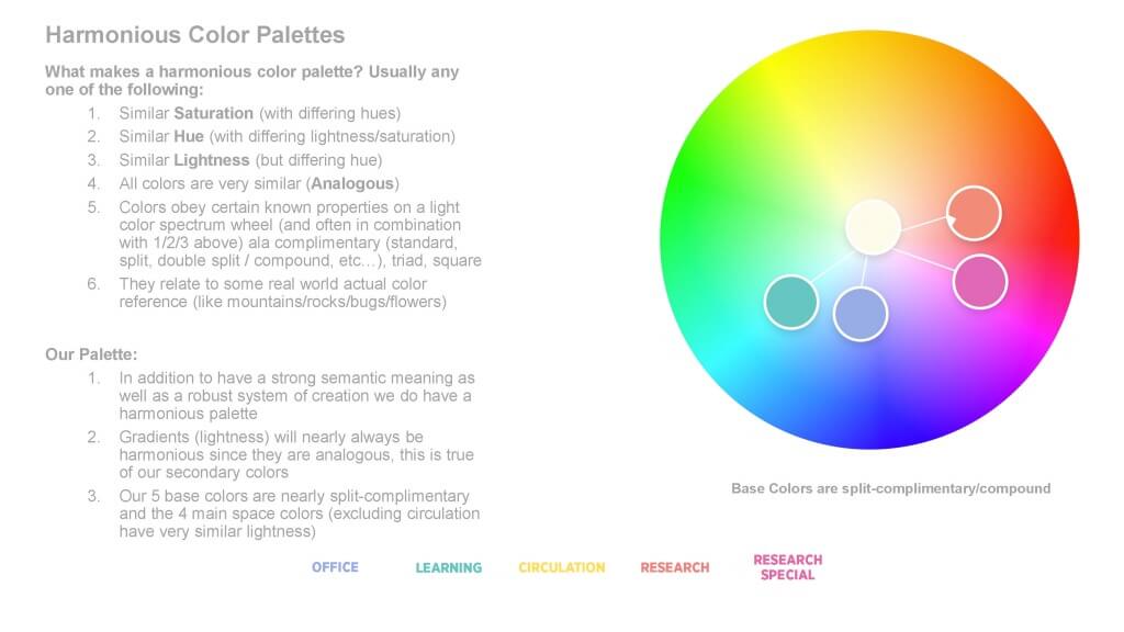
Summary of harmonious color properties and color wheel from Adobe Color. Five core colors approximate a split-complimentary color set on the color wheel. Office, Learning, Research and Research Special form a ring of colors nearly equal in lightness surrounding the much lighter Circulation color on a color wheel.
To aid in visual accessibility, our secondary colors are a gradation of varying lightness of a similar hue. Each color differs in lightness enough (contrast ratio) to be distinguishable by people with varying color vision sensitivity.
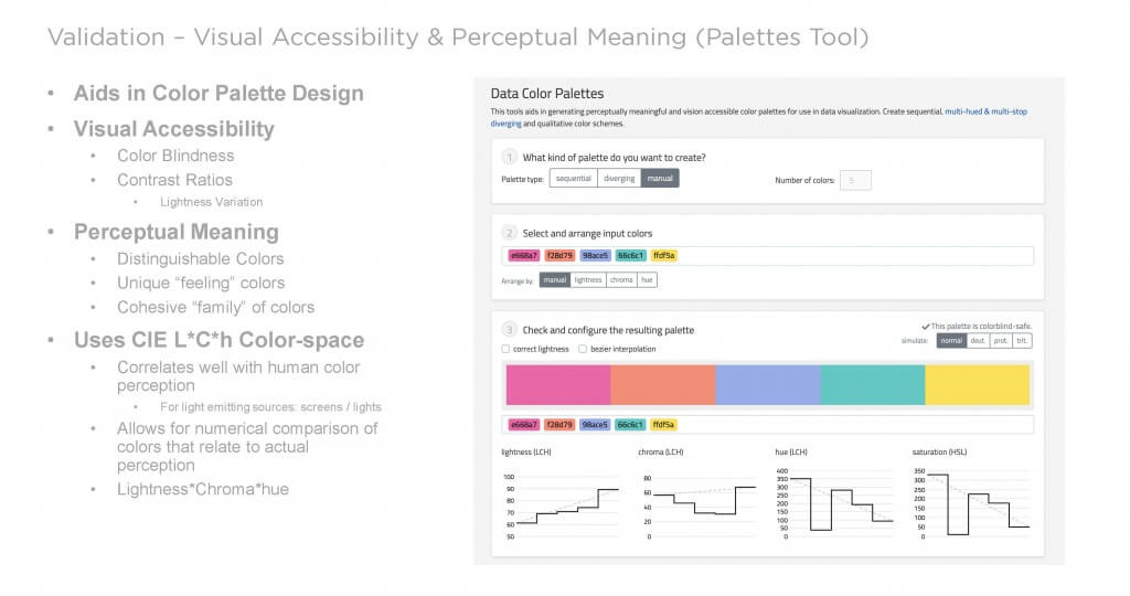
The Data Color Palettes tool aids in analysis of color palettes. Graphs show gradations in lightness, chroma, hue and saturation of our color palettes in a perceptually uniform color space (L*C*h) allowing us to quickly see if each color has a large enough contrast ratio between all others.
Our five primary colors do not differ much in lightness (except yellow), so what we are testing for is how distinguishable they are for people with varying degrees of color vision and differing color vision deficiencies, such as color blindness. We validated this by using the web-based tools Adobe Color and Data Palettes to simulate what our color palettes would look like with common types of color deficiencies. For example, deuteranopia, colloquially red/green color-blindness. Additionally, we solicited feedback from as many people as possible, and with varying color visions, ensuring our palette is both distinguishable and visually appealing.
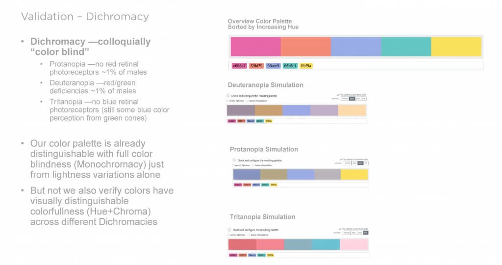
The Data Color Palettes tool provides quick feedback on color blindness accessibility of the palette for common types of color blindness
Colors & Categories
To streamline and simplify our colors, we created four overall categories for the net space in our higher education and research projects: Office, Learning, Research, and Research Special (animal facility, cleanroom). Within each of these overall categories we created four subcategories that range from open spaces with low mechanical intensity (i.e., circulation and open lounges) to spaces requiring the highest mechanical intensity (i.e., small, enclosed rooms). These sub-categories map onto our in-house space classification system, a system through which we can benchmark and compare our projects for different institutions and program types.
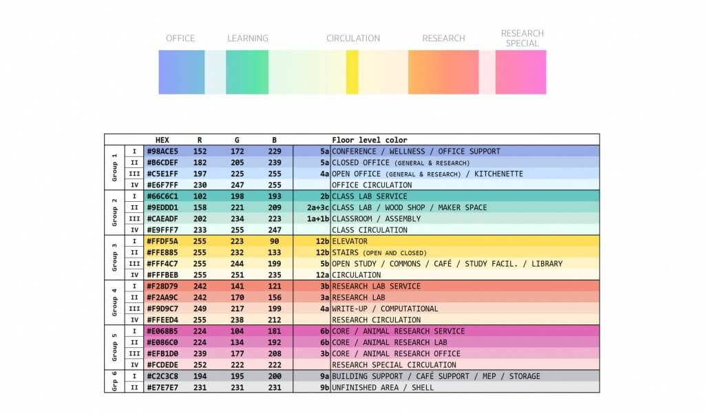
New science space types color chart
After creating these subcategories, we experimented with assigning different colors to each subcategory. We ultimately settled upon Office = blue, Learning = green/turquoise, Research = orange, Research Special = pink.
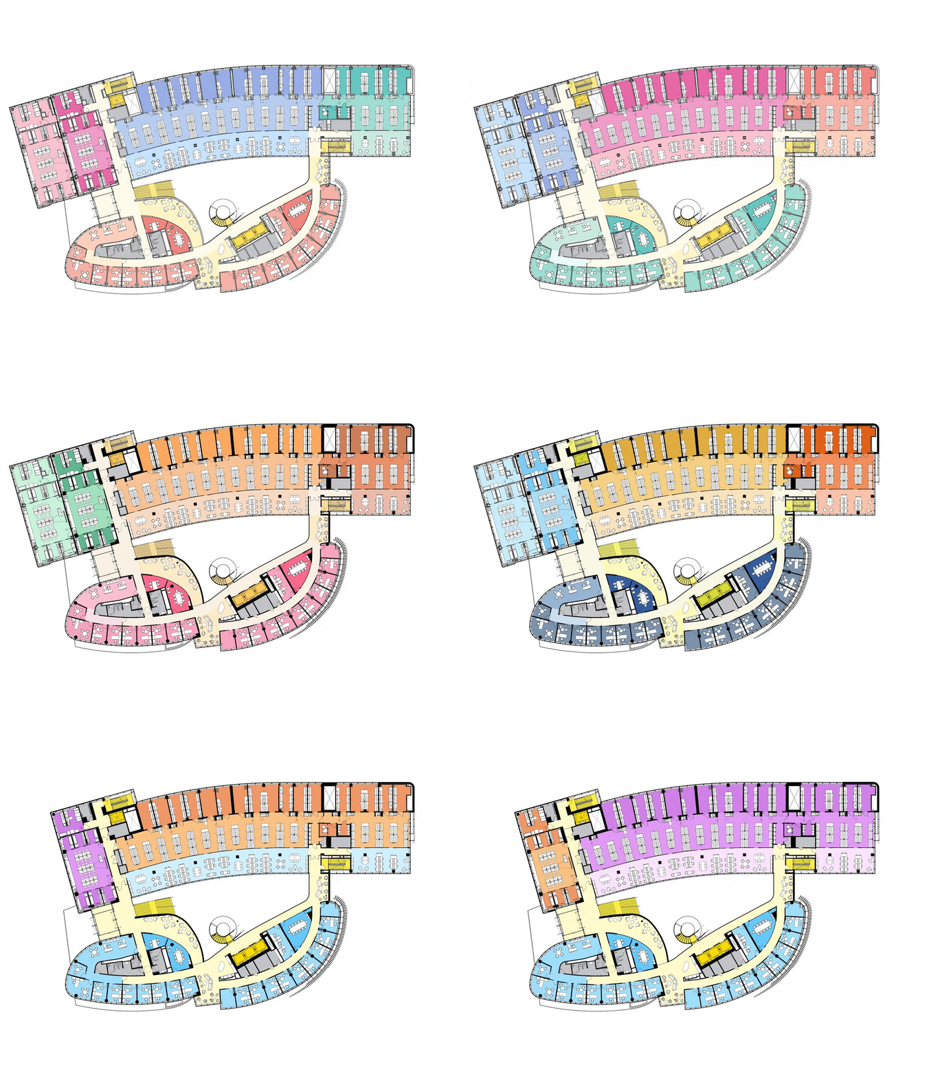
Tests of color and subcategory assignments using the Northeastern University Interdisciplinary Science and Engineering project

New space types color palette on the Northeastern University Interdisciplinary Science and Engineering Complex project
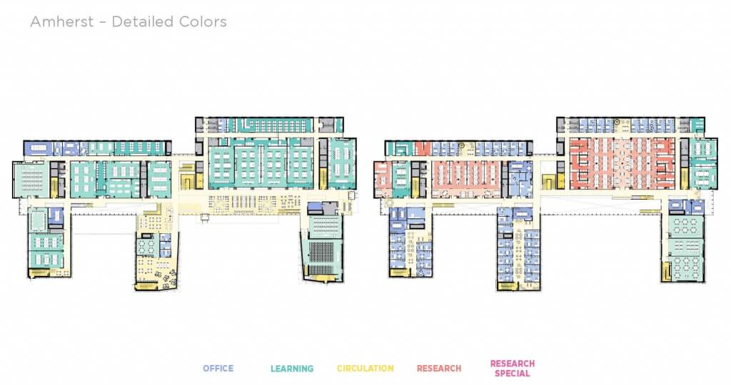
New space types color palette on the Amherst College New Science Center project

Overall colors used for diagrams and data visualization
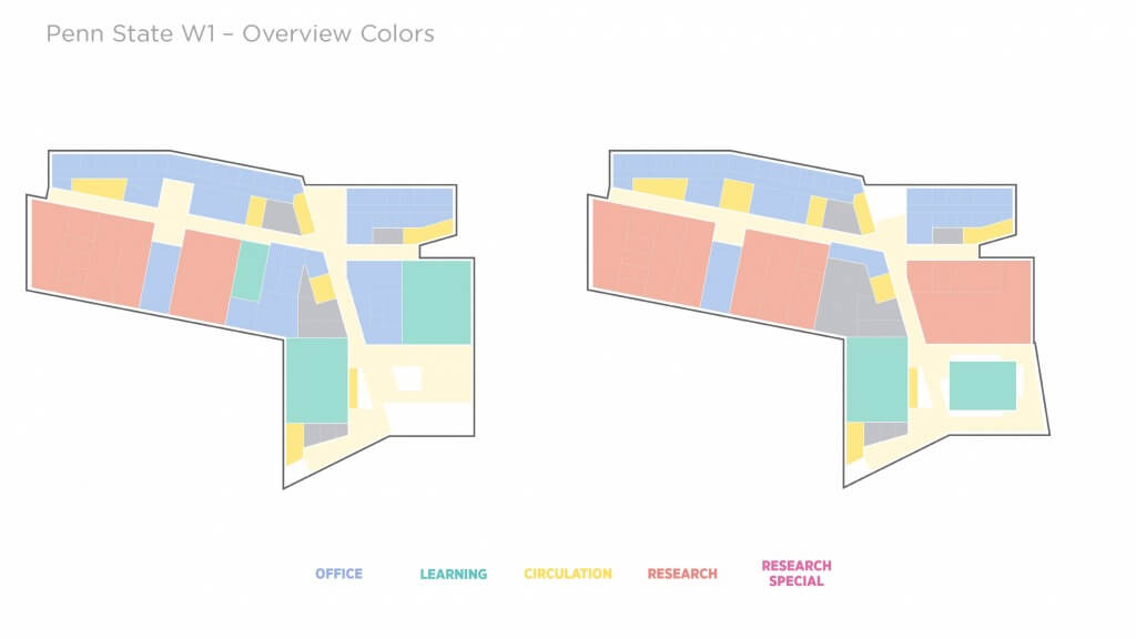
Overall colors on Penn State College of Engineering West 1 project

Detailed colors on Penn State College of Engineering West 1 project
Project Team
Leon W. Drachman, AIA, LEED Green Associate
Ben Garbow
Abigail Klima, AIA
Mi Li
Emily Miyares, AIA
Andrew Ringler
Thomas Simister, AIA, LEED AP
Kevin Sullivan, FAIA
Alex Zink, AIA, LEED AP BD+C
