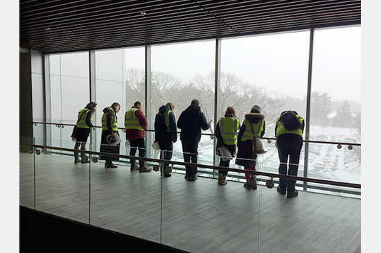
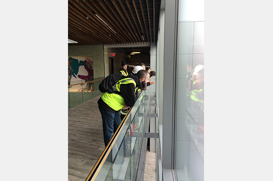
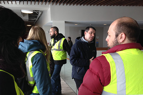
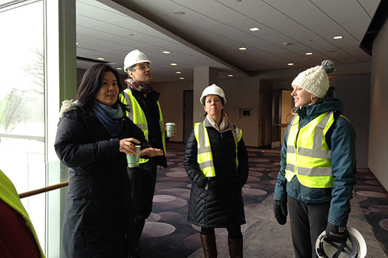
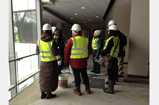
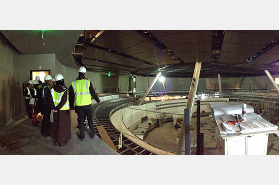
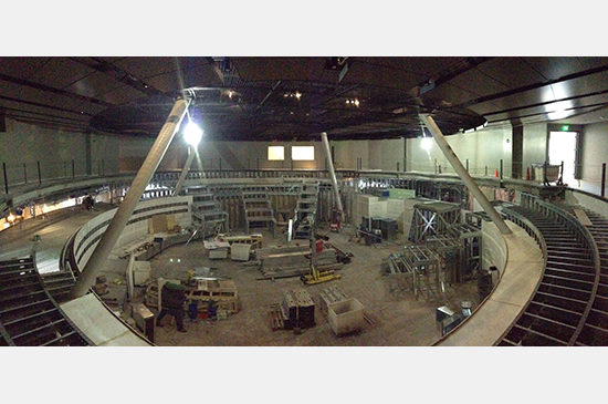
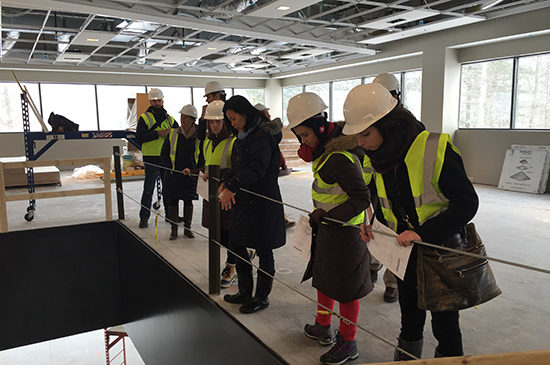
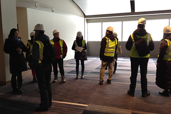
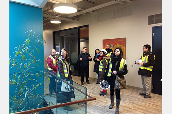
On a cold February afternoon, a group of PAYETTE designers ventured out to Foxborough, MA to tour the Meditech Office Fit-Out and Conference Center, due for completion this spring. Mee Kim and Jeff DeGregorio led the tour, organized by the Young Designer’s Core (YDC), focusing on the large 550-seat auditorium integrated into an existing office building. The challenges presented by the regular column grid and the restraining floor-to-floor height required a full gut renovation to incorporate auditorium in-the-round. Aligning the columns with the stair circulation, based on the frustum structure, provides no obstruction between the public and the presenter.
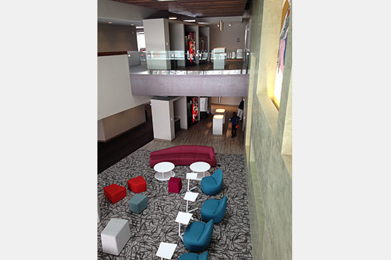
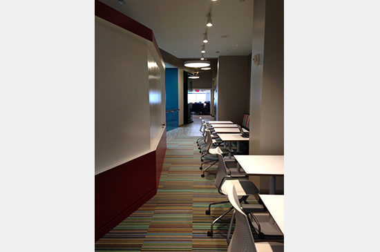
Before taking a closer look at the auditorium, Mee and Jeff took us through the building to get a sense of the entire project. The building, serving two functions, is vertically subdivided into the conference center and the office zones. The lower floors take on a corporate identity to serve the public, meanwhile the upper floors exhibit a colorful personality within the typical office layout. The central knuckle takes on the challenge to display the differences between the two functions. The upper and the lower atriums feel very different, despite having similar layout and configuration.
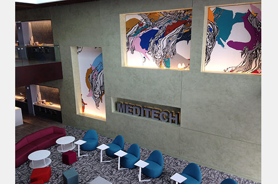
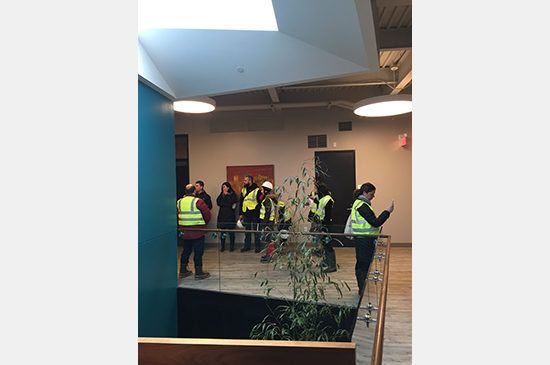
Standing on the fourth floor bridge, looking down at the atrium, one can sense the Meditech identity, manifested in the choice of artwork, color and material finishes. The carefully crafted curtain wall allows for an unobstructed view of the landscape. Looking down at the entrance canopy one can see a similar reference of the skylight and the cut opening, often found throughout the building not only in the knuckle, but also in the office wings. The surgical operation within the office wings was necessary to bring light to such deep floor plates. The central community cores within each wing serve to bring the employees together for informal collaborations and meetings. On the perimeter, the view toward the landscape is reinforced via the link between the old and the new, where the ceiling drops to line up with the fenestration of the existing façade.
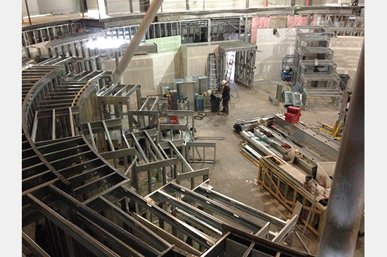
After getting a sense of the entire building, we entered the auditorium to observe the ongoing construction process. We looked at the installed tension grid that not only provides service access, but also conceals structure, lighting infrastructure and AV equipment. The black finish undermines the utilitarian function and calls attention to the space below. The surrounding perimeter wall is designed to incorporate artwork and LED lights, which can be adjusted in color, per presenter’s request. Mee pointed out the holes cut into the concrete slab in order to bring supply air to each individual chair. The design team worked through a number of damper plates and diffuser options to allow for the proper air pressure distribution within the auditorium.
Although at present it is difficult to get a sense of what the finished space will feel like, the auditorium is only a few months away from being completed. Because of the round configuration, each chair in the auditorium will include a tablet for viewing the presentation, in contrast to the projector and screen model. After the chairs are installed and the tablets are hooked up, we will be able to experience the TED-style auditorium in its intended use.

